11 Quality control
11.1 Preamble
11.1.1 Introduction
“Quality is everyone’s responsibility.” - W. Edwards Deming
Quality control (QC) procedures aim to remove low-quality spots or technical artifacts before further analysis. Low-quality spots can occur due to problems during library preparation or other experimental procedures. To prevent introducing unnecessary bias into downstream analysis, low-quality spots are usually removed prior to further analysis.
Low-quality spots can be identified according to several characteristics, including:
library size (i.e. total unique molecular identifier (UMI) counts per spot)
number of expressed features (i.e. number of genes with non-zero UMI counts per spot)
proportion of reads mapping to mitochondrial genes (a high proportion indicates cell damage)
number of cells per spot (unusually high values can indicate problems due to unsuccessful cell segmentation as a computational step, or tissue damage)
Low library size or low number of expressed features can indicate poor mRNA capture rates, e.g. due to cell damage and missing mRNAs, or low reaction efficiency. A high proportion of mitochondrial reads can be indicative of cell damage, e.g. partial cell lysis leading to leakage and missing cytoplasmic mRNAs, with the resulting reads therefore concentrated on the remaining mitochondrial mRNAs that are relatively protected inside the mitochondrial membrane. Unusually high numbers of cells per spot can indicate problems during cell segmentation.
11.1.2 QC challenges in sequencing-based ST
The first three characteristics listed above are the standard QC metrics used in scRNA-seq data, and they are often valid for ST data as well. However, caution must be taken in interpreting these metrics as they tend to be confounded by biology in sequencing-based ST data (Bhuva et al. 2024; Totty et al. 2025).
For example, in the brain, neuronal cell bodies reside in gray matter, whereas white matter is made up almost entirely of neuronal processes. This naturally leads to regions of gray matter containing much higher numbers of genes detected and overall transcripts captured relative to white matter. Moreover, white matter tends to show a higher proportion of mitochondrial reads than gray matter. Without this biological context, one might mistakenly assume that the white matter regions are of low quality and should be removed before downstream analyses.
11.1.3 Structure of this chapter
In this chapter, we will start with introducing some methods to identify low-quality spots using various strategies, including 1) standard methods developed for single-nucleus RNA-seq (snRNA-seq) via global thresholding, and 2) more recent methods that aim to mitigate bias in QC attributed to spatial confounding. Diagnostic visualizations and strategies are further introduced in Section 11.3 and Section 11.4.
In the advanced topics section (Section 11.6), we will visit some novel and unique challenges in QC of ST data, including identifying histological artifacts, i.e. regional artifacts and QC based on number of cells identified in each spot. While these methods are very useful, these procedures are not necessary for all datasets.
To note, the current chapter focuses on QC at the spot level. In some datasets, it may also be appropriate to apply QC procedures or filtering at the gene level. For example, certain genes may be biologically irrelevant for downstream analyses. However, here we make a distinction between QC and feature selection. Removing biologically uninteresting genes (such as mitochondrial genes) may also be considered as part of feature selection, since there is no underlying experimental procedure that has failed. Therefore, we discuss gene-level filtering in Chapter 12.
11.1.4 Dependencies
In this chapter, we will rely on the following packages:
11.1.5 Data import
Next, we import a 10x Genomics Visium dataset that will be used in several of the following chapters. This dataset has previously been preprocessed using data preprocessing procedures with tools outside R and saved in SpatialExperiment format, and is available for download from the STexampleData package.
The dataset consists of one sample (Visium capture area) from one donor, consisting of postmortem human brain tissue from the dorsolateral prefrontal cortex (DLPFC) brain region; it is described in Maynard et al. (2021).
Code
(spe <- Visium_humanDLPFC())## class: SpatialExperiment
## dim: 33538 4992
## metadata(0):
## assays(1): counts
## rownames(33538): ENSG00000243485 ENSG00000237613 ... ENSG00000277475
## ENSG00000268674
## rowData names(3): gene_id gene_name feature_type
## colnames(4992): AAACAACGAATAGTTC-1 AAACAAGTATCTCCCA-1 ...
## TTGTTTGTATTACACG-1 TTGTTTGTGTAAATTC-1
## colData names(8): barcode_id sample_id ... reference cell_count
## reducedDimNames(0):
## mainExpName: NULL
## altExpNames(0):
## spatialCoords names(2) : pxl_col_in_fullres pxl_row_in_fullres
## imgData names(4): sample_id image_id data scaleFactor11.2 Calculate QC metrics
We calculate the QC metrics described above with a combination of methods from the scrapper package (for metrics that are also used for scRNA-seq data, where we treat spots as equivalent to cells) and our own functions. We can then use these metrics to identify low-quality spots.
The QC metrics from scrapper can be calculated and added to the SpatialExperiment object’s column data using the quickRnaQc.se() function. The sum column contains the total number of unique molecular identifiers (UMIs) for each spot, the detected column contains the number of unique genes detected per spot, and subset.proportion.mito contains the proportion of transcripts mapping to mitochondrial genes per spot.
First, we subset the object to keep only spots covered by the tissue section. The remaining spots are background spots, which we are not interested in as they will contain almost entirely mitochondrial genes and transcripts from cellular debris.
Code
# subset to keep only spots over tissue
spe <- spe[, spe$in_tissue == 1]
dim(spe)
## [1] 33538 3639Code
##  is_mito
##  FALSE  TRUE
##  33525    13
Code
rowData(spe)$gene_name[is_mito]## [1] "MT-ND1" "MT-ND2" "MT-CO1" "MT-CO2" "MT-ATP8" "MT-ATP6" "MT-CO3"
## [8] "MT-ND3" "MT-ND4L" "MT-ND4" "MT-ND5" "MT-ND6" "MT-CYB"Code
# calculate per-spot QC metrics and store in colData
spe <- quickRnaQc.se(spe, subsets=list(mito=is_mito))
## using unknown matrix fallback for 'dgTMatrix'Code
head(colData(spe))## DataFrame with 6 rows and 12 columns
## barcode_id sample_id in_tissue array_row
## <character> <character> <integer> <integer>
## AAACAAGTATCTCCCA-1 AAACAAGTATCTCCCA-1 sample_151673 1 50
## AAACAATCTACTAGCA-1 AAACAATCTACTAGCA-1 sample_151673 1 3
## AAACACCAATAACTGC-1 AAACACCAATAACTGC-1 sample_151673 1 59
## AAACAGAGCGACTCCT-1 AAACAGAGCGACTCCT-1 sample_151673 1 14
## AAACAGCTTTCAGAAG-1 AAACAGCTTTCAGAAG-1 sample_151673 1 43
## AAACAGGGTCTATATT-1 AAACAGGGTCTATATT-1 sample_151673 1 47
## array_col ground_truth reference cell_count sum
## <integer> <character> <character> <integer> <numeric>
## AAACAAGTATCTCCCA-1 102 Layer3 Layer3 6 8458
## AAACAATCTACTAGCA-1 43 Layer1 Layer1 16 1667
## AAACACCAATAACTGC-1 19 WM WM 5 3769
## AAACAGAGCGACTCCT-1 94 Layer3 Layer3 2 5433
## AAACAGCTTTCAGAAG-1 9 Layer5 Layer5 4 4278
## AAACAGGGTCTATATT-1 13 Layer6 Layer6 6 4004
## detected subset.proportion.mito keep
## <integer> <numeric> <logical>
## AAACAAGTATCTCCCA-1 3586 0.166351 TRUE
## AAACAATCTACTAGCA-1 1150 0.122376 TRUE
## AAACACCAATAACTGC-1 1960 0.114089 TRUE
## AAACAGAGCGACTCCT-1 2424 0.242223 TRUE
## AAACAGCTTTCAGAAG-1 2264 0.152174 TRUE
## AAACAGGGTCTATATT-1 2178 0.155095 TRUECode
# keep copy of object to save later
spe_save <- spe
11.3 Global outlier detection
Many commonly used QC methods currently applied to ST were adapted from snRNA-seq workflows, such as global outlier detection. The simplest option for identifying potential low-quality spots is to apply fixed thresholds to each QC metric across the entire sample, and remove any spots that do not meet the thresholds for one or more metrics.
For example, we might consider spots to be of low-quality if they have library sizes below 600 UMI or mitochondrial proportion above 0.30 (30%). These cutoffs are somewhat arbitrary and often require knowledge of the tissue type and dataset at hand. In particular, exploratory visualizations can be used to help select appropriate thresholds, which may differ depending on the dataset.
Here, we use visualizations to select thresholds for several QC metrics in our human DLPFC dataset: (i) library size, (ii) number of expressed genes, (iii) proportion of mitochondrial reads, and (iv) number of cells per spot.
Code
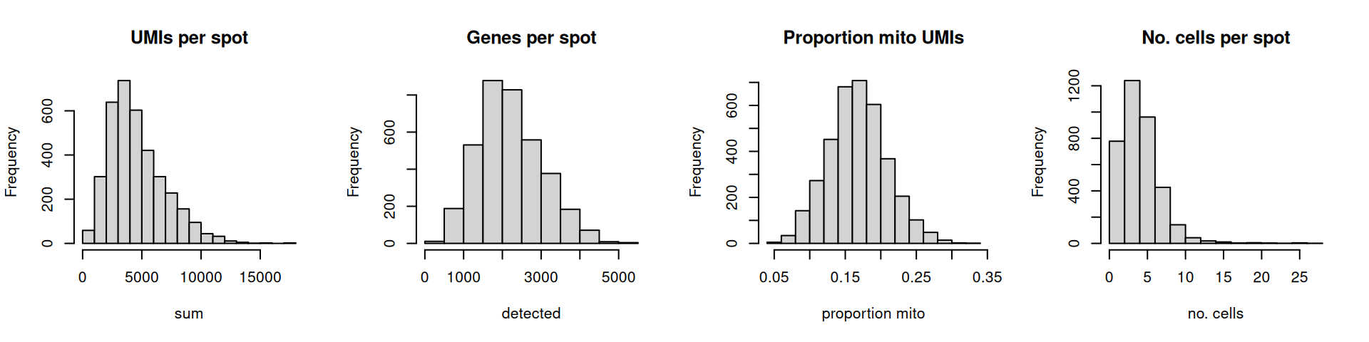
The distributions are relatively smooth, and there are no obvious issues such as a spike at very low library sizes.
We can also plot QC metrics together, such as the library size or mitochondrial proportion against the number of cells per spot. This can help us determine an optimal threshold while also checking that we are not inadvertently removing a biologically meaningful group of spots. The horizontal line (argument threshold) shows our first guesses at possible filtering thresholds for library size and mitochondrial proportion.
Code
# plot library size vs. number of cells per spot
p1 <- plotObsQC(spe,
    plot_type="scatter",
    x_metric="cell_count",
    y_metric="sum",
    y_threshold=600) +
    ggtitle("Library size vs. cells per spot")

# plot mito proportion vs. number of cells per spot
p2 <- plotObsQC(spe,
    plot_type="scatter",
    x_metric="cell_count",
    y_metric="subset.proportion.mito",
    y_threshold=0.30) +
    ggtitle("Mito proportion vs. cells per spot")

p1 | p2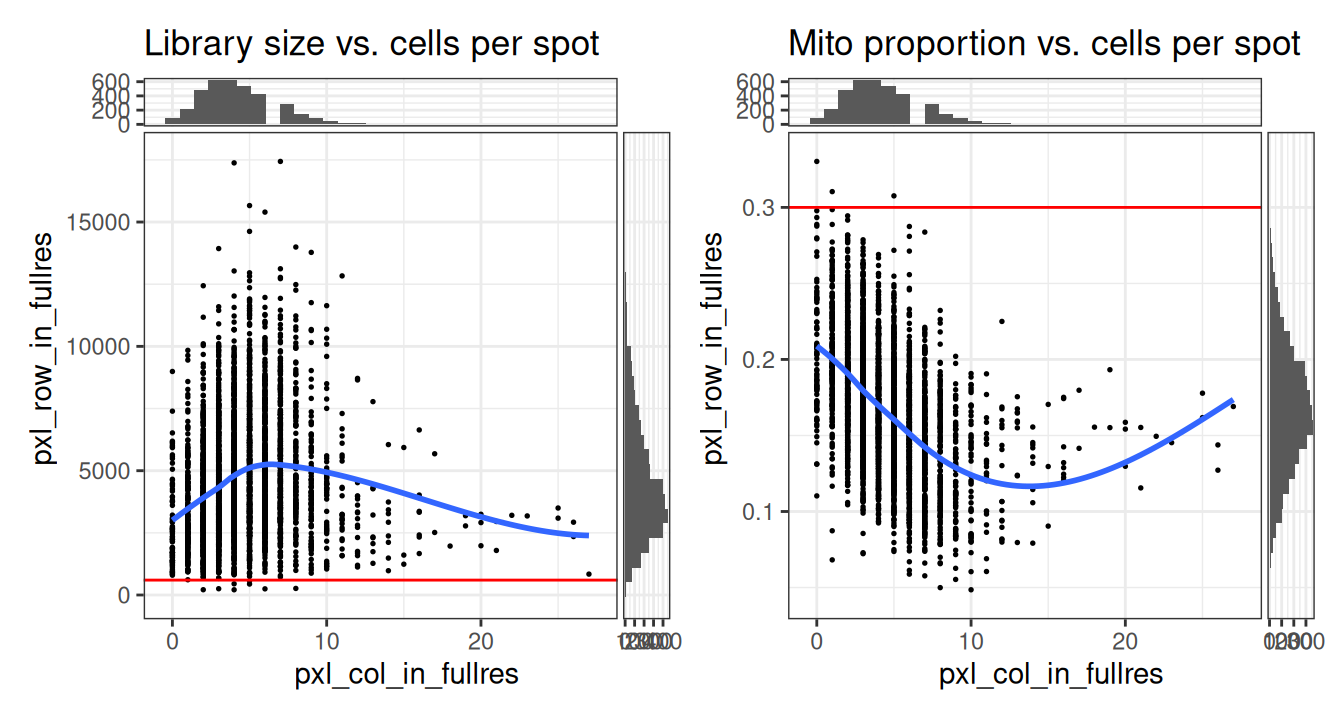
The plot shows that these filtering thresholds do not appear to select for any obvious biologically consistent group of spots and will not result in removing an excessive number of observations. We can further verify this by checking the exact number of spots excluded.
Code
# select QC thresholds for library size,
# detected features & mito. proportion
spe$qc_lib_size <- spe$sum < 600
spe$qc_detected <- spe$detected < 400
spe$qc_mito_prop <- spe$subset.proportion.mito > 0.30

# tabulate number of cells kept/flagged by each
qc <- grep("^qc", names(colData(spe)))
sapply(colData(spe)[qc], table)
## qc_lib_size qc_detected qc_mito_prop
## FALSE 3631 3632 3636
## TRUE 8 7 3Finally, we also check that the discarded spots do not have any obvious spatial pattern that correlates with known biological features. Otherwise, removing these spots could indicate that we have set the threshold too high, and are removing biologically informative spots.
Code
# check spatial pattern of discarded spots
p1 <- plotObsQC(spe,
    plot_type="spot", annotate="qc_lib_size") +
    ggtitle("Library size (< 600 UMI)")

p2 <- plotObsQC(spe,
    plot_type="spot", annotate="qc_detected") +
    ggtitle("Detected genes (< 400 genes)")

p3 <- plotObsQC(spe,
    plot_type="spot", annotate="qc_mito_prop") +
    ggtitle("Mito proportion (> 0.30)")

p1 | p2 | p3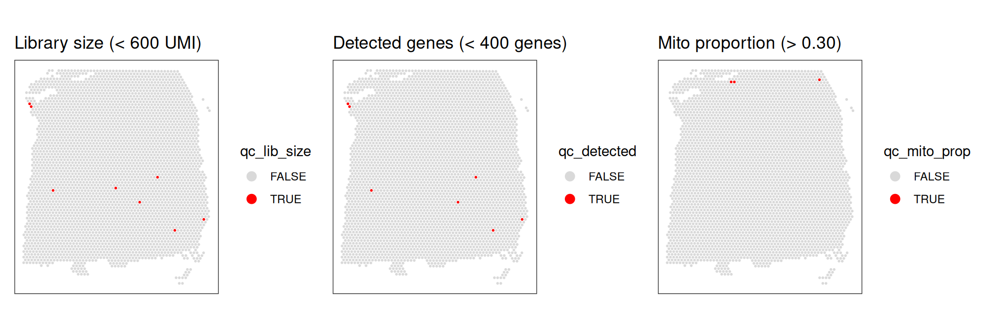
As an aside, here we can also illustrate what happens if we set the threshold too high. For example, if we set the threshold to 2000 UMI counts per spot – which may also seem like a reasonable value based on the histogram and scatterplot – then we see a possible spatial pattern in the discarded spots, matching known cortical layers. This illustrates the importance of interactively checking exploratory visualizations when choosing these thresholds. To illustrate this point, we can plot the manually annotated reference (“ground truth”) DLPFC layers here for reference.
Code
# check spatial pattern of discarded spots if threshold is too high
spe$qc_lib_size_2000 <- spe$sum < 2000

# plot the spots flagged with the high threshold
p1 <- plotObsQC(spe,
    plot_type="spot", annotate="qc_lib_size_2000") +
    ggtitle("Library size (< 2000 UMI)")

# plot manually annotated reference layers
p2 <- plotCoords(spe,
    annotate="ground_truth", pal="libd_layer_colors") +
    ggtitle("Manually annotated layers")

# plot library size by manual annotation
p3 <- plotColData(spe,
    x="ground_truth", y="sum", colour_by="ground_truth") +
    theme(axis.text.x=element_text(angle=45, hjust=1)) +
    ggtitle("Library size by layer") + xlab("")

p1 | p2 | p3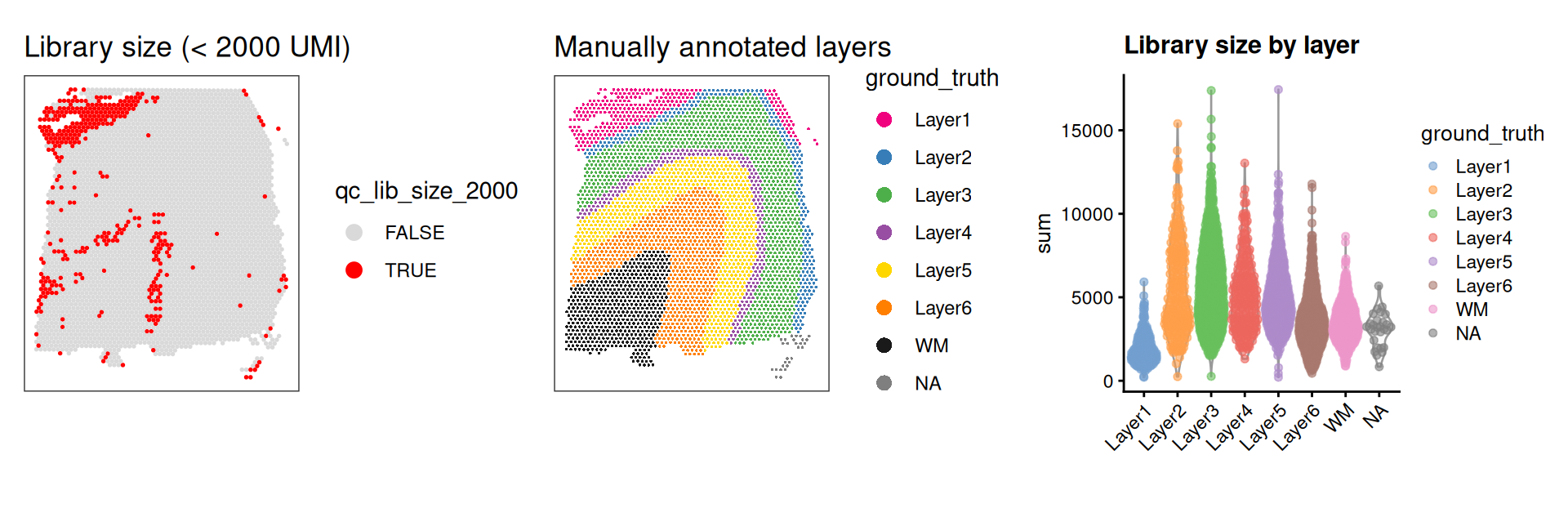
Looking at the flagged spots versus the manually annotated layers, it is clear that setting a library size threshold of 2000 UMIs is flagging more spots in layers 1 and 6 relative to other layers or spatial domains. In other words, library size is confounded with biology, as has been previously demonstrated (Bhuva et al. 2024; Totty et al. 2025).
We can additionally use violin plots to visualize the distribution of the QC metrics, with outliers annotated. This can help us determine if the thresholds we have chosen are appropriate or are excluding too many spots.
Code
# library size and outliers
p1 <- plotObsQC(spe,
    plot_type="violin", x_metric="sum",
    annotate="qc_lib_size", point_size=0.5) +
    xlab("Library size")

# detected genes and outliers
p2 <- plotObsQC(spe,
    plot_type="violin", x_metric="detected",
    annotate="qc_detected", point_size=0.5) +
    xlab("Detected genes")

# mito proportion and outliers
p3 <- plotObsQC(spe,
    plot_type="violin", x_metric="subset.proportion.mito",
    annotate="qc_mito_prop", point_size=0.5) +
    xlab("Mito proportion")

p1 | p2 | p3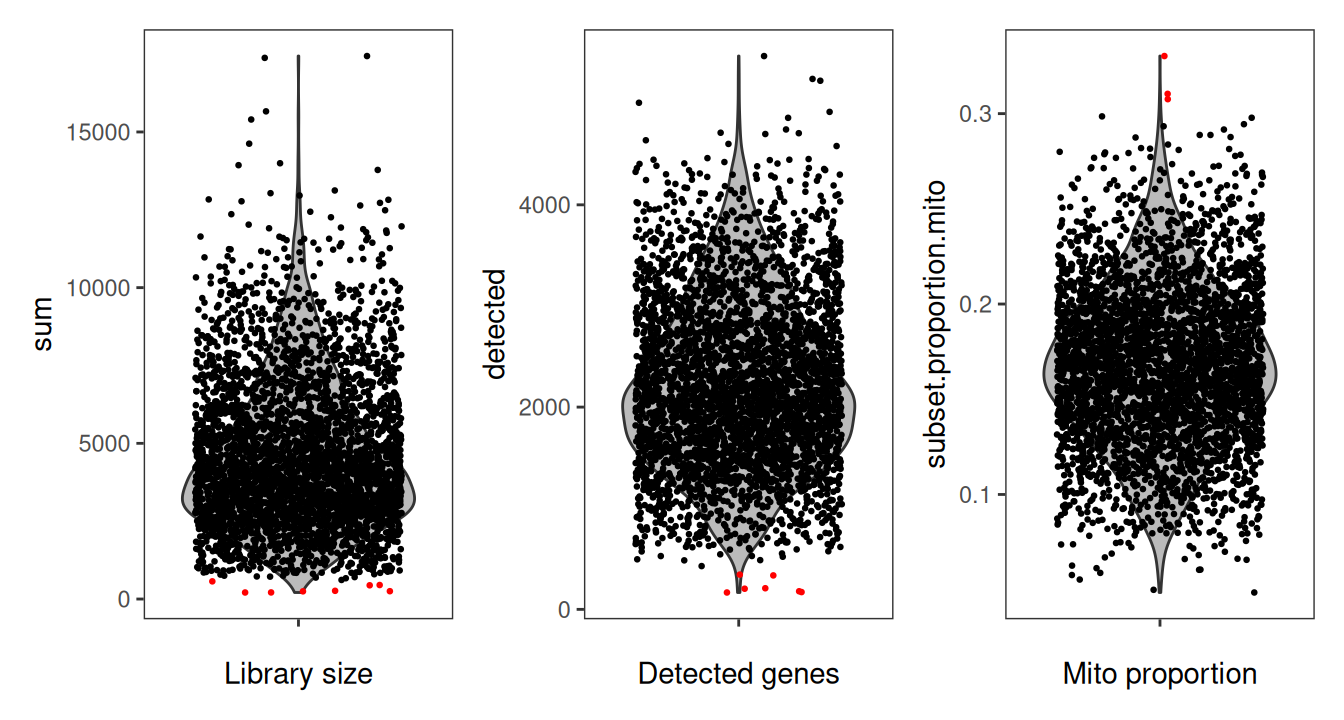
11.4 Local outlier detection
One of the key assumptions of global outlier detection in single cell and spatial transcriptomics is that the QC metrics are independent of natural biology. Otherwise, cells or spots with naturally low library size or higher mitochondrial ratio will be more likely to be removed as outliers. For snRNA-seq, this assumption is rarely or only mildly violated, resulting in negligible impacts on downstream analyses. However, as demonstrated above, this assumption is more commonly violated in sequencing-based ST due to the biological heterogeneity in the tissue being sampled for each spot.
One strategy to address this issue is to look for outliers within their local biological neighborhood. Here, we will implement local outlier detection using the localOutliers() function from the SpotSweeper Bioconductor package (Totty et al. 2025). This function detects local outliers by comparing the number of unique detected genes, total library size, and mitochondrial proportion of each spot to that of its nearest neighbors. By default, localOutliers() uses k = 36 nearest neighbors, which equates to third-order neighbors (i.e. three concentric rings of neighbors around each spot) in Visium’s hexagonal spot arrangement. However, for sequencing-based methods that use square grid arrangements (e.g. STOmics), third-order neighbors would be k = 48.
Similar to the adaptive thresholds used above, these methods assume a normal distribution, so we will use the log-transformed sum of the total counts and the log-transformed number of detected genes. We will not log-transform the mitochondrial proportion as it tends to follow a normal distribution.
Code
# detect local outliers based on library size, unique genes, mito. proportion
spe <- localOutliers(spe, metric="sum", direction="lower", log=TRUE)
spe <- localOutliers(spe, metric="detected", direction="lower", log=TRUE)
spe <- localOutliers(spe, metric="subset.proportion.mito", direction="higher", log=FALSE)
Similar to scrapper’s quickRnaQc.se() function, the localOutliers() function adds several columns to the colData slot of the SpatialExperiment object. The X_outliers column contains a logical vector indicating whether the spot is an outlier for the respective metric and the X_z column returns the local z-transformed QC metric. If log = TRUE, an additional X_log column will return the log-transformed metric.
We can then visually confirm that the local outliers detected indeed appear to be outliers by using spot plots of the QC metrics. To do this, we will visualize the output log2-transformed data (or untransformed mitochondrial proportion) next to the detected local outliers.
Code
# spot plot of log-transformed library size
p1 <- plotCoords(spe,
    annotate="sum_log") +
    ggtitle("log2(Library Size)")

p2 <- plotObsQC(spe,
    plot_type="spot", in_tissue="in_tissue",
    annotate="sum_outliers", point_size=0.2) +
    ggtitle("Local Outliers (Library Size)")

# spot plot of log-transformed detected genes
p3 <- plotCoords(spe,
    annotate="detected_log") +
    ggtitle("log2(Detected)")

p4 <- plotObsQC(spe,
    plot_type="spot", in_tissue="in_tissue",
    annotate="detected_outliers", point_size=0.2) +
    ggtitle("Local Outliers (Detected)")

# spot plot of mitochondrial proportion
p5 <- plotCoords(spe,
    annotate="subset.proportion.mito") +
    ggtitle("Mito Proportion")

p6 <- plotObsQC(spe,
    plot_type="spot", in_tissue="in_tissue",
    annotate="subset.proportion.mito_outliers", point_size=0.2) +
    ggtitle("Local Outliers (Mito Prop)")

# plot using patchwork
(p1 / p2) | (p3 / p4) | (p5 / p6)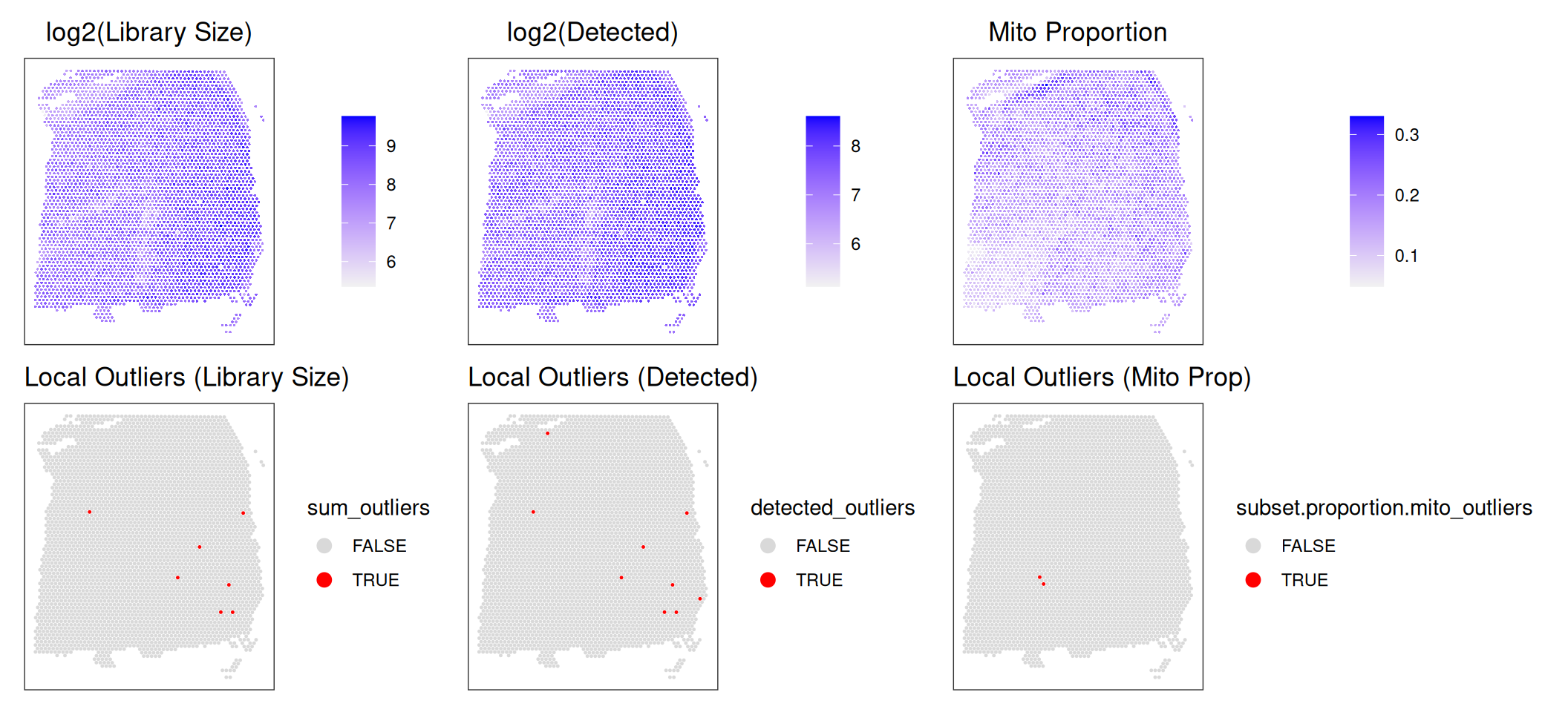
It is particularly evident in the log-transformed library size and detected genes that there are clear outliers in the bottom right corner of the tissue area. We can additionally see that these spots were successfully identified in the bottom row. This “eye test” is a good diagnostic for confirming that local outliers are being accurately detected. We can alternatively visualize the spots that were detected as outliers by visualizing the z-transformed metrics for each spot using violin plots.
Code
# z-transformed library size and outliers
p1 <- plotObsQC(spe,
    plot_type="violin", x_metric="sum_z",
    annotate="sum_outliers", point_size=0.5) +
    xlab("sum_outliers")

# z-transformed detected genes and outliers
p2 <- plotObsQC(spe,
    plot_type="violin", x_metric="detected_z",
    annotate="detected_outliers", point_size=0.5) +
    xlab("detected_outliers")

# z-transformed mito proportion and outliers
p3 <- plotObsQC(spe,
    plot_type="violin", x_metric="subset.proportion.mito_z",
    annotate="subset.proportion.mito_outliers", point_size=0.5) +
    xlab("mito_outliers")

p1 | p2 | p3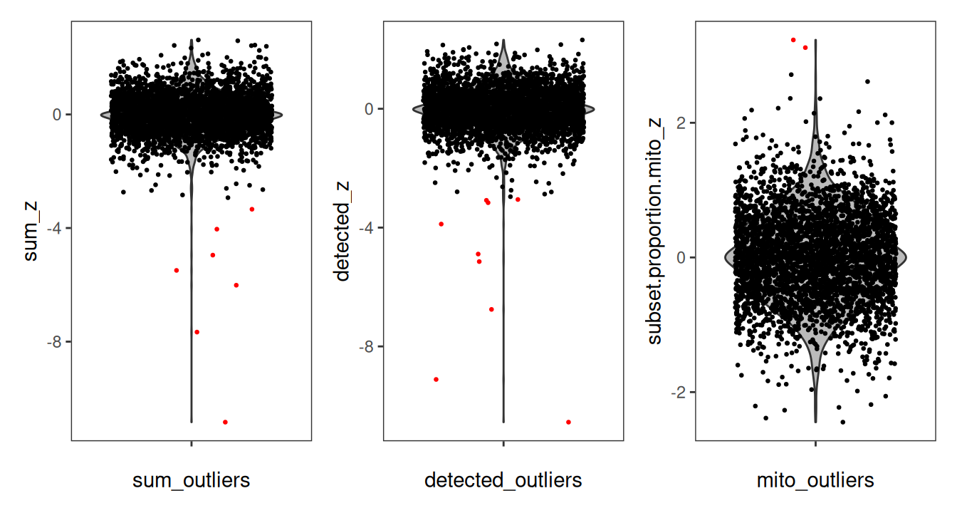
11.5 Remove low-quality spots
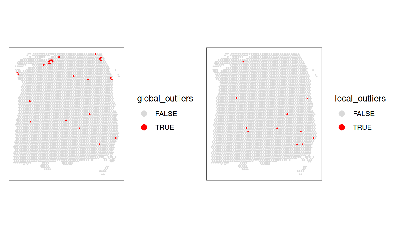
Now that we have calculated several QC metrics and selected thresholds for each one, we can combine the sets of low-quality spots, and remove them from our object.
We also check again that the combined set of discarded spots does not correspond to any obvious biologically relevant group of spots.
We also select a slightly updated global threshold for the mitochondrial proportion.
Code
# select updated threshold for mito proportion
spe$qc_mito <- spe$subset.proportion.mito > 0.28
table(spe$qc_mito)
##
## FALSE TRUE
## 3622 17Code
# combine global/local outliers
spe$global_outliers <-
    spe$qc_lib_size |
    spe$qc_detected |
    spe$qc_mito
spe$local_outliers <-
    spe$sum_outliers |
    spe$detected_outliers |
    spe$subset.proportion.mito_outliers

rbind( # tabulate kept/flagged cells
    global=table(spe$global_outliers),
    local=table(spe$local_outliers))
## FALSE TRUE
## global 3614 25
## local 3628 11Code
11.6 Advanced topics
11.6.1 Histological artifact detection
11.6.1.1 Hangnail artifact detection
When working with ST datasets, ensuring high-quality data is essential for accurate downstream analyses. One common issue researchers face is the presence of technical artifacts. Here, we will demonstrate how to detect and remove “hangnail” artifacts from Visium datasets.
Hangnail artifacts arise during tissue preparation, and most commonly occur when smaller areas, such as distinct brain regions, are dissected from larger structures like whole human brain sections Totty et al. (2025). Tissue dissection can cause mechanical damage, leading to areas with artificially low biological heterogeneity. This manifests as regions with low variance in QC metrics such as mitochondrial proportion. Such artifacts can significantly impact downstream analyses, such as spatial domain detection, if not properly identified and addressed Totty et al. (2025).
11.6.1.2 Loading data and adding QC metrics
We start by loading an example Visium dataset from the SpotSweeper package containing a known hangnail artifact, and then calculate per-spot QC metrics, such as mitochondrial proportion, as shown above.
Code
# load DLPFC artifact samples from SpotSweeper package
data(DLPFC_artifact)
spe.hangnail <- DLPFC_artifact

# identify mitochondrial genes
is_mito <- grepl("(^MT-)|(^mt-)", rowData(spe.hangnail)$gene_name)
table(is_mito)
rowData(spe.hangnail)$gene_name[is_mito]

# calculate per-spot QC metrics and store in colData
spe.hangnail <- quickRnaQc.se(spe.hangnail, subsets=list(mito=is_mito))
head(colData(spe.hangnail))
11.6.1.3 Identifying hangnail artifacts via local variance
As a note, SpotSweeper’s findArtifacts() function assumes that an artifact is present in the sample being analyzed. This means that if no artifact is present, the function will arbitrarily label half of the sample as an “artifact”. Therefore, confirming the presence of a hangnail artifact prior to artifact detection is essential.
Hangnail artifacts are best identified by plotting QC metrics for all samples, as they appear as regions with unusually smooth or low variance in mitochondrial proportion. We can observe this in the example below, as the oblong piece of tissue on the right side has an usually smooth or “smudged” appearance in the mitochondrial proportion (subset.proportion.mito) on the right, but not in the library size (sum) on the left.
Code
plotCoords(spe.hangnail, annotate="sum") |
plotCoords(spe.hangnail, annotate="subset.proportion.mito")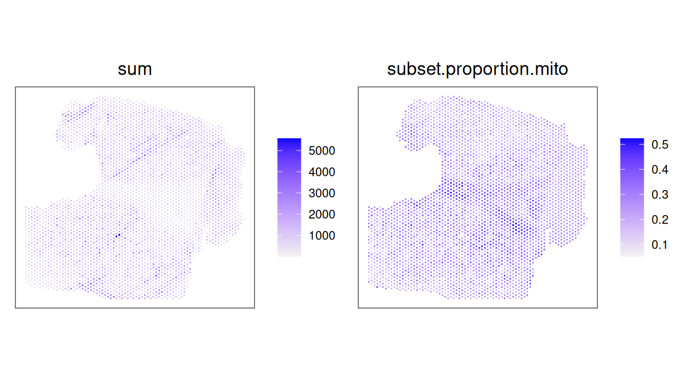
A complementary strategy to confirm that existence of an artifact prior to removal is to quantify the local variance in mitochondrial proportion. Here, we will do this using the localVariance() function in SpotSweeper, specifying the QC metric (subset.proportion.mito) and the number of neighbors to consider. The default neighbor size of n_neighbors = 36 works well in our experience.
Code
spe.hangnail <- localVariance(spe.hangnail,
    n_neighbors=36,
    metric="subset.proportion.mito",
    name="local_mito_variance_k36")

plotCoords(spe.hangnail, annotate="local_mito_variance_k36", point_size=1)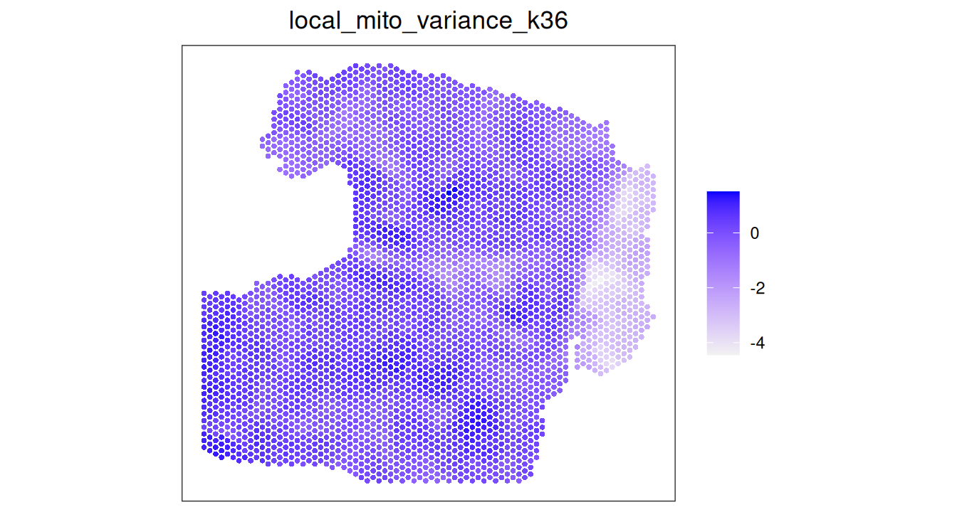
Another way to confirm the presence of a hangnail artifact is via the distribution of the local variance in mitochondrial proportion. Samples affected by hangnails often exhibit a long-tailed or bimodal distribution towards lower variance, reflecting regions with abnormal mitochondrial signal variation. We will demonstrate this here by comparing the distribution of local mitochondrial variance in this hangnail sample to the distribution in a normal sample.
Code
# get local mito ratio variance of a normal sample
spe <- localVariance(spe,
    n_neighbors=36,
    metric="subset.proportion.mito",
    name="local_mito_variance_k36")

# plot distribution of local variance in mitochondrial proportion
hangnail_sample <- data.frame(x=spe.hangnail$local_mito_variance_k36)
normal_sample <- data.frame(x=spe$local_mito_variance_k36)

p1 <- ggplot(hangnail_sample, aes(x)) + ggtitle("Hangnail Sample")
p2 <- ggplot(normal_sample, aes(x)) + ggtitle("Normal Sample")

(p1 | p2) &
    geom_density(fill="gray", alpha=0.5) &
    xlab("local mitochondrial variance")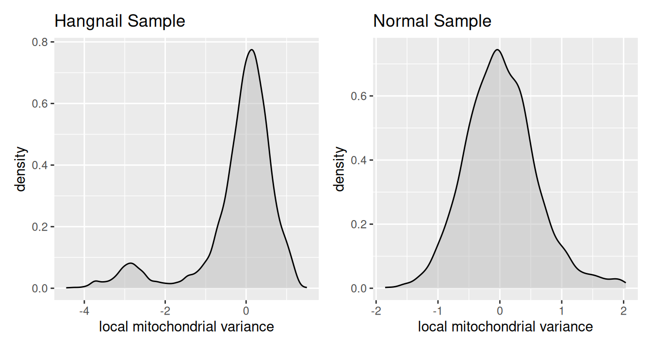
11.6.1.4 Classifying artifacts using multiscale local variance
After confirming that our sample contains a hangnail artifact with low local variance, we can move on to artifact classification using the findArtifacts() function. This function calculates the local variance (subsets_mito_ratio) at multiple scales (n_order) to accurately detect hangnail artifacts. Visium spots form hexagonal grids, so we specify shape = "hexagonal" to ensure the correct number of neighbors are used for each order. Use shape = "square" for datasets with square grid arrangements, such as STEREO-seq or Visium HD.
Code
spe.hangnail <- findArtifacts(spe.hangnail,
    mito_percent="expr_chrM_ratio",
    mito_sum="expr_chrM", n_order=7,
    shape="hexagonal", name="artifact")

plotObsQC(spe.hangnail, plot_type="spot", annotate="artifact")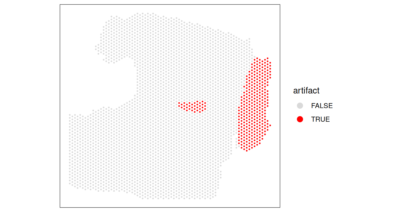
Code
# removing hangnail artifacts prior to downstream analyses
spe.hangnail <- spe.hangnail[, !spe.hangnail$artifact]
11.6.2 Assessing spot quality via cell segmentation
The number of cells per spot depends on the tissue type and organism. Here, we check for any outlier values that could indicate problems during cell segmentation.
Code
# histogram of cell counts
hist(spe$cell_count, breaks=20)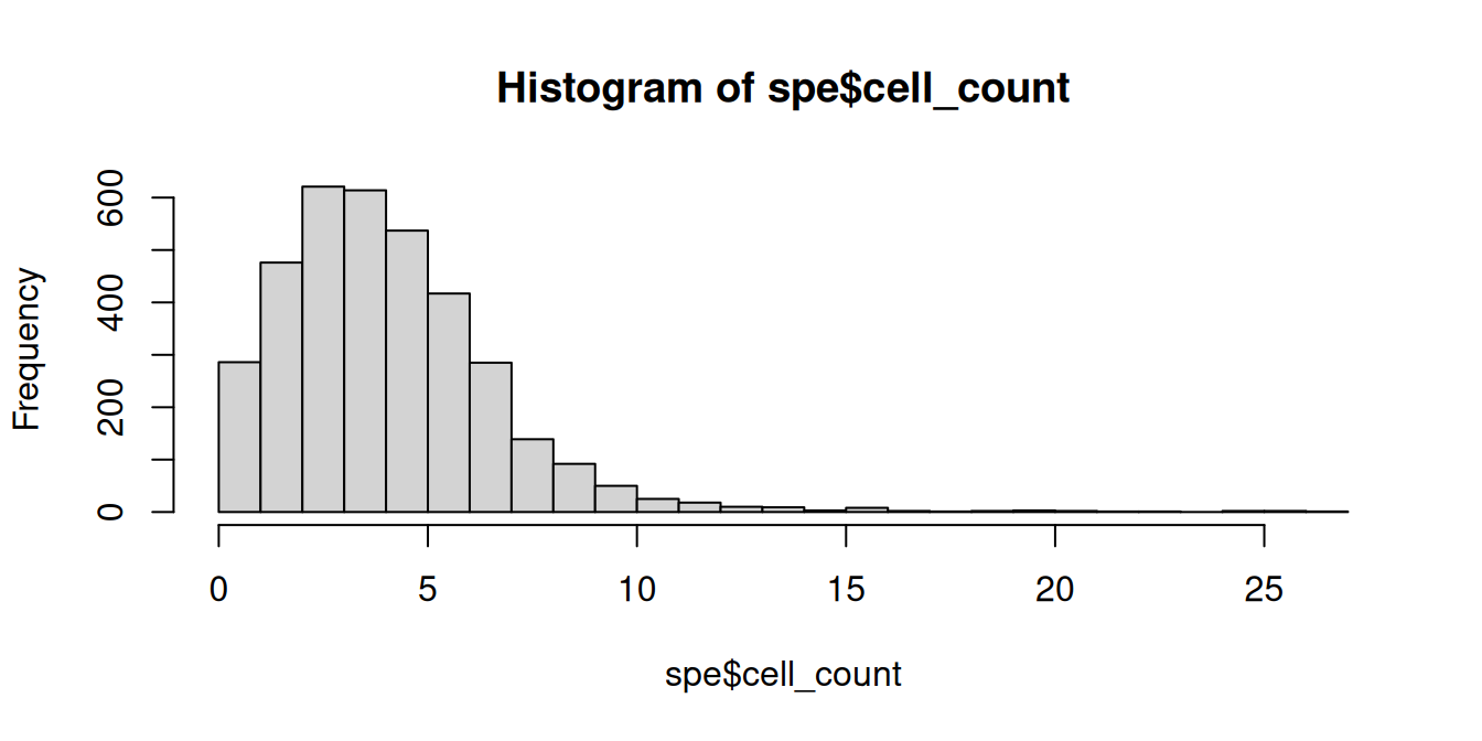
Code
# distribution of cells per spot
(tbl_cells_per_spot <- table(spe$cell_count))
##
## 0 1 2 3 4 5 6 7 8 9 10 11 12 13 14 15 16 17 18
## 79 207 476 621 614 537 417 285 139 92 50 25 18 10 9 3 8 2 1
## 19 20 21 22 23 25 26 27
## 2 3 2 1 1 2 2 1We see a tail of very high values, which could indicate problems for these spots. These values are also visible on the scatterplots. Here, we again plot the number of expressed genes vs. cell counts, with an added trend.
Code
# plot number of expressed genes vs. number of cells per spot
plotObsQC(spe,
    plot_type="scatter", x_threshold=10,
    x_metric="cell_count", y_metric="detected")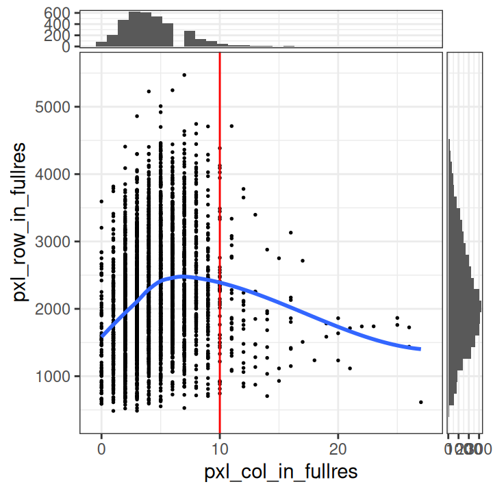
In particular, we see that the spots with very high cell counts also have low numbers of expressed genes. This indicates that the experiments may have failed for these spots, and they should be removed.
We select a threshold of 10 cells per spot. The number of spots above this threshold is relatively small, and there is a clear downward trend in the number of expressed genes above this threshold.
Code
# select QC threshold for number of cells per spot
spe$qc_cell_count <- spe$cell_count > 10
table(spe$qc_cell_count)
##
## FALSE TRUE
## 3517 90Code
# check spatial pattern of discarded spots
plotObsQC(spe, plot_type="spot", annotate="qc_cell_count")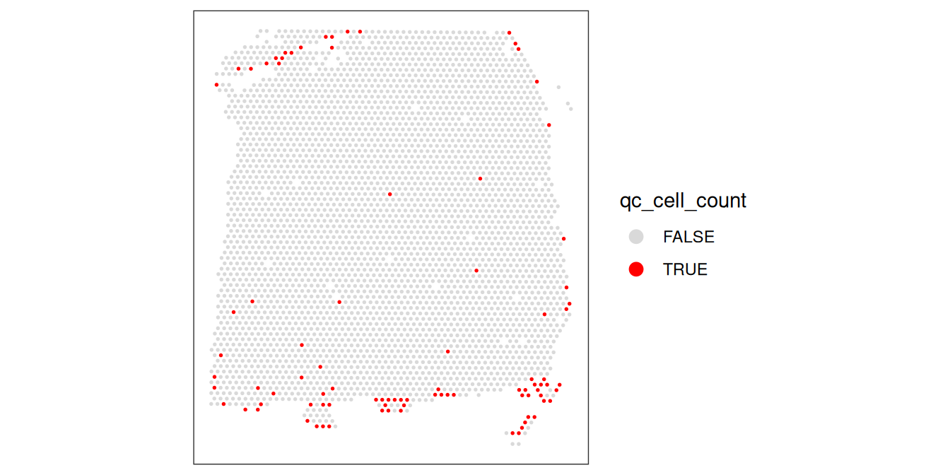
While there is a spatial pattern to the discarded spots, it does not appear to be correlated with the known biological features (cortical layers). The discarded spots are all on the edges of the tissue. It seems plausible that there may have been experimental issues and/or issues with computational cell segmentation at the edges of the images, so it makes sense to remove these spots.
11.6.3 Zero-cell and single-cell spots
A particular characteristic of Visium data is that spots can contain zero, one, or multiple cells.
We could also imagine other filtering procedures such as (i) removing spots with zero cells, or (ii) restricting the analysis to spots containing a single cell (which would make the data more similar to scRNA-seq).
However, this would discard a large amount of biological information. Below, we show the distribution of cells per spot again (up to a filtering threshold of 12 cells per spot).
Code
# distribution of cells per spot
(ns <- tbl_cells_per_spot)[seq(12)]
##
## 0 1 2 3 4 5 6 7 8 9 10 11
## 79 207 476 621 614 537 417 285 139 92 50 25##
## 0 1 2 3 4 5 6 7 8 9 10 11
## 2.19 5.74 13.20 17.22 17.02 14.89 11.56 7.90 3.85 2.55 1.39 0.69Only 6% of spots contain a single cell. If we restricted the analysis to these spots only, we would be discarding most of the data.
Removing the spots containing zero cells (2% of spots) would also be problematic, since these spots can also contain biologically meaningful information. For example, in this brain dataset, the regions between cell bodies consists of neuropil (dense networks of axons and dendrites). In Maynard et al. (2021), the authors explored the transcriptomic profile of these neuropil spots.
11.7 Appendix
Save data
Save data object for re-use within later chapters.