20 Quality control
20.1 Preamble
20.1.1 Introduction
The analyses demonstrated here will use 313-plex Xenium data (10x Genomics) of a human breast cancer biopsy section (Janesick et al. 2023), and 1k-plex CosMx data (Bruker) of a mouse brain section. These datasets can be accessed through Bioconductor’s ExperimentHub packages: STexampleData and OSTA.data.
The CosMx dataset includes additional information, such as fluorescent stains, cell boundaries, field of view placement, etc. that allow us to demonstrate more intricate quality control metrics using the SpaceTrooper package.
Throughout this chapter, we will switch between both Xenium (xen object) and CosMx (cos object) datasets to showcase quality control (QC) metrics that are standard for scRNA-seq data (using scuttle), and ones that are more specific to some imaging-based ST data types (using SpaceTrooper (Banzi et al. 2025)). Lastly, we will save the post-QC Xenium dataset for use in later chapters.
20.1.2 Dependencies
20.2 Importing data
SpatialExperimentIO provides functions to import CosMx (Bruker), Xenium (10x Genomics), and MERSCOPE (Vizgen) datasets into SingleCell/SpatialExperiment objects, starting from the outputs provided by the three providers. 10x Genomics-specific readers are provided by TENxIO, VisiumIO, and XeniumIO; data from most commercial platforms can also be read using SpatialFeatureExperiment functions.
See Chapter 6 for details on data importing and representation.
20.2.1 From Xenium
We load the Xenium dataset from STexampleData:
Code
(xen <- Janesick_breastCancer_Xenium_rep1())
# required for visuals
xen$in_tissue <- TRUE
xen$sample_id <- "Xenium"
##
## class: SpatialExperiment
## dim: 313 167780
## metadata(0):
## assays(1): counts
## rownames(313): ABCC11 ACTA2 ... ZEB2 ZNF562
## rowData names(3): ID Symbol Type
## colnames(167780): 1 2 ... 167779 167780
## colData names(8): cell_id transcript_counts ... nucleus_area
## sample_id
## reducedDimNames(0):
## mainExpName: NULL
## altExpNames(0):
## spatialCoords names(2) : x_centroid y_centroid
## imgData names(0):20.2.2 From CosMx
To load the CosMx data into a SpatialExperiment object, we use SpatialExperimentIO’s readCosmxSXE function. To not confuse RNA target counts with counts stemming from either negative probes and system controls, the latter are moved into altExps by default. We also add additional colData and metadata slots that are expected by ggspavis (for visualization) and SpaceTrooper (for analysis). In particular, SpaceTrooper’s updateCosmxSPE function takes care of standardizing the object’s colData for use with SpaceTrooper’s functions.
See Chapter 18 for details on the three main types of barcodes: RNA targets, negative probes, and system controls.
Code
# retrieve CosMx dataset from OSF repo
id <- "CosMx1k_MouseBrain2"
pa <- OSTA.data_load(id, mol=FALSE)
dir.create(td <- tempfile())
unzip(pa, exdir=td)
cos <- readCosmxSXE(td, addTx=FALSE)

# prepare data for 'SpaceTrooper'
cos <- updateCosmxSPE(cos, td, sampleName="CosMx")
cos <- readAndAddPolygonsToSPE(cos)
cos$in_tissue <- TRUE
cos
## class: SpatialExperiment
## dim: 950 48556
## metadata(4): fov_positions fov_dim polygons technology
## assays(1): counts
## rownames(950): Chrna4 Slc6a1 ... Cck Aqp4
## rowData names(0):
## colnames(48556): f1_c1 f1_c10 ... f99_c98 f99_c99
## colData names(22): fov cellID ... polygons in_tissue
## reducedDimNames(0):
## mainExpName: NULL
## altExpNames(1): NegPrb
## spatialCoords names(2) : CenterX_global_px CenterY_global_px
## imgData names(1): sample_id20.3 Visualization
Imaging-based ST data relies on imaging a 2D tissue section. Hence, an advantage compared to scRNA-seq is that we can readily visualize a 2D map of the cells and directly plot cell features onto the map. The easiest way to visualize the data is by representing the cells as centroids. This is useful to have a global bird’s-eye-view of the tissue.
Code
# spatial plots for datasets acquired through
# Xenium & CosMx (points = cell centroids)
plotCoords(xen, point_size=0, y_reverse = FALSE) + ggtitle(xen$sample_id) +
plotCoords(cos, point_size=0, y_reverse = FALSE) + ggtitle(cos$sample_id)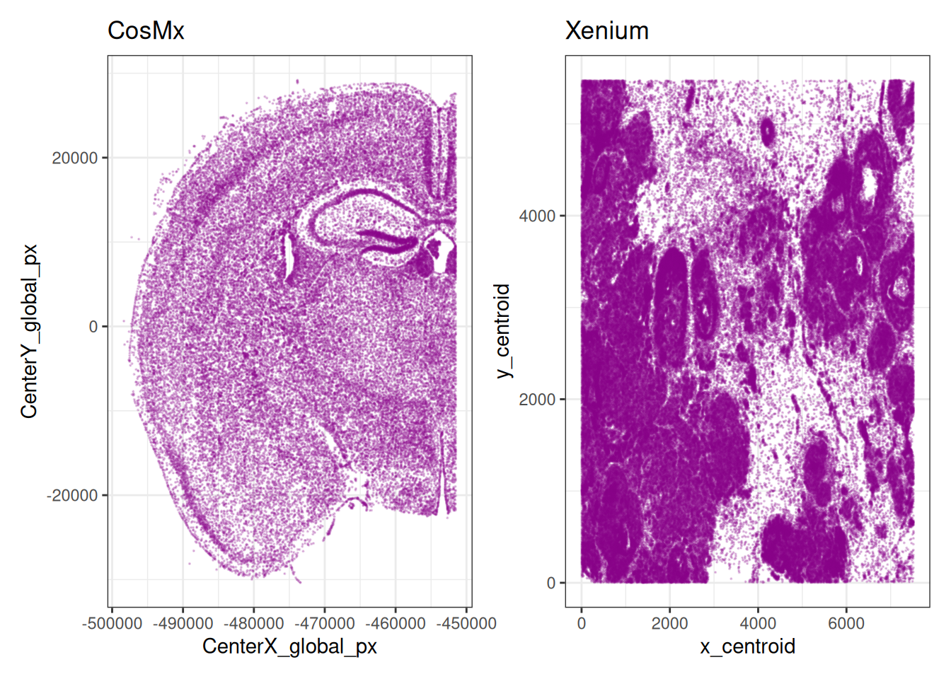
20.4 General QC metrics
Similarly to scRNA-seq, quality control (QC) is an important step to remove low-quality cells and highlights specific biases in the data at the sample, field of view (FOV), or slide area level. Unlike scRNA-seq and sequencing-based ST, however, most imaging-based ST platforms do not measure the transcriptome, nor an “unbiased” sample of it, but rely on the design of gene panels.
Depending on the platform and the application, such gene panels may be pan-tissue or targeting specific tissues or cell types. Moreover, they vary from a few hundred (e.g., 313 in the first Xenium panel) to several thousands (e.g., the 5k Xenium panel or the 6k and 18k CosMx panels). Hence, unlike in sequencing-based platforms, we may not have enough ribosomal or mitochondrial transcripts to use for computing QC metrics. However, imaging-based platforms provide a set of negative probes that can be used to check for nonspecific RNA captures.
Finally, imaging-based platforms include, in addition to transcript data, morphology information (such as area and eccentricity of segmented cells) and information from antibody stains (such as those targeting cell nuclei or surface; see above).
20.4.1 scRNA-seq
We start out by computing QC metrics that are standard for scRNA-seq data, using the scrapper package. Although not available for these data, the altexp.proportions argument could be used to quantify metrics across alternative experiments, such as negative probes or blank codes, in addition to RNA targets, which represent the object’s primary data.
See also Chapter 11.
Code
# compute standard QC metrics for Xenium
# (i.e., total counts & unique features)
xen <- quickRnaQc.se(xen, subsets=list())
20.4.2 IF staining
CosMx outputs, for instance, typically include the min/max/mean intensities of a set of immunofluorescence (IF) markers for, e.g., nuclei and cell surface (used for segmentation), as well as additional markers (experiment-dependent). Here, we show the distribution of mean IF intensities across the CosMx sample.
Code
flu <- grepv("^Mean", names(colData(cos)))
lapply(flu, \(.) {
    cos[[.]] <- asinh(cos[[.]]/10)
    plotCoords(cos, annotate=., point_size=0, y_reverse = FALSE)
}) |>
    wrap_plots(nrow=1) &
    theme(
        legend.position="bottom",
        legend.key.height=unit(0.4, "lines")) &
    scale_color_gradientn(colors=pals::jet())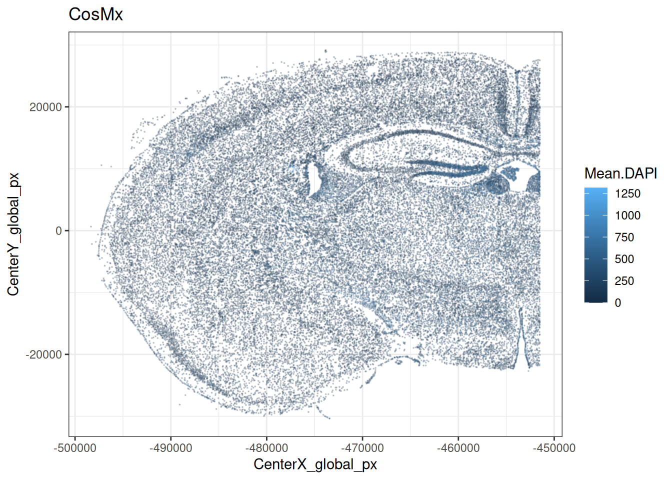
20.4.3 Morphology
SpaceTrooper’s spatialPerCellQC function can be used to compute a set of metrics that are particular to imaging-based ST data; examples listed below. In addition, the function incorporates an internal call to quickRnaQc.se from the scrapper package to compute some standard scRNA-seq QC metrics on an altExp; here, we specify using negative probes.
Note that metrics also include each cell’s distance from horizontal/vertical and nearest FOV borders: dist_border_x/y and dist_border, respectively; we will get back to this in Section 20.5.
Code
# compute 'SpaceTrooper' QC metrics
cos <- spatialPerCellQC(cos, use_altexps="NegPrb")
# the following cell metadata are newly available:
## [1] "sum" "detected"
## [3] "altexps_NegPrb_sum" "altexps_NegPrb_detected"
## [5] "altexps_NegPrb_percent" "total"
## [7] "control_sum" "control_detected"
## [9] "target_sum" "target_detected"
## [11] "CenterX_global_px" "CenterY_global_px"
## [13] "ctrl_total_ratio" "log2Ctrl_total_ratio"
## [15] "CenterX_global_um" "CenterY_global_um"
## [17] "Area_um" "dist_border_x"
## [19] "dist_border_y" "dist_border"
## [21] "log2AspectRatio" "SignalDensity"
## [23] "log2SignalDensity"In particular, the following metrics have been added to the colData:
-
Area_um: area in microns -
SignalDensity: count density = number of transcripts per area -
log2AspectRatio: log2 of the aspect ratio (x-/y-axis) of each cell -
ctrl_total_ratio: proportion of negative probe counts over total counts
20.4.4 Counts & area
Imaging-based ST data relies on imaging a 2D tissue section. Cells thus represent a slice through a 3D system, and we expect a tight relationship between a cell’s counts and its area. When we inspect total counts and cell areas as separate (univariate) distributions, both appear approximately log-normal distributed.
Note that there are many more counts for the CosMx data, mostly because there are 950 features but only 313 for Xenium.
Code
.p <- \(df, xs) {
    fd <- pivot_longer(df, all_of(xs))
    mu <- summarise_at(group_by(fd, name), "value", median)
    ggplot(fd, aes(value)) + facet_grid(~ name) +
        geom_histogram(bins=50, linewidth=0.1, fill="gray") +
        geom_vline(data=mu, aes(xintercept=value), col="blue") +
        geom_text(
            hjust=-0.1, size=3, col="blue",
            data=mu, aes(value, 0, label=round(value))) +
        scale_x_continuous(NULL, trans="log10") + ylab("# cells") +
        theme_minimal() + theme(panel.grid.minor=element_blank())
}
df_cos <- data.frame(colData(cos), spatialCoords(cos))
df_xen <- data.frame(colData(xen), spatialCoords(xen))
p2 <- .p(df_cos, c("Area_um", "total"))
p1 <- .p(df_xen, c("cell_area", "total_counts"))
p1 + ggtitle("CosMx") | p2 + ggtitle("Xenium")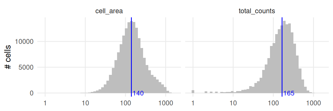
Similarly, we can visualize the distribution of these metrics in the tissue by plotting cell centroids colored by total counts and cell area, respectively.
Code
lapply(c("cell_area", "total_counts"), \(.) {
    # crop very low/high values for clearer visualization
    val <- xen[[.]]
    qs <- quantile(val, c(0.01, 0.99))
    val <- ifelse(val < qs[1], qs[1], ifelse(val > qs[2], qs[2], val))
    xen[[.]] <- val
    plotCoords(xen, annotate=., point_size=0, y_reverse = FALSE) +
        theme(legend.key.width=unit(0.5, "lines")) +
        scale_color_gradientn(colors=unname(pals::jet()), trans="log10")
}) |> wrap_plots(nrow=1)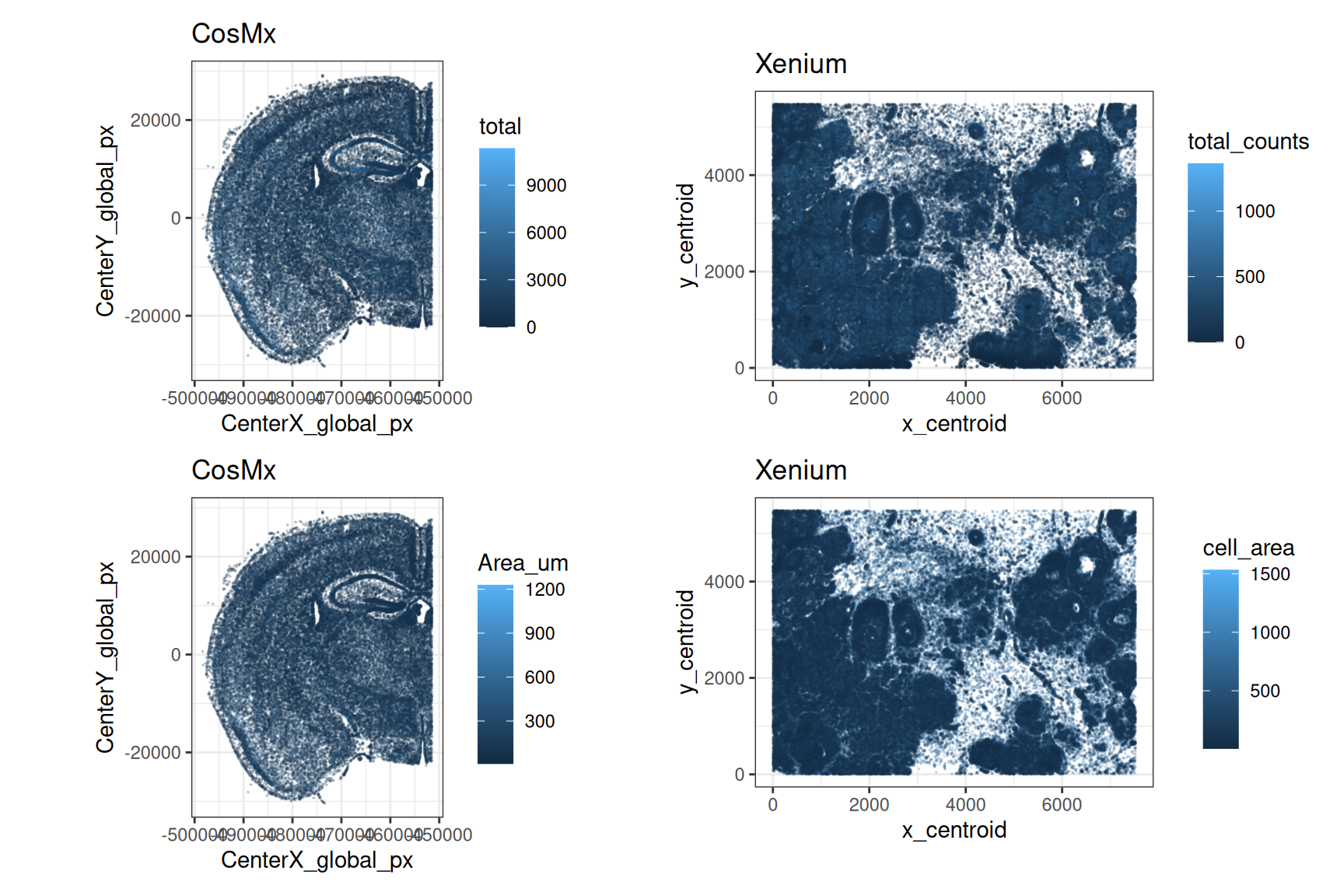
In a bivariate setting, we observe a positive relationship between counts and area (as expected). However, this dependency is not always linear and may exhibit a bimodal distribution.
Code
.p <- \(df, x, y) {
    ggplot(df, aes(.data[[x]], .data[[y]])) +
        geom_point(shape=16, size=0, alpha=0.1) +
        geom_smooth(method="lm", col="blue") +
        scale_x_log10() + scale_y_log10() +
        theme_minimal() + theme(
            aspect.ratio=1,
            panel.grid.minor=element_blank())
}
.p(df_cos, "Area_um", "total") + ggtitle("CosMx") +
.p(df_xen, "cell_area", "total_counts") + ggtitle("Xenium")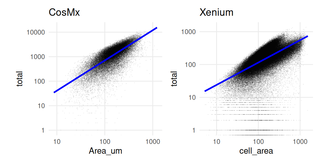
In some cases, a peculiar count-area distribution might be indicative of segmentation problems. Undersegmentation (i.e., when groups of cells are merged together) might lead to fewer counts than expected for a given area (e.g., when they are far apart and empty space is being segmented).
log2SignalDensity, which estimates the transcript density for each cell.20.5 CosMx-specific QC
20.5.1 Fields of view (FOVs)
Imaging-based ST data from CosMx are acquired through iterative imaging of predefined rectangular regions, so-called fields of view (FOV).
Unlike Xenium and MERSCOPE, standard CosMx pipelines do not stitch FOVs, but rather treat each FOV independently. The colData of the SpatialExperiment object resulting from a CosMx data import will include the FOV of each cell, but it is sometimes tricky to understand (or remember) the relative position of each FOV within the slide.
SpaceTrooper’s plotZoomFovsMap function provides an easy way to map FOVs within the slide, allowing to zoom in on a subset of FOVs, while visualizing the global structure of the tissue.
Code
plotZoomFovsMap(cos,
    mapPointCol="green",
    colourBy="Mean.DAPI",
    fovs=c(98:100, 113:115, 122:124))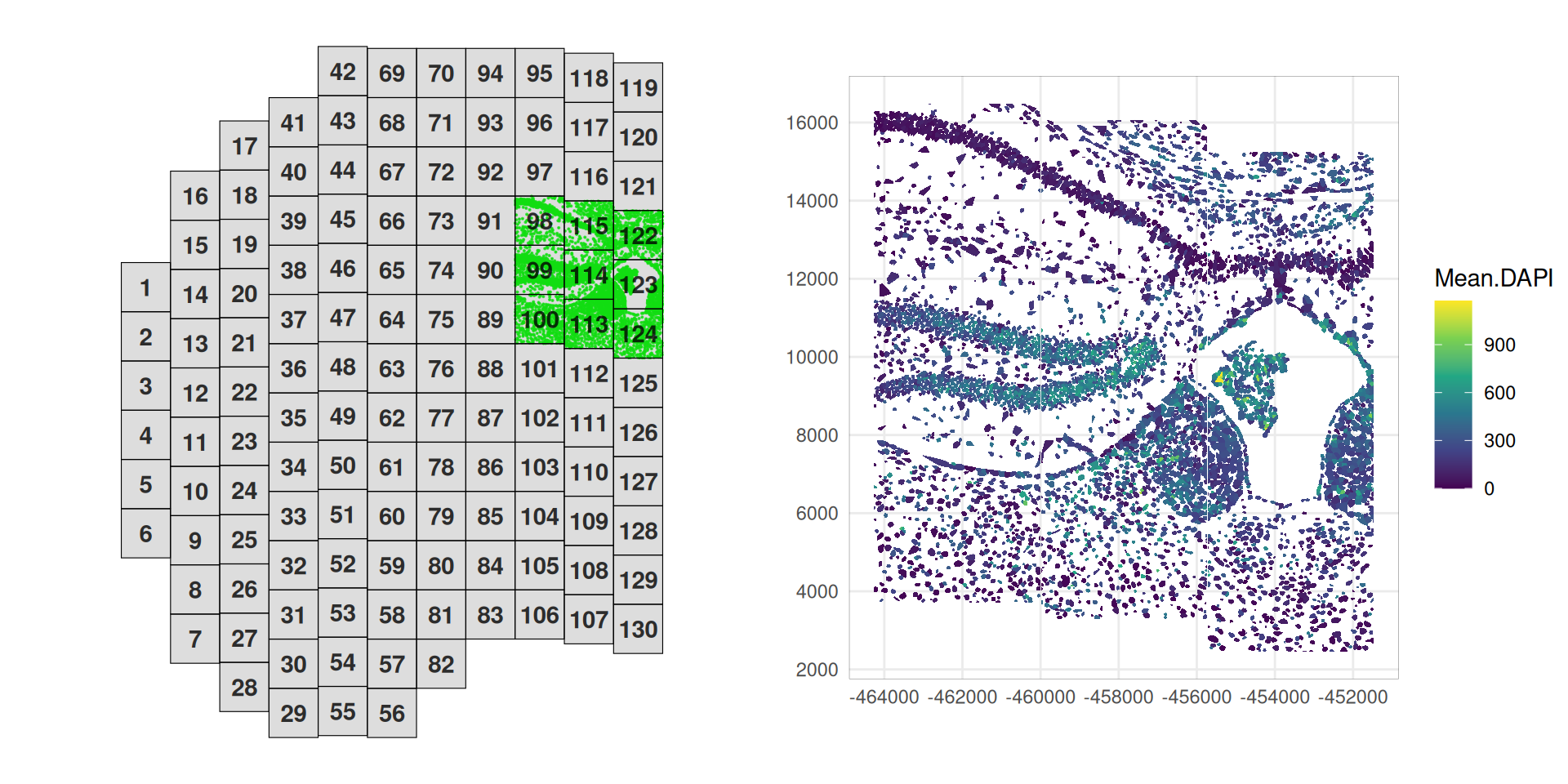
Assuming FOV placement aims to capture biologically interesting regions – regions of interest (ROIs) – we would expect every FOV to capture a decent number of cells. Issues in image registration or IF staining, however, may affect spot calling and cell segmentation, and can yield FOVs with virtually no cells. We thus advice inspecting the number of cells across FOVs:
Code
ns <- as.data.frame(
    table(fov=cos$fov),
    responseName="n_cells")
ggplot(ns, aes(fov, n_cells)) +
    scale_x_discrete(breaks=c(1, seq(5, max(cos$fov), 5))) +
    scale_y_continuous(limits=c(0, 1e3), n.breaks=4) +
    labs(x="field of view (FOV)", y="# cells") +
    geom_col(fill="grey", alpha=2/3) +
    coord_cartesian(expand=FALSE) +
    theme_bw()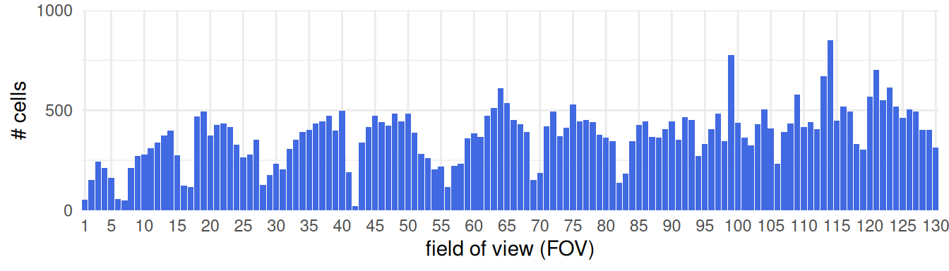
It is generally also worth checking that basic QC metrics do not vary across FOVs. Of course, such effects will also be driven by differences in subpopulation composition across FOVs. However, gross differences in detection efficacy, IF staining, spot calling, segmentation, etc. often still manifest in FOV-level shifts in IF stains and/or RNA target, negative probe, system control counts. A simple spot-check is the following type of visualization, but more thorough investigation is advisable ‘in the wild’, especially so in challenging types of tissue:
Code
df <- data.frame(colData(cos))
ys <- c("detected", "total", "Area_um", "log2SignalDensity")
ys <- c(grepv("Mean", names(df)), ys)
fd <- pivot_longer(df, ys) |>
    mutate(value=case_when(
        grepl("Mean", name) ~ asinh(value),
        grepl("total", name) ~ log10(value),
        grepl("^Area", name) ~ log10(value),
        TRUE ~ value), fov=factor(fov))
ggplot(fd, aes(fov, value, fill=fov)) +
    facet_wrap(~name, nrow=3, scales="free_y") +
    geom_boxplot(linewidth=0.2, outlier.size=0.2) +
    scale_x_discrete(breaks=c(1, seq(10, max(cos$fov), 10))) +
    theme_minimal() + theme(legend.position="none") +
    labs(x="field of view (FOV)", y=NULL)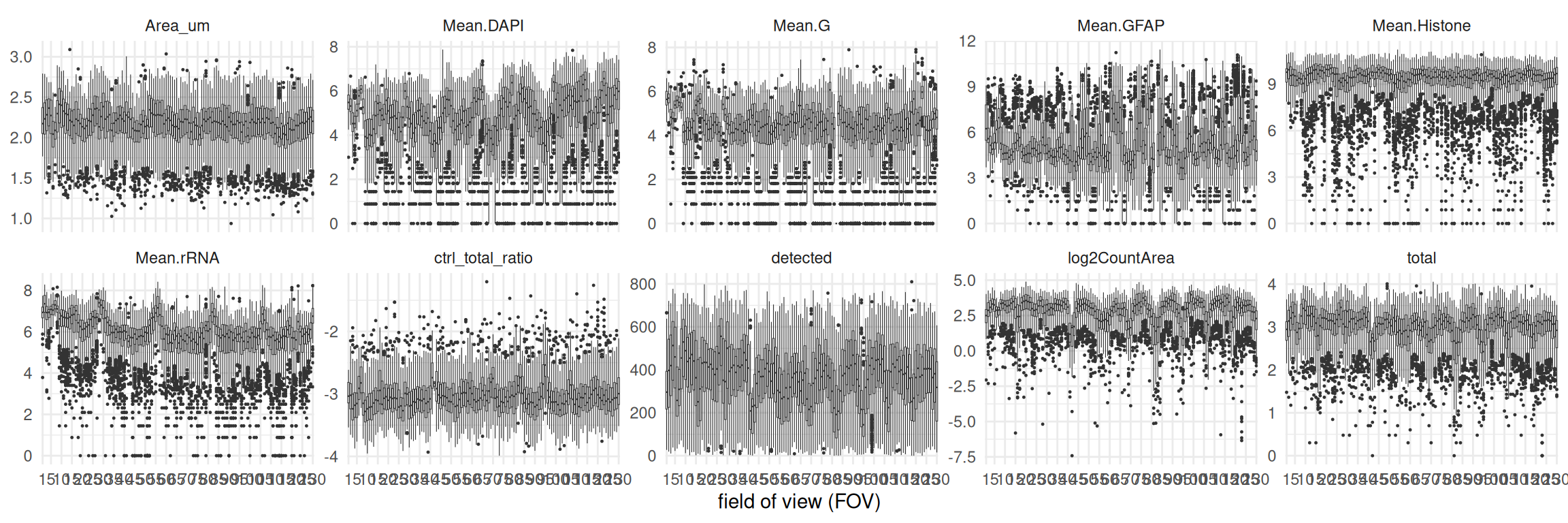
In our example, DAPI stains, RNA target counts (total), and the number of uniquely detected RNA targets (detected) are fairly constant across FOVs; systematic differences seem to reflect morphological differences across FOVs. Taken together, we cannot deem any FOVs as being obviously problematic here.
20.5.2 Border effects
Particularly in CosMx, lack of FOV stitching during cell segmentation can result in fractured and possibly duplicated cells. To investigate potential artifacts related to this, we can use the distance to FOV borders calculated previously.
We can roughly estimate cell radii as \(A=\pi r^2\) \(\leftrightarrow r=\sqrt{A/\pi}\), and use this as a threshold on FOV border distances; i.e., we flag a cell when its centroid is closer to any border than the radius of an average circular cell.
Now, let us visualize total RNA counts against distance to FOV borders, setting the above estimate for radius r as a threshold on the latter; we also include rolling means to better highlight global trends:
Code
df <- data.frame(colData(cos))
.p <- \(df, x, y) {
    ggplot(df, aes(.data[[x]], .data[[y]])) +
        geom_point(color="grey", size=0) +
        geom_smooth() + theme_minimal() +
        geom_vline(xintercept=r, col="red") +
        geom_vline(xintercept=50, linetype=2)
}
p1 <- .p(df, "dist_border", "total") + xlim(0, 500) + ylim(0, 2000)
p2 <- .p(df, "dist_border", "Area_um") + xlim(0, 500) + ylim(0, 200)
p3 <- .p(df, "dist_border_x", "log2AspectRatio") + xlim(0, 500)
p4 <- .p(df, "dist_border_y", "log2AspectRatio") + xlim(0, 500)
(p1 + p2) / (p3 + p4) 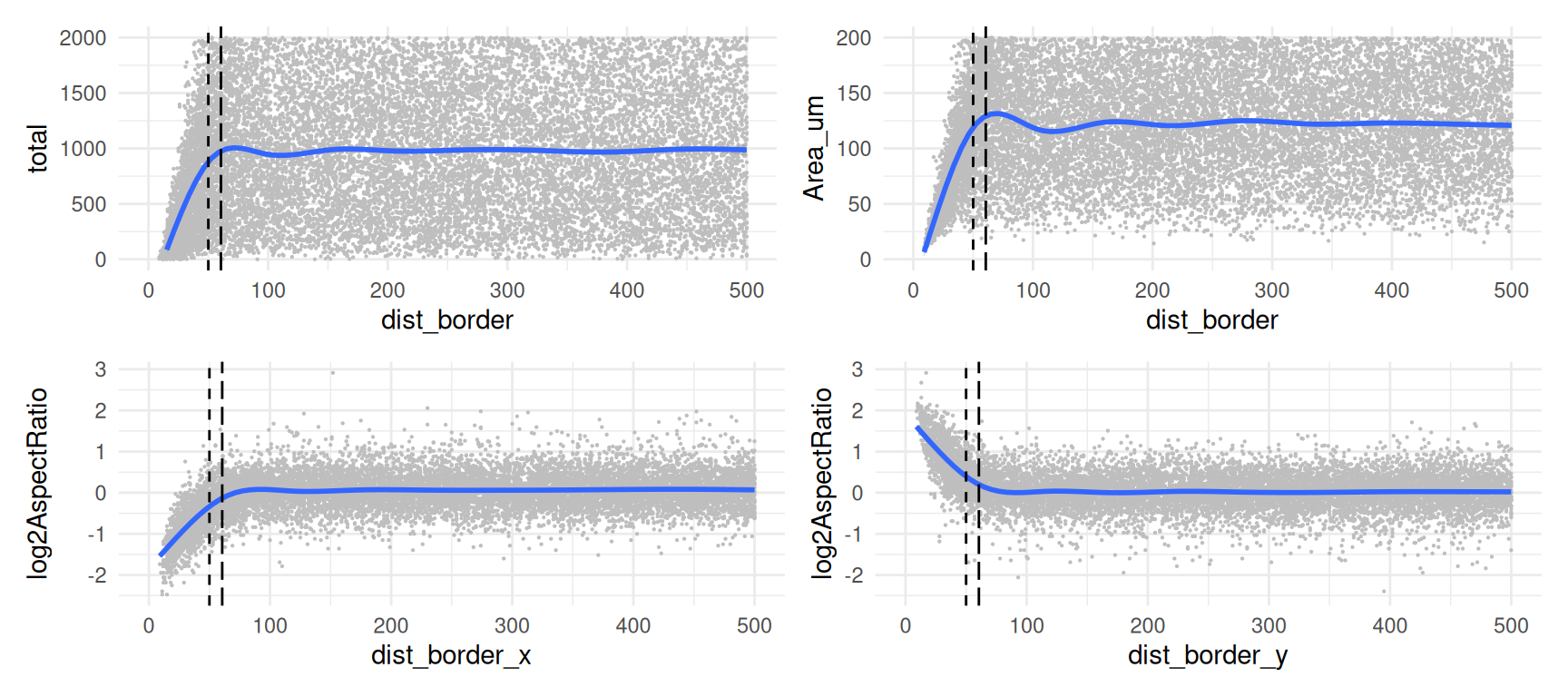
As expected, we observe a decline in counts near FOV borders, with about 6.6% of cells falling below \(r\) (red line) and 5.1% of cells falling below 50 pixels (dashed line).
These cells exhibit lower total counts and smaller segmented areas, as well as a distortion in their aspect ratio (thin cells close to the y border and broad cells close to the x border).
To mitigate potential artifacts in downstream analyses, we may choose to filter out these cells, or otherwise flag them as potentially problematic events to be kept a cautionary eye on.
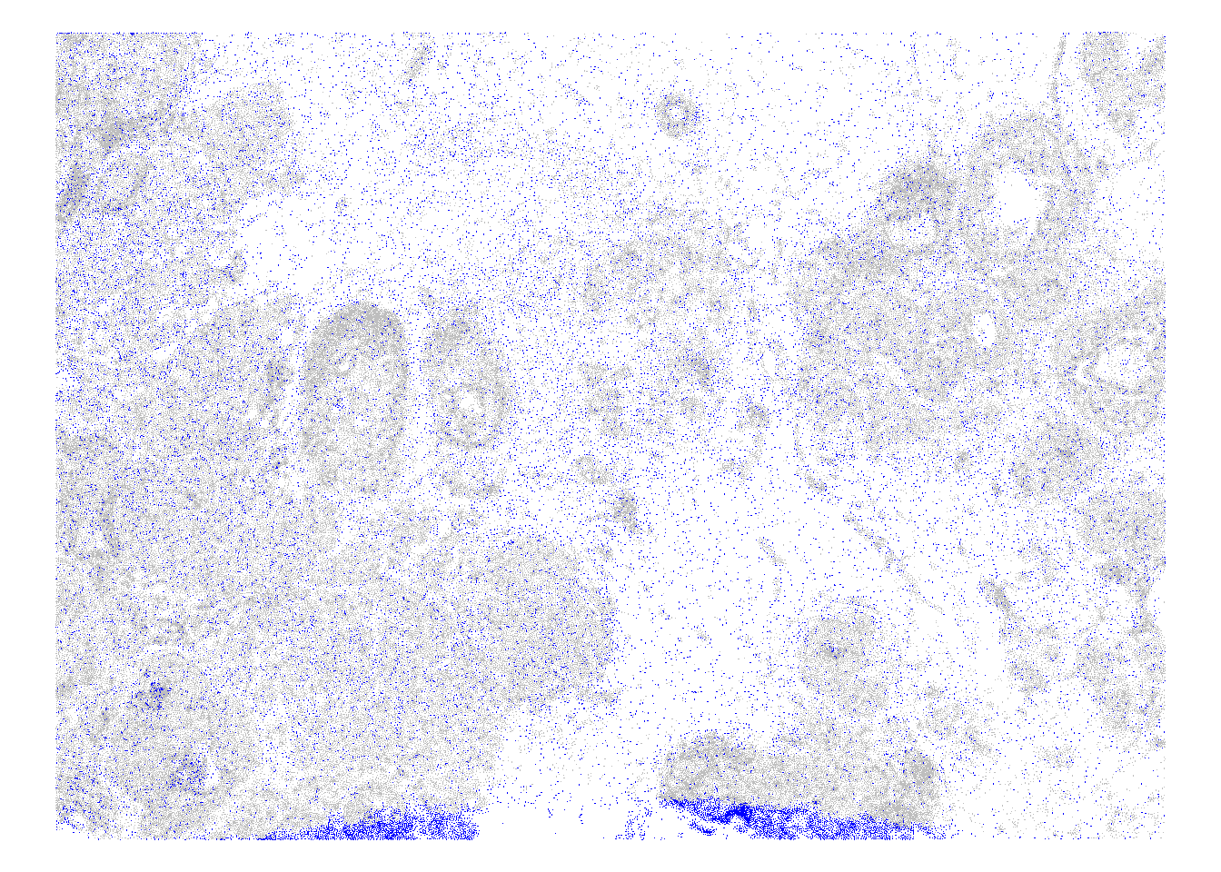
Code
# highlight border cells across
# the tissue (using cell centroids)
cos$ex <- df$dist_border < r
plotCentroids(cos, colourBy="ex", sampleId=NULL) +
    scale_color_manual(values=c("lavender", "blue")) +
    guides(col=guide_legend(override.aes=list(size=2))) +
    theme_void() + theme(legend.key.size=unit(0, "pt"))
# zoom in on subset of FOVs
# visualizing cell boundaries
fs <- c(98:100, 113:115, 122:124)
plotPolygons(
    cos[, cos$fov %in% fs],
    colourBy="ex", sampleId=NULL,
    borderCol="black", palette=c("lavender", "blue")) +
    theme(legend.position="none")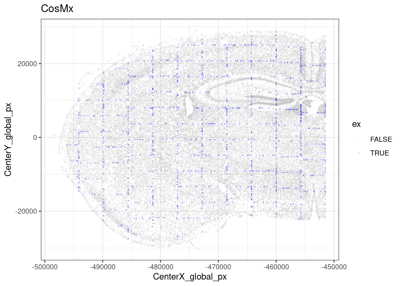

20.6 Identifying low-quality cells
We can now use the QC metrics calculated above to flag (and potentially remove) low-quality cells.
20.6.1 Individual metrics
First, we can consider metrics separately looking for outliers in their distribution. Depending on the metric, we are interested in low-end or high-end outliers (or both). For instance, we may want to exclude too small/large cells as potential artifacts.
SpaceTrooper provides a function to compute outliers of the distribution of any QC metric present in the colData of the object. We can then visualize the distribution and outlier threshold with a histogram.
Note that thresholds could also be obtained using scuttle’s isOutlier function on the corresponding metric(s); see Section 20.7.
Code
cos <- computeSpatialOutlier(cos, computeBy="total", method="mc")
cos <- computeSpatialOutlier(cos, computeBy="Area_um", method="mc")
plotMetricHist(cos, metric="total", useFences="total_outlier_mc") +
plotMetricHist(cos, metric="Area_um", useFences="Area_um_outlier_mc")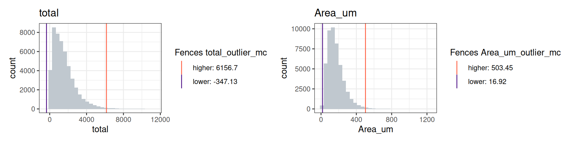
In the CosMx data, we identify 332 outliers for total counts and 339 outliers for area.
20.6.2 Combined score
Finally, we can compute an aggregated quality score, which combines a cell’s transcript density, aspect ratio and (for CosMx) distance from FOV borders.
Specifically, SpaceTrooper’s computeQCScore function will compute a combined quality score based on count density (log2SignalDensity), cell aspect ratio (log2AspectRatio), only for cells closer than a specified distance from FOV borders, and control-to-total count ratio (log2Ctrl_total_ratio). The count density is computed as the ratio between the per cell total gene counts divided by the cell area; the aspect ratio represents FOV border effect typical of CosMx datasets; the control-to-total ratio is the ratio between counts for control probes and total counts per cell and represents nonspecific signal.
The quality score is computed using a ridge logistic regression model, which predicts a score between 0 and 1, where higher scores indicate better quality cells, using the following model formula: ~(log2SignalDensity + Area_um + log2Ctrl_total_ratio + I(abs(log2AspectRatio) * as.numeric(dist_border<50)))^2, where the ^2 notation indicates all pairwise interactions among the included variables. See ?computeQCScore for details.
Here, computeQCScore() will add a (numeric) QC_score, and computeQCScoreFlags will add a (logical) low_qcscore slot to the input SPE’s colData; the latter flags low-quality cells.
Code
# compute quality scores & flag cells that
# fall below specified percentile threshold
cos <- computeQCScore(cos)
cos <- computeQCScoreFlags(cos,
    qsThreshold=0.5)

# the following slots have now been
# added to the object's cell metadata
nms <- names(colData(cos))
sco <- grepv("score$", nms)
head(colData(cos)[sco])
## DataFrame with 6 rows and 2 columns
## QC_score low_qcscore
## <numeric> <logical>
## f1_c1 0.101339 TRUE
## f1_c10 0.930193 FALSE
## f1_c11 0.716814 FALSE
## f1_c12 0.786023 FALSE
## f1_c13 0.862402 FALSE
## f1_c14 0.468452 TRUECode
# visualize quality scores & highlight flagged cells
thm <- list(theme_void(), ggtitle(""), coord_equal())
plotCentroids(cos, colourBy="QC_score") + thm +
plotCentroids(cos, colourBy="low_qcscore") + thm +
    guides(col=guide_legend(override.aes=list(size=2))) +
    scale_color_manual(values=c("lavender", "blue")) +
theme(legend.key.size=unit(0, "pt")) 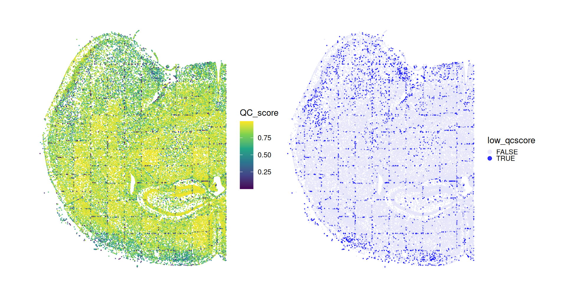
We can see how the QC score flags several cells close to the tissue border as well as cells close to the FOVs borders.
20.7 Filtering
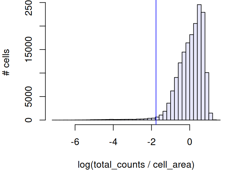
For the Xenium dataset, we will employ rather stringent filtering criteria to:
- exclude cells with too few counts per area (thresholding on MADs)
- exclude cells with any negative probe or system control counts
Code
##      lower
##  0.1714161
Code
Code
# fraction of low-quality Xenium cells
mean(ex <- ol |
    xen$control_probe_counts > 0 |
    xen$control_codeword_counts > 0)
## [1] 0.1639766For the CosMx dataset, we might filter based on SpaceTroopers quality score, which would exclude about 7% of cells.
Code
# fraction of low-quality CosMx cells
mean(cos$low_qcscore)
## [1] 0.0726894520.8 Conclusion
In a stringent analysis, we may want to remove low-quality cells, but this has to be done with caution: before excluding any cells, it is recommendable to inspect where these fall in the tissue. We would expect low-quality cells to be distributed randomly, and otherwise to accumulate at the tissue or FOV borders or in regions were tissue was, for example, smudged, detached, necrotic etc.
In general, spatially organized clusters of excluded cells might indicate a bias towards excluding specific types of cells (e.g., some immune cells tend to be smaller or might otherwise contain fewer transcripts due to the panel design). Whenever possible, we advice readers to cross-check visualizations like the following with a corresponding H&E stain of the tissue, considering possible experimental faults as well as their prior knowledge on tissue pathology.
20.9 Appendix
Save data
Code
# save post-QC Xenium data
# for consecutive chapters
saveRDS(xen[, !ex], "img-spe_qc.rds")