10 Processing
10.1 Preamble
10.1.1 Introduction
This chapter demonstrates methods for several data processing steps – normalization, feature selection, and dimensionality reduction – that are required before downstream analysis methods can be applied.
We use methods from the scater (McCarthy et al. 2017) and scran (Lun, McCarthy, and Marioni 2016) packages, which were originally developed for scRNA-seq data, with the (simplified) assumption that these methods can be applied to spot-based ST data by treating spots as equivalent to cells. In addition, we discuss alternative spatially-aware methods, and provide links to later parts of the book where these methods are described in more detail.
Following the processing steps, this chapter also includes short demonstrations for subsequent steps, including clustering and identification of marker genes. For more details on these steps, see the later analysis chapters or workflow chapters.
10.1.2 Dependencies
Code
# set seed for reproducibility
set.seed(123)
10.1.3 Load data
Here, we load a 10x Genomics Visium dataset that will also be used in several of the following chapters. This dataset has previously been preprocessed using tools outside R and saved in SpatialExperiment format, and is available for download from the STexampleData package.
This dataset consists of one sample (Visium capture area) of postmortem human brain tissue from the dorsolateral prefrontal cortex (DLPFC) brain region, measured with the 10x Genomics Visium platform. The dataset is described in Maynard et al. (2021).
Code
# load data from STexampleData package
spe <- Visium_humanDLPFC()

class(spe)
## [1] "SpatialExperiment"
## attr(,"package")
## [1] "SpatialExperiment"Code
dim(spe)## [1] 33538 499210.2 Normalization
10.2.1 Library size normalization
A simple and fast approach for normalization is “library size normalization”, which consists of calculating log-transformed normalized counts (“logcounts”) using library size factors, treating each spot as equivalent to a single cell. This method is simple, fast, and generally provides a good baseline. It can be calculated using the scater (McCarthy et al. 2017) and scran (Lun, McCarthy, and Marioni 2016) packages.
However, library size normalization does not make use of any spatial information. In some datasets, the simplified assumption that each spot can be treated as equivalent to a single cell is not appropriate, and can create problems during analysis. (“Library size confounds biology in spatial transcriptomics data” (Bhuva et al. 2024).)
Some alternative non-spatial methods from scRNA-seq workflows (e.g. normalization by deconvolution) are also less appropriate for spot-based ST data, since spots can contain multiple cells from one or more cell types, and datasets can contain multiple samples (e.g. multiple tissue sections), which may result in sample-specific clustering.
Code
# calculate library size factors
spe <- computeLibraryFactors(spe)

summary(sizeFactors(spe))
## Min. 1st Qu. Median Mean 3rd Qu. Max.
## 0.0194 0.4216 0.8880 1.0000 1.3995 4.7655Code
hist(sizeFactors(spe), breaks = 50, main = "Histogram of size factors")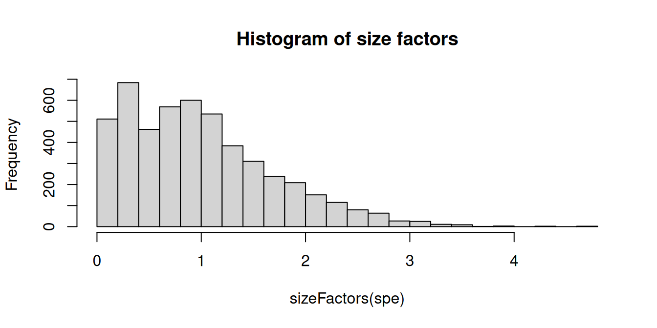
Code
# calculate logcounts and store in new assay
spe <- logNormCounts(spe)

assayNames(spe)
## [1] "counts" "logcounts"10.2.2 Spatially-aware normalization
SpaNorm (Salim et al. 2024) was developed specifically for ST data, using a gene-wise model (e.g. negative binomial) in which variation is decomposed into a library size-dependent (technical) and -independent (biological) component.
10.3 Feature selection
10.3.1 Highly variable genes (HVGs)
Feature selection is used as a preprocessing step to identify a subset of biologically informative features (e.g. genes), in order to reduce noise (due to both technical and biological factors) and improve computational performance.
Identifying a set of top “highly variable genes” (HVGs) is a standard step for feature selection in many scRNA-seq workflows, which can also be used as a simple and fast baseline approach in spot-based ST data. As above, this makes the simplified assumption that spots can be treated as equivalent to cells.
The set of top HVGs can then be used as the input for subsequent steps, such as dimensionality reduction and clustering. In this example, we use the scran package (Lun, McCarthy, and Marioni 2016) to identify HVGs.
Note that HVGs are defined based only on molecular features (i.e. gene expression), and do not take any spatial information into account. If the spatial patterns in gene expression in a dataset mainly reflect spatial distributions of cell types (defined by gene expression), then relying on HVGs for downstream analyses may be sufficient. However, if there is further biologically meaningful spatial structure that is not captured in this way, spatially-aware methods may be needed instead.
To identify the set of top HVGs, we first remove mitochondrial genes, since these tend to be very highly expressed and are not of main biological interest.
Code
##  mt
##  FALSE  TRUE
##  33525    13
Code
# remove
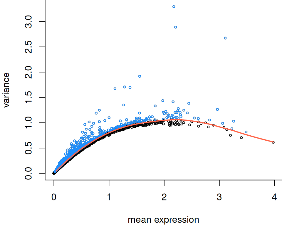
spe <- spe[!mt, ]Next, apply methods from scran. This gives a list of top HVGs, which can be used as the input for subsequent steps. The parameter prop defines the proportion of HVGs to select – for example, prop = 0.1 returns the top 10%. (Alternatively, argument n can be used to selected a fixed number of top HVGs, say 1000 or 2000.)
Code
# fit mean-variance relationship, decomposing variance into
# technical and biological components
dec <- modelGeneVar(spe)

# select top HVGs
sel <- getTopHVGs(dec, prop = 0.1)

# number of HVGs selected
length(sel)
## [1] 1281Code
10.3.2 Spatially variable genes (SVGs)
Alternatively, spatially-aware methods can be used to identify a set of “spatially variable genes” (SVGs). These methods take the spatial coordinates of the measurements into account, which can generate a more biologically informative ranking of genes associated with biological structure within the tissue area. The set of SVGs may then be used either instead of or complementary to HVGs in subsequent steps.
A number of methods have been developed to identify SVGs. For more details and examples, see Section 24.3.1.
10.4 Dimensionality reduction
A standard next step is to perform dimensionality reduction using principal component analysis (PCA), applied to the set of top HVGs (or SVGs). The set of top principal components (PCs) can then be used as the input for subsequent steps. Note that we have set a random seed at the start of the chapter for reproducibility. See Chapter 22 for more details.
Code
# using scater package
spe <- runPCA(spe, subset_row = sel)
In addition, we can perform nonlinear dimensionality reduction using the UMAP algorithm, applied to the set of top PCs (default 50). The top two UMAP dimensions can then be used for visualization purposes by plotting on the x and y axes. The UMAP algorithm is stochastic, so the visual layout of the UMAP plot will change from one run to the next. Setting a random seed (as above) ensures that the visualization is reproducible.
Note that UMAP plots should be interpreted with caution (Chari and Pachter 2023). Specifically, the UMAP algorithm can introduce misleading structure in a 2D plot, and the relative distances between points in the 2D plot are not meaningful. For this reason, we recommend using UMAP only for generating visualizations, not clustering – any cluster labels shown on a UMAP plot should be generated using a separate clustering algorithm. Similar arguments also apply to the t-SNE algorithm, which may be used as an alternative to UMAP.
Code
# using scater package
# not run
spe <- runUMAP(spe, dimred = "PCA")
10.5 Clustering
Next, we demonstrate some short examples of downstream analysis steps, following the processing steps above.
Here, we run a spatially-aware clustering algorithm, BayesSpace (Zhao et al. 2021), to identify spatial domains. BayesSpace was developed specifically for sequencing-based ST data, and takes the spatial coordinates of the measurements into account.
For more details on clustering, see Chapter 23.
Code
# run BayesSpace clustering
.spe <- spatialPreprocess(spe, skip.PCA = TRUE)
.spe <- spatialCluster(.spe, nrep = 1000, burn.in = 100, q = 10, d = 20)

# cluster labels
table(spe$BayesSpace <- factor(.spe$spatial.cluster))
##
## 1 2 3 4 5 6 7 8 9 10
## 701 272 1150 725 788 361 153 237 284 32110.6 Visualizations
We can visualize the cluster labels in x-y space as spatial domains, alongside the manually annotated reference labels (ground_truth) available for this dataset.
Code
# using plotting functions from ggspavis package
# and formatting using patchwork package
plotCoords(spe, annotate = "ground_truth") +
plotCoords(spe, annotate = "BayesSpace") +
  plot_layout() &
  theme(legend.key.size = unit(0, "lines")) &
  scale_color_manual(values = unname(pals::trubetskoy()))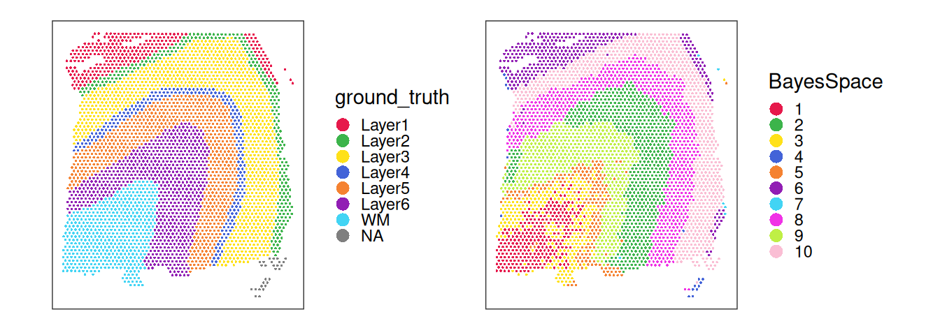
Code
table(spe$BayesSpace, spe$ground_truth, useNA = "ifany")##
## Layer1 Layer2 Layer3 Layer4 Layer5 Layer6 WM <NA>
## 1 0 0 0 3 247 440 0 11
## 2 1 3 0 0 0 0 0 268
## 3 0 0 460 215 424 18 0 33
## 4 4 1 2 0 1 1 1 715
## 5 2 210 520 0 0 0 0 56
## 6 264 39 7 0 0 1 0 50
## 7 0 0 0 0 0 1 0 152
## 8 1 0 0 0 1 177 23 35
## 9 0 0 0 0 0 2 272 10
## 10 1 0 0 0 0 52 217 51Inspecting the spatial distribution of the top PCs, we can observe that the main driver of expression variability is the distinction between white matter (WM) and non-WM cortical layers.
Code
pcs <- reducedDim(spe, "PCA")
pcs <- pcs[, seq_len(4)]
lapply(colnames(pcs), \(.) {
    spe[[.]] <- pcs[, .]
    plotCoords(spe, annotate = .)
}) |>
    wrap_plots(nrow = 1) &
    geom_point(shape = 16, stroke = 0, size = 0.2) &
    scale_color_gradientn(colors = pals::jet()) &
    coord_equal() &
    theme_void() &
    theme(legend.position = "bottom",
          plot.title = element_text(hjust = 0.5),
          legend.key.width = unit(0.8, "lines"),
          legend.key.height = unit(0.4, "lines"))
##  Scale for colour is already present.
##  Adding another scale for colour, which will replace the existing scale.
##  Scale for colour is already present.
##  Adding another scale for colour, which will replace the existing scale.
##  Scale for colour is already present.
##  Adding another scale for colour, which will replace the existing scale.
##  Scale for colour is already present.
##  Adding another scale for colour, which will replace the existing scale.
##  Coordinate system already present. Adding new coordinate system, which will
##  replace the existing one.
##  Coordinate system already present. Adding new coordinate system, which will
##  replace the existing one.
##  Coordinate system already present. Adding new coordinate system, which will
##  replace the existing one.
##  Coordinate system already present. Adding new coordinate system, which will
##  replace the existing one.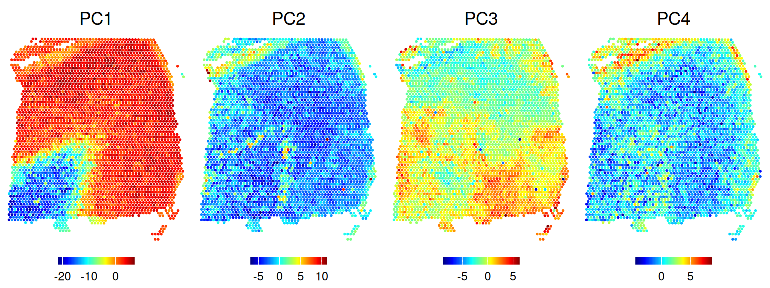
10.7 Differential expression
Having clustered our spots to identify spatial domains, we can test for genes that are differentially expressed (DE) between spatial domains, which can be interpreted as marker genes for the spatial domains.
Here, we will use pairwise t-tests and specifically test for upregulation (as opposed to downregulation), i.e. expression should be higher in the cluster for which a gene is reported to be a marker. See Chapter 23 for additional details.
Alternatively, we could also test for spatially variable genes (SVGs) within domains to identify genes with spatial expression patterns that vary independently of the spatial arrangement of domains. See Section 24.3.1 for details.
Code
## [1] 42We can visualize selected marker genes as a heatmap where bins represent the average expression (here, log-transformed library size-normalized counts) of a given gene (= columns) in a given cluster (= rows).
scale = "column". This will, for every gene, subtract the mean and divide by the standard deviation across per-cluster means, bringing genes of potentially very different expression levels to a comparable scale.Code
pbs <- aggregateAcrossCells(spe,
    ids = spe$BayesSpace, subset.row = top,
    use.assay.type = "logcounts", statistics = "mean")

# use gene symbols as feature names
mtx <- t(assay(pbs))
colnames(mtx) <- rowData(pbs)$gene_name

# using pheatmap package
pheatmap(mat = mtx, scale = "column")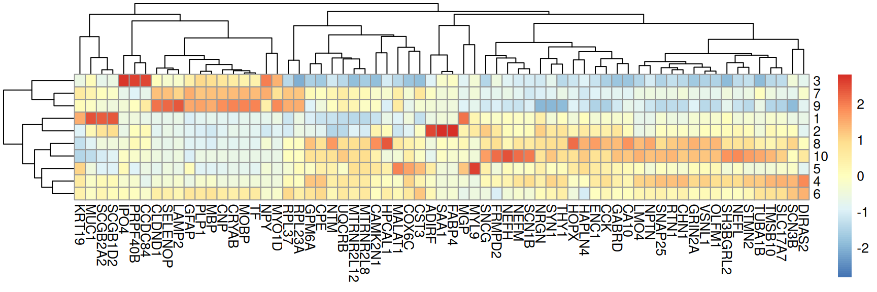
In addition, we can plot in x-y space, i.e. coloring spots by their expression of a given marker gene.
Code
ps <- lapply(
    c("MBP", "PLP1", "NRGN", "SNAP25", "NEFL", "HPCAL1"), \(.)
    plotCoords(spe, annotate = ., feature_names = "gene_name",
               assay_name = "logcounts"))

wrap_plots(ps, nrow = 2) &
  theme(legend.key.width = unit(0.4, "lines"),
        legend.key.height = unit(0.8, "lines")) &
  scale_color_gradientn(colors = rev(hcl.colors(9, "Rocket")))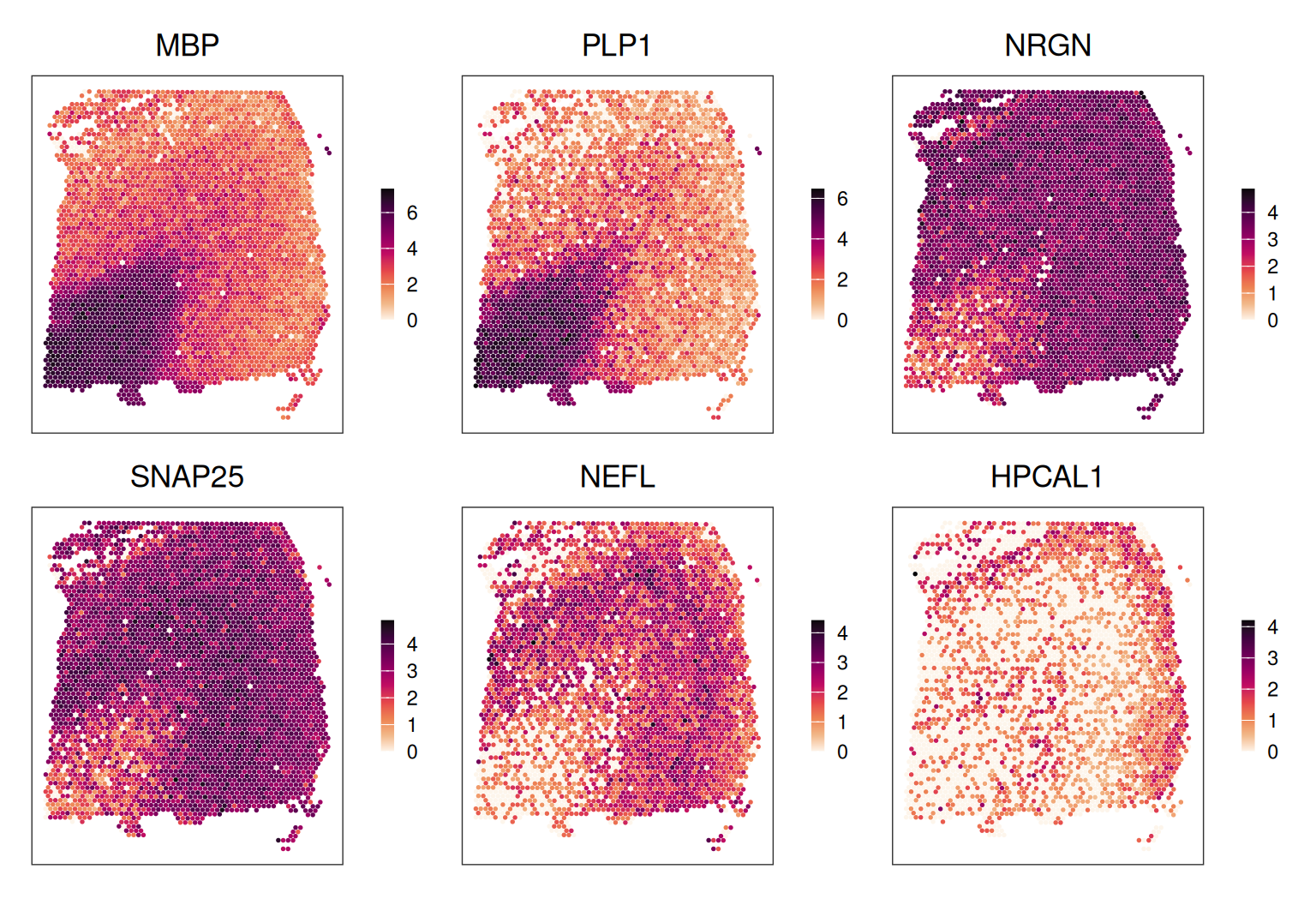
10.8 Appendix
Save data
Save data object for re-use within later chapters.