26 Spatial statistics
26.1 Preamble
26.1.1 Introduction
Spatial statistics builds around the first law of geography of Tobler (1970) that states “everything is related to everything else, but near things are more related than distant things”. This dependence of spatial observations has been studied in the field of (geo)spatial statistics. In general, spatial dependence is estimated by comparing the values at one location with the values at another location that is a given distance (called spatial lag) away (Dale and Fortin 2014; Baddeley, Rubak, and Turner 2015).
The two technological streams, imaging- and sequencing-based assays, are very different in terms of data modalities. In imaging-based assays (e.g. CosMx and Xenium) the observations of interest (e.g. mRNAs) are recorded where they occur natively. This means the locations of the observations are governed by a stochastic process and can be approximated as a point process. Sequencing-based assays (e.g. Visium) however, are recorded along defined grids which is called a lattice. This lattice is not created by a stochastic process and therefore can not be approximated as a point process. Here, lattice data analysis methods have to be used. There are methods however, where cells can be segmented from very fine bins (e.g. Visium HD and IMC). These technologies can be approximated as being generated by a point process after segmentation (Emons et al. 2024; Baddeley, Rubak, and Turner 2015; Pebesma and Bivand 2023). In the following vignette, the two main exploratory spatial statistics streams, point pattern analysis and lattice data analysis will be introduced.
26.1.2 Dependencies
Code
bp <- MulticoreParam(4)
set.seed(77)

sfe <- STexampleData::Janesick_breastCancer_Xenium_rep1() %>% toSpatialFeatureExperiment()

# load the official 10X annotations
labels <- read.xlsx("https://cdn.10xgenomics.com/raw/upload/v1695234604/Xenium%20Preview%20Data/Cell_Barcode_Type_Matrices.xlsx", sheet = 4)

labels$cell_id <- (labels$Barcode)

# add the cell type labels to the spe
matchedDf <- as.data.frame(colData(sfe)) |>
  left_join(as.data.frame(labels), by = join_by("cell_id"))

colData(sfe) <- DataFrame(matchedDf)

sfe <- sfe[, colSums(counts(sfe)) > 0]
sfe <- sfe[, !is.na(sfe$Cluster)]
sfe <- logNormCounts(sfe)

xy <- spatialCoords(sfe)
# basic theme for spatial plots
theme_xy <- list(
    coord_equal(expand=FALSE),
    theme_void(), theme(
        plot.margin=margin(l=5),
        legend.key=element_blank(),
        panel.background=element_rect(fill="black")))
26.2 Lattice data analysis
26.2.1 Introduction
In this chapter we will use SpatialFeatureExperiment which is a Bioconductor package that integrates the SpatialExperiment with geometric annotations that are represented as Simple Features in the sf.
Again, we will use the human breast cancer Xenium data set (Janesick et al. 2023) in a SpatialFeatureExperiment object available through SFEData.
We will use the Voyager package (Moses et al. 2023) which provides convenient wrappers around classic geospatial R packages such as spdep (Pebesma and Bivand 2023). For more details, please consult the authors’ comprehensive vignettes.
This part is based on the following vignette of the pasta resource (Emons et al. 2024).
26.2.2 The spatial weight matrix
Lattice based spatial methods rely on the concept of neighborhood. The neighborhood defines the spatial dependency between locations. Therefore, the first step of lattice based spatial analysis is the construction of a spatial weight matrix. Here we will use a nearest neighbor-based approach.
Different methods for the construction of the weight matrix exist, such as
- contiguity-based neighbors (neighbors in direct contact),
- graph-based neighbors (e.g., k-nearest neighbors),
- distance-based neighbors,
- higher order neighbors.
A detailed overview can be found in the documentation of the spdep package.
As different weight matrices influence downstream results, analysts should justify their choice of the weight matrix. A more detailed overview can be found in Pebesma and Bivand (2023).
Code
colGraph(sfe, "knn6") <-
  findSpatialNeighbors(
    sfe,
    type = "centroids",
    method = "knearneigh",
    k = 6
  )

plotColGraph(sfe,
  colGraphName = "knn6",
  colGeometryName = "centroids"
) + theme_void()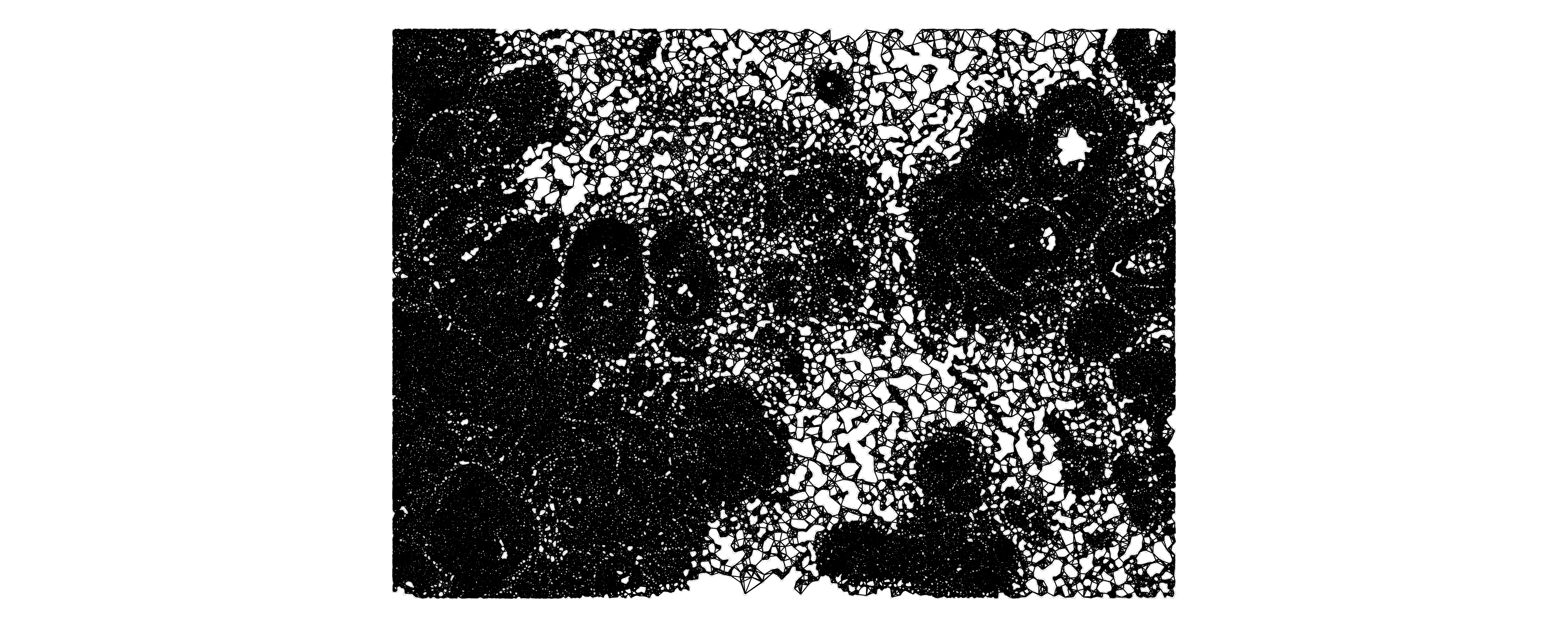
26.2.3 Spatial autocorrelation
Spatial autocorrelation measures similarity between spatial units (e.g., cells) while recognize that the units are not independent due to their spatial context. Spatial autocorrelation metrics can be global (summarizing the entire study area) of view or local (provide statistic for each unit). In addition, there exist methods for univariate and multivariate comparisons of continuous and categorical data (Pebesma and Bivand 2023).
26.2.3.1 Univariate measures - Moran’s \(I\)
Moran’s \(I\) can be interpreted as the Pearson correlation between the value at a certain location and the average values of its neighbors. The global value is a weighted average of the respective local values (Moran 1950).
Code
# get all gene probes
geneProbes <- rowData(sfe)[rowData(sfe)$Type == "Gene Expression", "Symbol"]

sfe <- runUnivariate(sfe,
  type = "moran",
  features = geneProbes,
  colGraphName = "knn6",
  BPPARAM = MulticoreParam(4)
)
We can output and plot the three genes with highest Moran’s \(I\).
Code
topGenes <- rownames(sfe)[order(rowData(sfe)$moran_sample01, decreasing = TRUE)[1:3]]
plotSpatialFeature(sfe, topGenes, ncol = 3)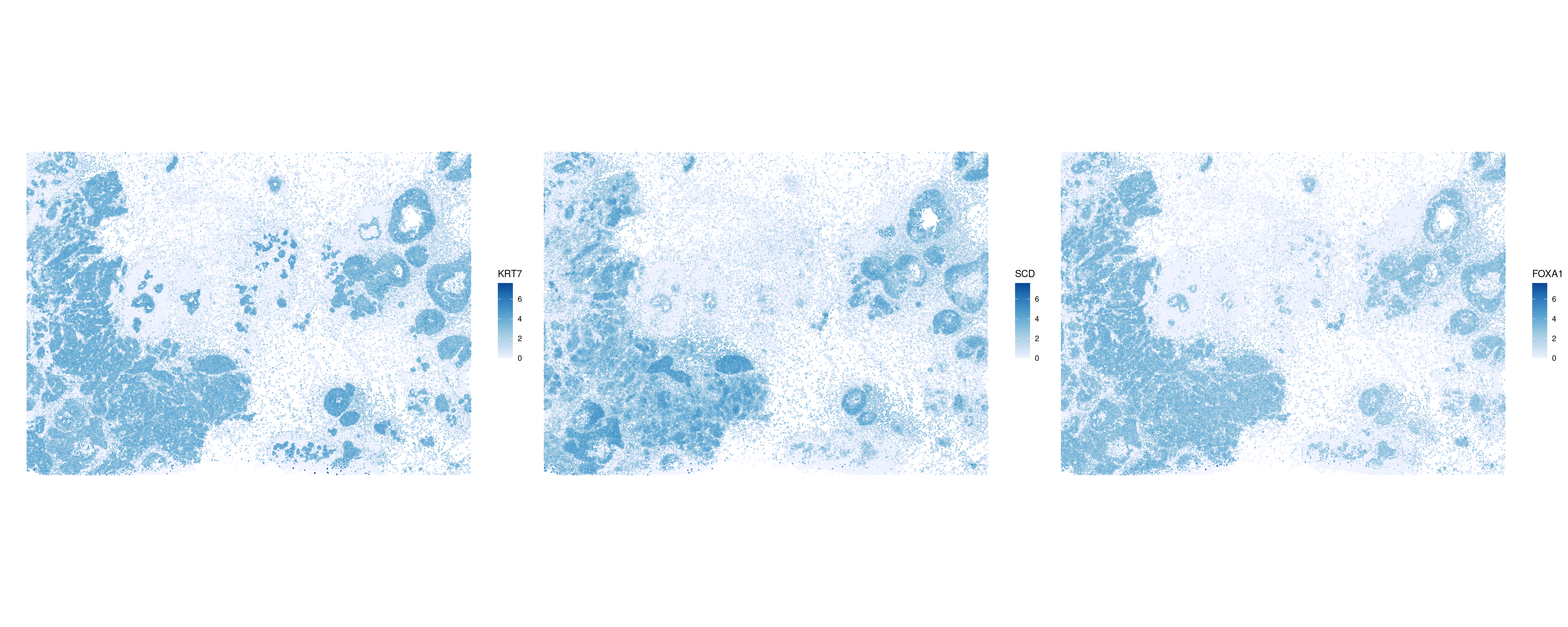
We can further visualize this using when calculating and plotting local Moran’s \(I\) values (Anselin 1995). The interpretation is analogue to the global counterpart. The higher the value, the more similar the expression among a cell’s neighbors. Negative values indicate local dissimilarity in expression.
Code
sfe <- runUnivariate(sfe,
  type = "localmoran",
  features = topGenes,
  colGraphName = "knn6",
  BPPARAM = MulticoreParam(4)
)

plotLocalResult(sfe,
                name = "localmoran",
                features = topGenes,
                colGeometryName = "centroids",
                divergent = TRUE,
                diverge_center = 0,
                ncol = 3)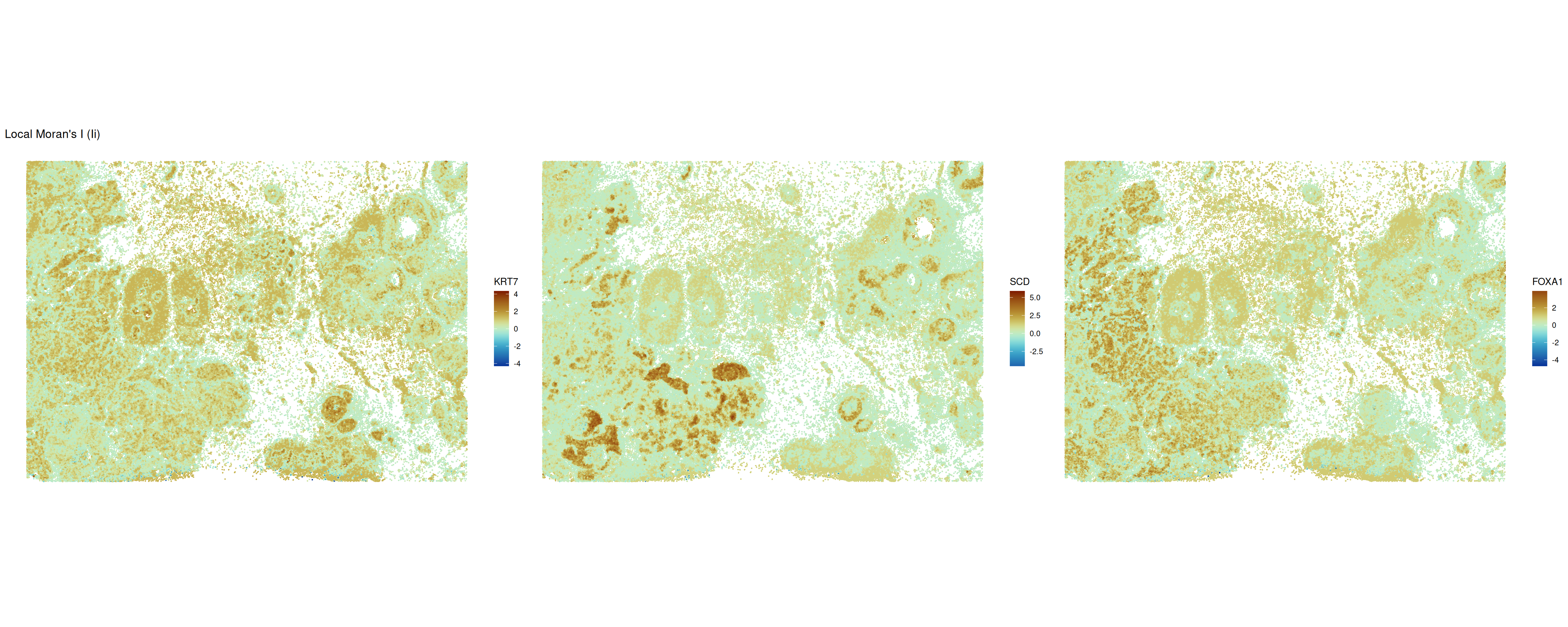
During the interpretation of local autocorrelation measures, both the effect size (the value of the statistic) and the significance level should be considered. Because we calculate significance on each spot individually, values should be corrected for multiple testing.
Code
plotLocalResult(sfe,
                name = "localmoran",
                features = topGenes,
                attribute = "-log10p_adj",
                colGeometryName = "centroids",
                divergent = TRUE,
                diverge_center = 0,
                ncol = 3)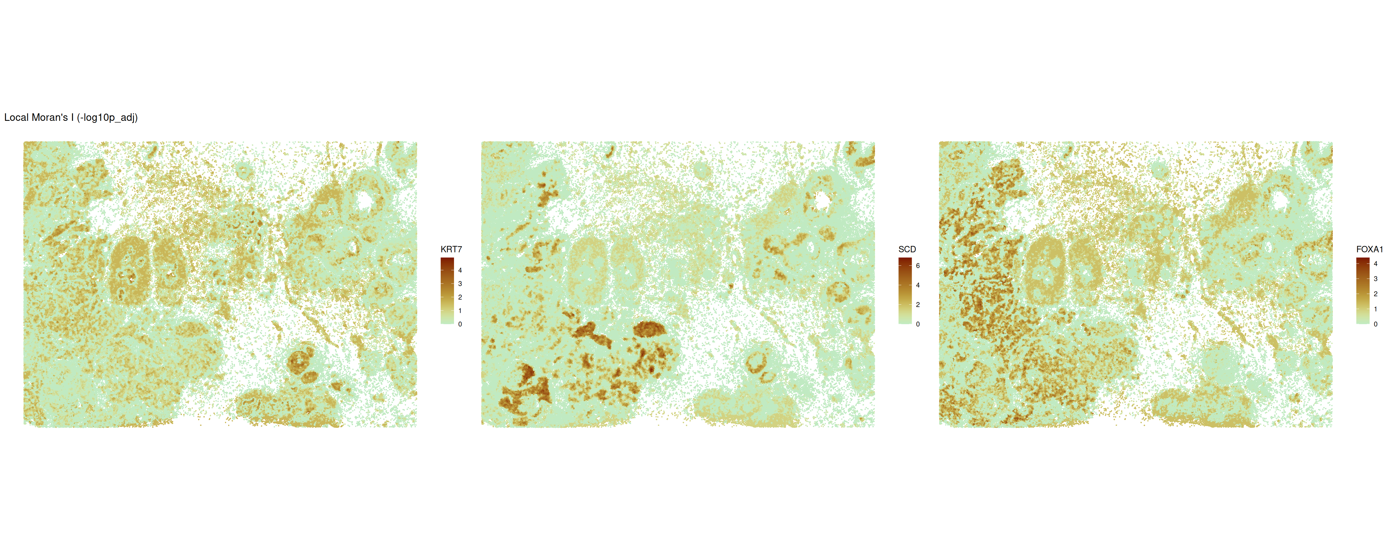
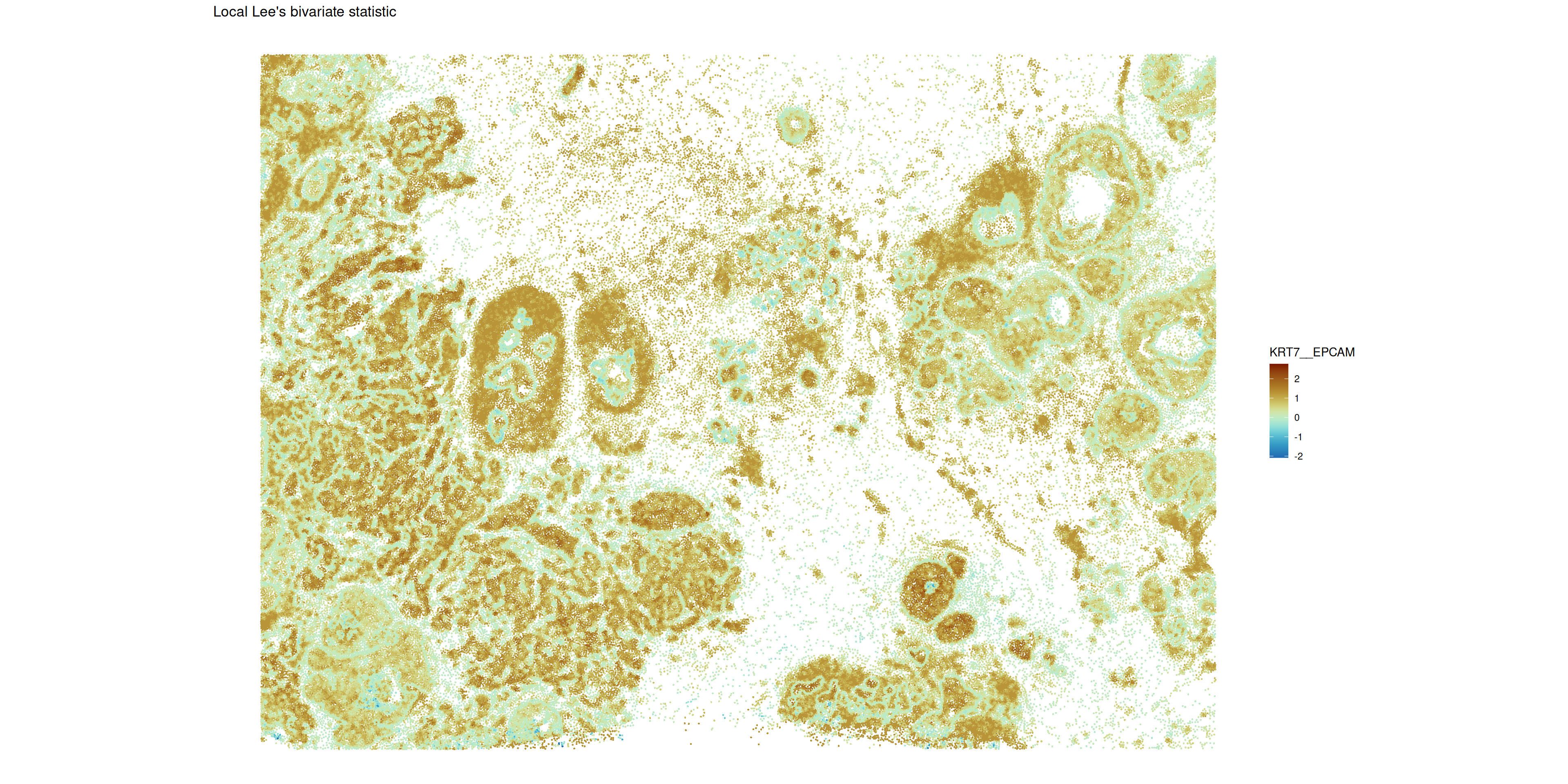
Multivariate measures – Lee’s L
Lee’s \(L\) combines the Pearson correlation coefficient and Moran’s \(I\) (Lee 2001). This unified metric allows to evaluate how two continuous variables are related while accounting for their spatial dependencies. We will calculate the global metric on the 20 most highly (non-spatial) variable features.
Code
hvgs <- getTopHVGs(sfe, n = 20)

res <- calculateBivariate(sfe,
                          type = "lee",
                          feature1 = geneProbes,
                          colGraphName =  "knn6"
)
We will identify the gene pairs with highest Lee’s \(L\) value and then calculate and visualize the respective local measure.
Code
# select the 20 highest values in the res matrix
genePairs <- which(res >= tail(sort(res), n=20)[1], arr.ind=TRUE)
# take only pair of two genes
genePairs <- genePairs[genePairs[,1] != genePairs[,2],]
#
data.frame(i = rownames(res)[genePairs[,1]], j = colnames(res)[genePairs[,2]],
           val = res[genePairs])
## i j val
## 1 FOXA1 EPCAM 0.6436054
## 2 KRT7 EPCAM 0.6669321
## 3 EPCAM FOXA1 0.6436054
## 4 KRT7 FOXA1 0.6308081
## 5 EPCAM KRT7 0.6669321
## 6 FOXA1 KRT7 0.6308081
## 7 KRT8 KRT7 0.6416129
## 8 KRT7 KRT8 0.6416129Code
sfe <- runBivariate(
  sfe,
  "locallee",
  colGraphName =  "knn6",
  feature1 = c("EPCAM", "KRT7")
)

plotLocalResult(
  sfe,
  name = "locallee",
  features = "KRT7__EPCAM",
  colGeometryName = "centroids",
  divergent = TRUE,
  diverge_center = 0
)
26.2.4 Join count statistics
Join count statistics can be used to quantify the arrangement of categorical marks on lattices. The join count statistic calculates how often a categorical mark appears next to itself or to another category within the pre-defined neighborhood. This values can then be compared against a theoretical or a permutation-based value test of the null hypothesis of random spatial allocation of the marks (Getis 2009).
Here, we will use the this to quantify the tendency of clusters (non-spatial) to co-localize in their relative neighborhood. Note that the output contains z-scores and no p-values such that a user-defined threshold can be applied.
Code
### code adapted from https://robinsonlabuzh.github.io/pasta/04-imaging-multivar-latSOD.html ###
library(BiocNeighbors)
library(BiocSingular)
# normalize expression
sfe <- logNormCounts(sfe)
set.seed(123)
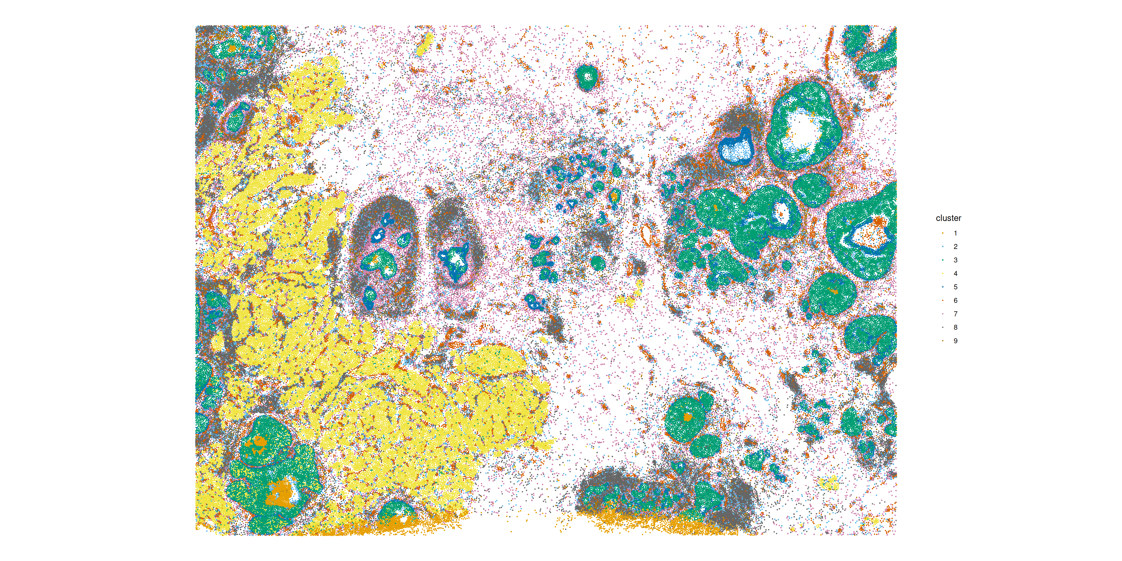
# Run PCA on the sample
sfe <- scater::runPCA(sfe, exprs_values = "logcounts", ncomponents = 50)
# Cluster based on first 20 PC's and using leiden
colData(sfe)$cluster <- bluster::clusterRows(reducedDim(sfe, "PCA")[,1:10],
BLUSPARAM = bluster::KNNGraphParam(
k = 20,
cluster.fun = "leiden",
cluster.args = list(
resolution = 0.3,
objective_function = "modularity")))
plotSpatialFeature(sfe,
"cluster",
colGeometryName = "centroids"
)
Code
resJc <- joincount.multi(as.factor(sfe$cluster), colGraph(sfe, "knn6"))
resJc <- resJc[order(resJc[, "z-value"], decreasing=TRUE), ]
head(resJc, n = 20)
## Joincount Expected Variance z-value
## 4:4 14910.0833 3836.16091 383.08992 565.784589
## 3:3 10405.4167 2077.05255 235.08187 543.187966
## 1:1 1985.0000 112.32999 16.22122 464.964203
## 5:5 2250.0833 260.53248 36.26822 330.363413
## 8:8 9711.9167 3652.23050 369.06495 315.426904
## 6:6 2567.8333 468.89491 62.89311 264.666011
## 7:7 4466.4167 1480.49383 176.49437 224.756962
## 9:9 391.8333 61.85256 9.09270 109.431461
## 5:3 2839.5833 1471.35090 186.35733 100.227440
## 2:2 1480.5833 661.75293 86.31994 88.132969
## 8:2 4698.1667 3109.40924 364.44710 83.222420
## 7:2 2962.8333 1979.72857 249.88363 62.191481
## 9:8 1546.4167 950.69679 116.58886 55.171345
## 9:7 1058.5000 605.29878 80.41584 50.538260
## 9:2 689.5833 404.68703 56.16565 38.014689
## 7:6 1888.9167 1666.47278 212.86306 15.246506
## 6:2 1236.5833 1114.16038 148.32507 10.052071
## 8:7 4509.8333 4650.80788 527.08776 -6.140436
## 9:6 283.0833 340.65272 47.92377 -8.316030
## 8:6 2441.5000 2617.40217 310.01770 -9.990287We note that the non-spatial cluster labels are of course most likely found next to each other. Apart from this obvious result, the first top non-self interaction is \(5:3\). Looking at the plot of the spatial distributions of the clusters these are two clusters in the ductal carcinoma regions of the tissue, the inner (blue) and the outer (green) lining.
26.3 Point Pattern Analysis
Point pattern analysis is a subfield of spatial statistics that focuses on the representation of spatial locations of events or objects as points (Baddeley, Rubak, and Turner 2015, 3). There are two main ways how to summarize cells as points (Emons et al. 2024):
- approximate the features (mRNAs) as points.
- segment the cells and represent the centroids as points.
The central R package to perform point pattern analysis is called spatstat (Baddeley and Turner 2005). The package spatialFDA creates an interface between SpatialExperiment objects and the spatstat library for easy integration into analysis workflows.
Part of this vignette is based on the pasta overview vignette and another vignette (Emons et al. 2024)
ppp object
The central object in spatstat is called ppp. This object contains three attributes:
- the \(x\) and \(y\) coordinates of the points
- the observation window of the pattern
- marks which are associated with each point; this can be, e.g., a discrete cell type mark or a continuous gene expression mark
In the following we will work with a Xenium dataset of breast cancer (Janesick et al. 2023). The representation of cells as points is done via cell centroids.
Code
spe <- sfe
rm(sfe)
In the plot below, the centroids of the cells are attributed with a discrete cell type mark.
Code
df <- data.frame(xy, colData(spe))
ggplot(df, aes(x_centroid, y_centroid, col=Cluster)) +
    guides(col=guide_legend(override.aes=list(size=2))) +
    theme_xy + theme(legend.key.size=ggplot2::unit(0, "pt")) +
geom_point(size=0.05) 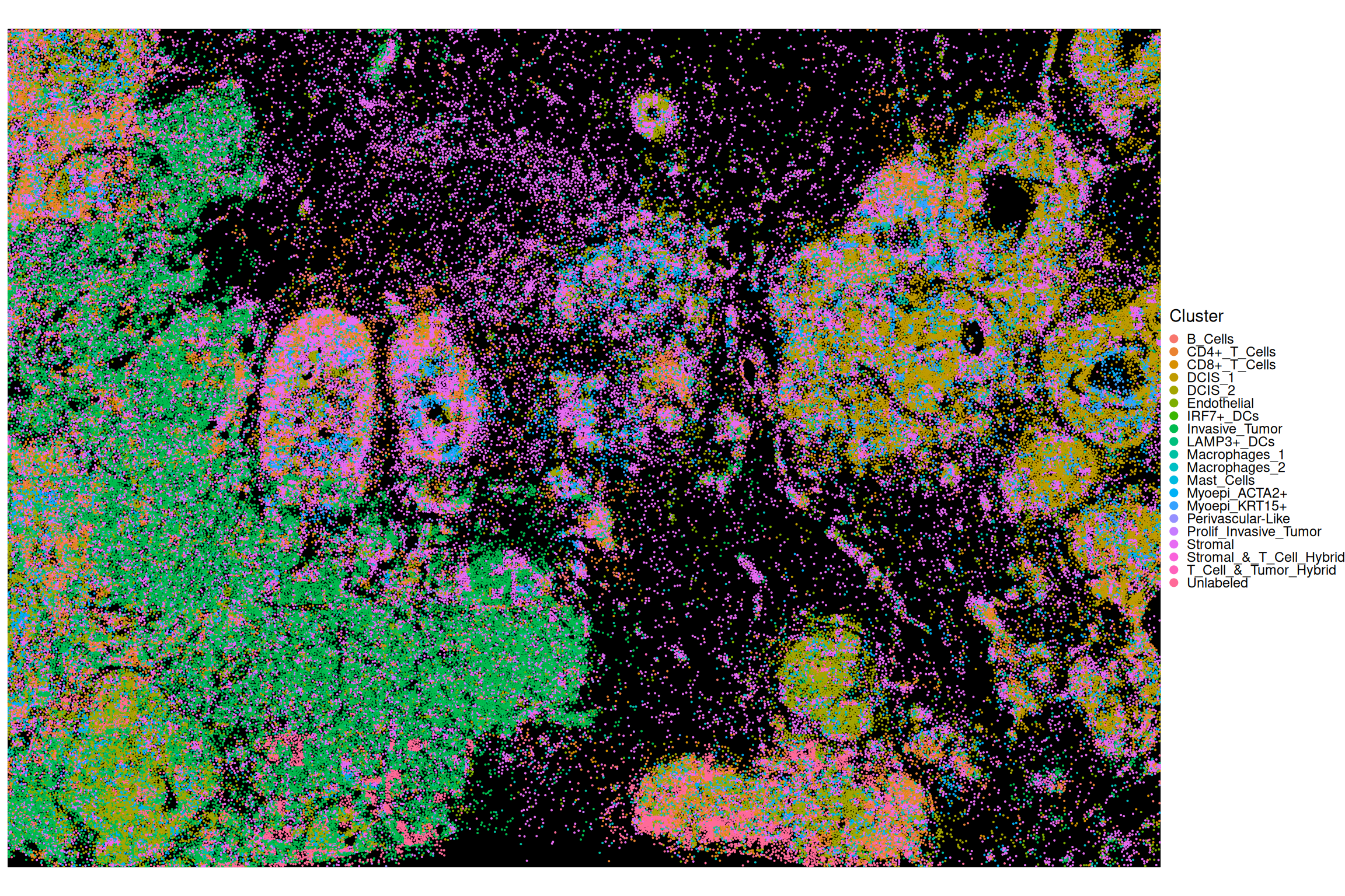
26.3.1 Intensity
The first property to assess in a point pattern is the intensity. For a window \(W\) and points \(x\), the average intensity \(\bar{\lambda}\) is defined as the number of points \(n(x)\) divided by the area of the window \(|W|\):
\[ \bar{\lambda}=\frac{n(x)}{|W|} \]
The intensity of the points can be uniform in space which is called homogeneous. If the intensity is not uniform in space, it is called inhomogeneous. This distinction has important implications for the choice of the spatial metrics. Most metrics have a correction for inhomogeneous intensity of points (Baddeley, Rubak, and Turner 2015, 157 ff.).
Code
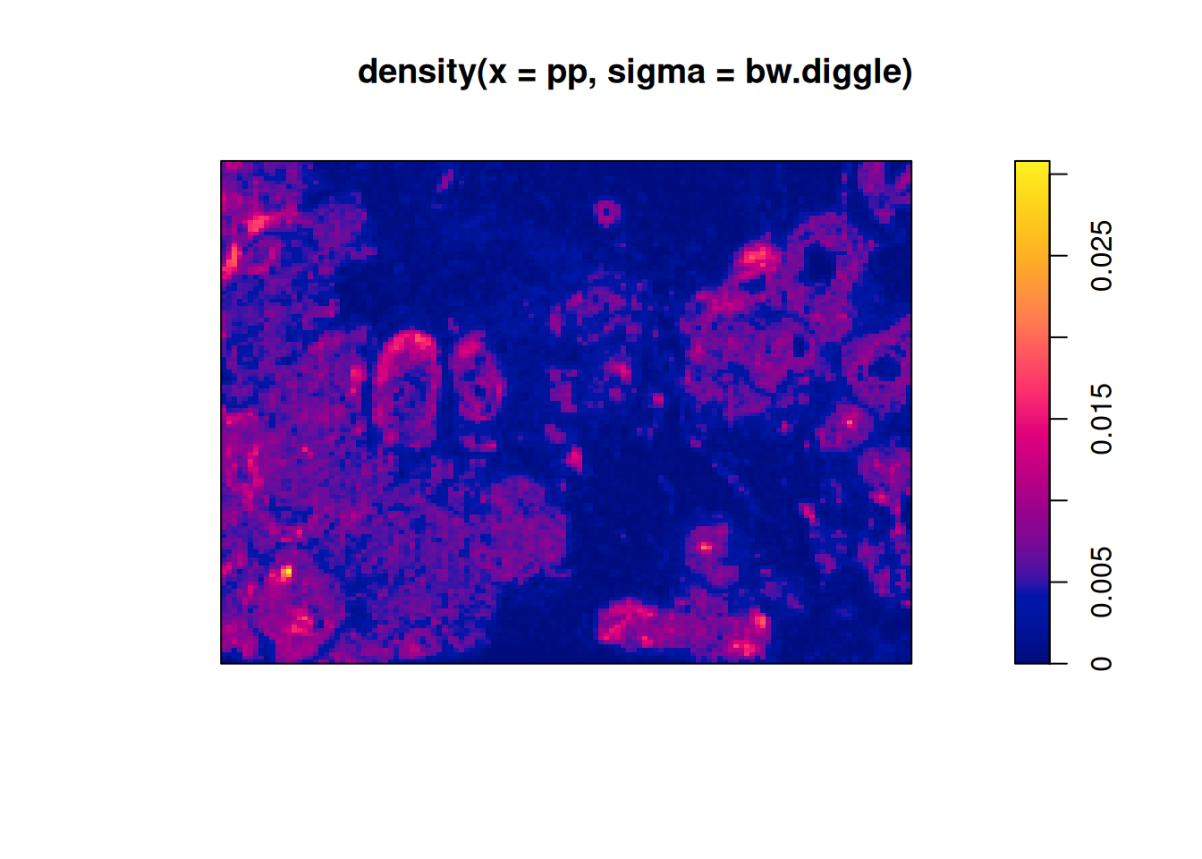
In the plot above we see that the intensity of all points is not uniform. This inhomogeneity of points has to be taken into accounts when interpreting spatial statistics metrics. For example, an indication of clustering in a point pattern can be due solely to an inhomogeneity of points. This is called the confounding between intensity and interaction (Baddeley, Rubak, and Turner 2015, 151 ff.).
26.3.2 Global Analysis
Global analyses summarize a statistic across the entire field of view. This means it reflects an average statistic and might not be reflective of local heterogeneities (Emons et al. 2024).
26.3.2.1 Correlation
One option in point pattern analysis is to analyse the correlation of marks. Like this, e.g., a clustering or spacing of cells can be determined relative to a completely spatially random (CSR) process.
Complete spatial randomness is the null scenario for a point pattern. It is characterized by two key properties:
- Homogeneity: The intensity of points is homogeneous in space.
- Independence: The points in one region do not influence the distribution of points in another region.
26.3.2.1.1 Ripley’s \(K\)
Ripley’s \(K\) is a well established function to assess correlation in a point pattern. It can be calculated within a mark or across marks. In essence, Ripley’s \(K\) quantifies the average number of points that fall in a \(r\)-neighborhood of a chosen mark (Ripley 1976; Baddeley, Rubak, and Turner 2015, 132 ff.).
Code
resCross <- calcCrossMetricPerFov(
  spe,
  selection = c("DCIS_1", "DCIS_2", "Invasive_Tumor"),
  subsetby = 'sample_id',
  fun = 'Kcross',
  marks = 'Cluster',
  rSeq = seq(0, 500, length.out = 100),
  by = c("sample_id")
)
## [1] "Calculating Kcross from DCIS_1 to DCIS_1"## [1] "Calculating Kcross from DCIS_2 to DCIS_1"
## [1] "Calculating Kcross from Invasive_Tumor to DCIS_1"
## [1] "Calculating Kcross from DCIS_1 to DCIS_2"
## [1] "Calculating Kcross from DCIS_2 to DCIS_2"## [1] "Calculating Kcross from Invasive_Tumor to DCIS_2"
## [1] "Calculating Kcross from DCIS_1 to Invasive_Tumor"
## [1] "Calculating Kcross from DCIS_2 to Invasive_Tumor"
## [1] "Calculating Kcross from Invasive_Tumor to Invasive_Tumor"Code
plotCrossMetricPerFov(
  resCross,
  theo = TRUE,
  correction = "border",
  x = "r",
  imageId = 'sample_id'
)
## [[1]]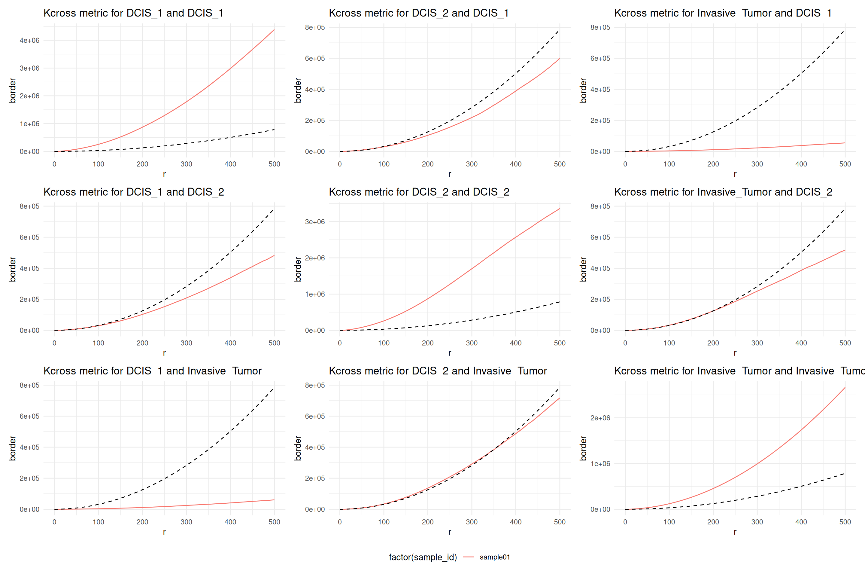
This plot shows Ripley’s \(K\) function not corrected for inhomogeneities of the chosen marks. The diagonal is Ripley’s \(K\) function among the three cell types themselves and the off diagonal plots show the cross type combinations. We note that all cell types, ductal carcinoma in situ 1 (DCIS 1), ductal carcinoma in situ 2 (DCIS 2) and invasive tumor cells show a clear interaction among themselves. DCIS 1 and invasive tumor cells show spacing, meaning there are less invasive tumor cells found in DCIS 1 than expect under CSR. However, DCIS 2 and invasive tumor cells show a distribution that is completely spatially random in a \(500 µm\) \(r\)-neighborhood.
26.3.2.2 Spacing
A complementary approach to correlation analysis is spacing. There are three main distance types (Baddeley, Rubak, and Turner 2015, 255):
- pairwise distances: distances between all pairs of points
- nearest-neighbor distances: distance to the nearest point of the query point
- empty-space distances: distance from a reference location to the nearest point
26.3.2.2.1 Nearest-neighbor distance function \(G\)
The nearest neighbor function \(G\) quantifies the average nearest-neighbor distance over a radius range \(r\) (Baddeley, Rubak, and Turner 2015, 262).
Code
resCross <- calcCrossMetricPerFov(
  spe,
  selection = c("DCIS_1", "DCIS_2", "Invasive_Tumor"),
  subsetby = 'sample_id',
  fun = 'Gcross',
  marks = 'Cluster',
  rSeq = seq(0, 100, length.out = 100),
  by = c("sample_id")
)
## [1] "Calculating Gcross from DCIS_1 to DCIS_1"
## [1] "Calculating Gcross from DCIS_2 to DCIS_1"
## [1] "Calculating Gcross from Invasive_Tumor to DCIS_1"
## [1] "Calculating Gcross from DCIS_1 to DCIS_2"
## [1] "Calculating Gcross from DCIS_2 to DCIS_2"
## [1] "Calculating Gcross from Invasive_Tumor to DCIS_2"
## [1] "Calculating Gcross from DCIS_1 to Invasive_Tumor"
## [1] "Calculating Gcross from DCIS_2 to Invasive_Tumor"
## [1] "Calculating Gcross from Invasive_Tumor to Invasive_Tumor"Code
plotCrossMetricPerFov(
  resCross,
  theo = TRUE,
  correction = "km",
  x = "r",
  imageId = 'sample_id'
)
## [[1]]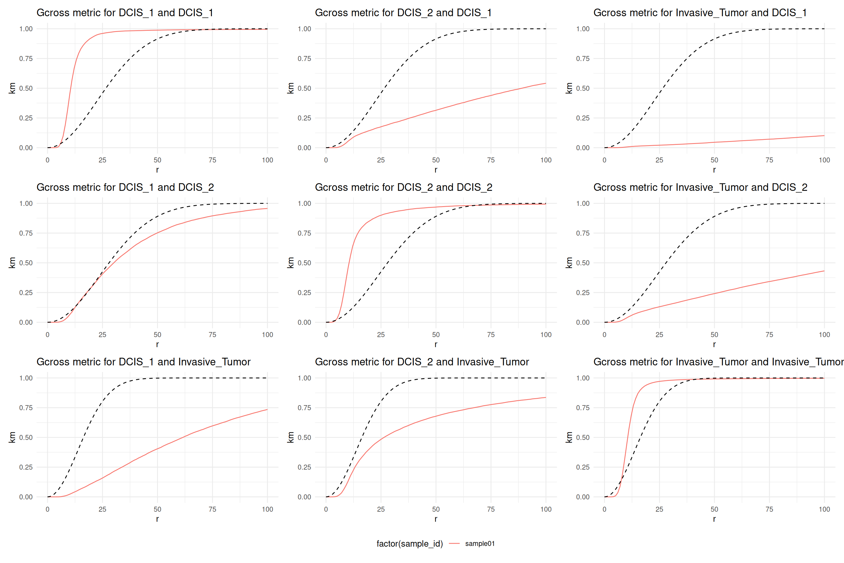
In terms of spacing, the interpretation is a bit different. Still, the diagonal shows that all cell types are more clustered than expected if the patterns were completely spatially random. Comparing now DCIS 1 and DCIS 2 with invasive tumor cells, we see that both are more spaced than expect at random. However, the spacing is stronger for DCIS 1 and invasive tumor cells. At small radii, DCIS 2 and invasive tumor are distributed close to random.
The analysis with Ripley’s \(K\) and the \(G\) function are not contradictory. \(G\) functions summarize shorter scale interactions than \(K\) functions (Baddeley, Rubak, and Turner 2015, 295).
26.3.3 Local Analysis
26.3.3.1 Local indicators of spatial association
The metrics shown before are an average over the entire window \(W\). Anselin (1995) proposed an alternative approach which is termed local indicators of spatial association (LISA). Instead of a global average LISA shows the local contributions of each point to the overall metric (Baddeley, Rubak, and Turner 2015, 247). This is a general concept not only for point pattern analysis but for lattice data analysis as well (Anselin 1995, 2019).
Code
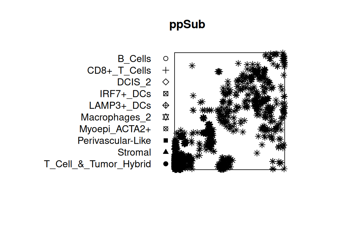
Code
# calculate LISA K curves
resLocal <- localK(ppSub, verbose=FALSE)

# code adapted from
# https://robinsonlabuzh.github.io/
# pasta/01-imaging-univar-ppSOD.html

df <- resLocal |>
    as.data.frame() |>
    pivot_longer(
        iso0001:iso1327,
        names_to="curve")

sel <- df %>%
    filter(r > 700.5630 & r < 702.4388) %>%
    mutate(sel=value) %>% select(curve, sel)

df <- df %>% left_join(sel)

thm <- list(
    theme_light(),
    theme(legend.position="none"),
    scale_color_viridis_c())

p <- ggplot(df, aes(r, value, group=curve, col=sel)) +
    geom_line() +
    geom_line(aes(y=theo), linetype=2, col="darkgray") +
    geom_vline(xintercept=700) +
    thm

df <- data.frame(
    x=ppSub$x, y=ppSub$y,
    sel=unique(sel)$sel)

q <- ggplot(df, aes(x, y, col = sel)) +
    coord_equal(expand=FALSE) +
    geom_point(size = 1) +
    thm

p | q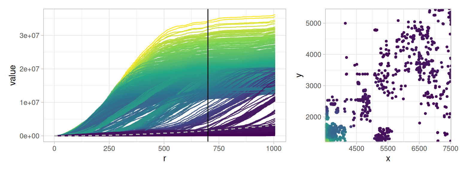
The LISA Ripley’s \(K\) are colored by their value at \(r = 700\). We note that the LISA Ripley’s \(K\) gives two populations of curves. Those curves that increase at radii \(r<500 µm\) above the CSR line indicated in gray and the other curves that remain either below the gray CSR line or increase after \(r>500µm\).
If the values at \(r=700\) of the curves are projected back into the physical space, we note that the curves above the gray CSR line are the highly clustered cells in the bottom left. The other curves are the more spaced cells.