19 Neighborhood analysis
19.1 Preamble
19.1.1 Introduction
Neighborhood analysis aims to investigate the composition of and interaction between cells and cell types within small regions of tissue, which are referred to as neighborhoods or niches.
19.1.2 Dependencies
Code
# basic theme for spatial plots
theme_xy <- list(
    coord_equal(expand=FALSE),
    theme_void(), theme(
        plot.margin=margin(l=5),
        legend.key=element_blank(),
        panel.background=element_rect(fill="black")))
19.2 Nearest neighbors
Custom spatial analyses may rely on identifying nearest neighbors (NNs) of cells. We recommend RANN for this purpose, which finds NNs in \(O(N\log N)\) time for \(N\) cells (c.f., conventional approaches would take \(O(N^2)\) time) by relying on a Approximate Near Neighbor (ANN) C++ library. Furthermore, there is support for exact, approximate, and fixed-radius searchers. The latter is of particular interest in biology; e.g., one might require \(k\)NNs to lie within a biologically sensible distance as to avoid consideration of cells that are far-off, especially in sparse regions or at tissue borders.
As a toy example, we here compute the \(k\)NNs between a pair of subpopulations, with and without thresholding on NN distances (searchtype="radius").
For the first approach, each cell will receive \(k\) neighbors exactly,
but these may lie within an arbitrary distance.For the second approach, cells will receive \(\leq k\) neighbors,
depending on how many cells lie within a radius \(r\).
Code
library(RANN)
k <- 10 # num. neighbors
r <- 50 # dist. threshold
i <- spe$k == 1 # source
j <- spe$k == 4 # target
xy <- spatialCoords(spe)
# k-NN search: all cells have k neighbors
ns_k <- nn2(xy[j, ], xy[i, ], k=k)
is_k <- ns_k$nn.idx
all(rowSums(is_k > 0) == k)
# w/ fixed-radius: cells have 0-k neighbors
ns_r <- nn2(xy[j, ], xy[i, ], k=k, searchtype="radius", r=r)
is_r <- ns_r$nn.idx
range(rowSums(is_r > 0))
## [1] TRUE
## [1] 0 10The neighbors obtained via fixed-radius search (right) are less scattered than those obtained for unlimited distances (left); the former are arguably more meaningful in a biological context:
Code
df <- data.frame(xy, colData(spe))
p0 <- ggplot(df, aes(x_centroid, y_centroid)) +
    geom_point(data=df, col="navy", shape=16, size=0) +
    geom_point(data=df[i, ], col="magenta", shape=16, size=0)
p1 <- p0 + geom_point(
    data=df[which(j)[is_k], ],
    col="gold", shape=16, size=0) +
    ggtitle("k-nearest neighbors")
p2 <- p0 + geom_point(
    data=df[which(j)[is_r], ],
    col="gold", shape=16, size=0) +
    ggtitle("fixed-radius search")
(p1 | p2) + plot_layout(nrow=1) & theme_xy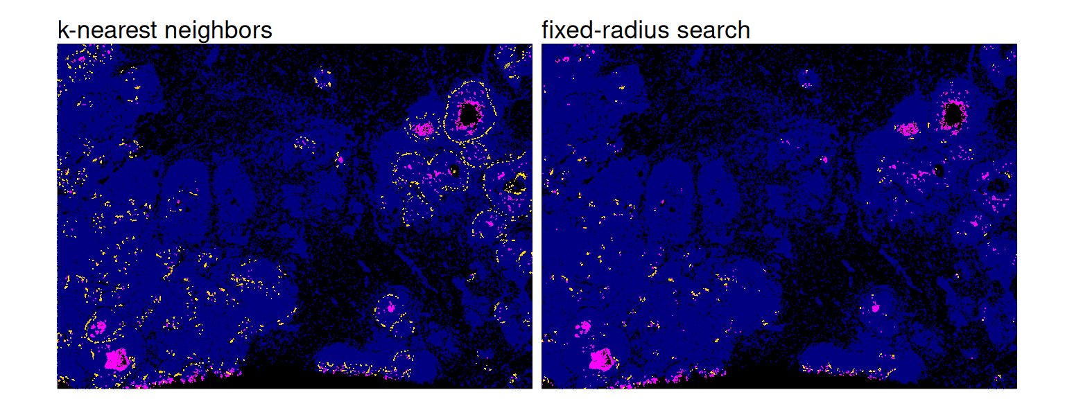
Note that, we could also set a very large k in order to identify all neighbors within a radius r. In order to prevent unnecessarily costly searches, it is sensible to estimate how many neighbors we would expect, and to set k accordingly. nn2() will otherwise find each cells’ \(k\)NNs, and set the indices of those with a distance \(>r\) to 0.
As an exemplary approach, we here sample 1,000 cells to estimate the highest number of NNs obtained, considering half of all target cells as potential NNs:
Code
## [1] 35For our actual search, we then set k to be twice our estimate. As a final spot-check, we make sure that all cells have fewer than k NNs, since we might otherwise be missing some.
19.3 Spatial contexts
Spatial niche analysis aims at identifying regions of homogeneous composition by grouping cells based on their microenvironment. To this end, methods such as imcRtools (Windhager et al. 2023) rely on a \(k\)-nearest-neighbor (\(k\)NN) graph (based on Euclidean cell-to-cell distances), and clustering cells using common clustering algorithms (according to their neighborhood’s subpopulation frequencies).
Here, we demonstrate how to identify spatial contexts based on \(k\)-means clustering on cluster frequencies among (Euclidean) \(k\)NNs. We recommend readers consult imcRtools’ documentation for a much wider range of visualizations and downstream analyses in this context.
Code
library(imcRtools)
# construct kNN-graph based on Euclidean distances
sqe <- buildSpatialGraph(spe,
    coords=spatialCoordsNames(spe),
    img_id="sample_id", type="knn", k=10)
# compute cluster frequencies among each cell's kNNs
sqe <- aggregateNeighbors(sqe,
    colPairName="knn_interaction_graph",
    aggregate_by="metadata", count_by="k")
# view composition of 1st cell's kNNs
unlist(sqe$aggregatedNeighbors[1, ])
## 1 2 3 4 5 6 7 8 9 10 11 12 13 14 15 16
## 0.3 0.7 0.0 0.0 0.0 0.0 0.0 0.0 0.0 0.0 0.0 0.0 0.0 0.0 0.0 0.0Code
##
##      1     2     3     4     5
##  30977 45211 20516 28422 15142
Let’s quickly view the subpopulation composition of each spatial context:
Code
df <- data.frame(spatialCoords(sqe), colData(sqe))
round(100*with(df, prop.table(table(k, ctx), 2)), 2)
## ctx
## k 1 2 3 4 5
## 1 33.65 1.49 0.24 0.09 0.09
## 2 9.17 1.45 1.33 0.17 0.75
## 3 5.30 3.22 0.00 0.00 0.00
## 4 7.19 6.89 0.00 0.17 0.00
## 5 0.66 17.18 4.79 6.38 2.93
## 6 0.45 14.91 5.27 14.93 2.81
## 7 0.12 1.50 63.36 0.72 45.75
## 8 1.47 8.18 2.84 11.24 1.56
## 9 0.05 0.18 16.36 0.07 42.83
## 10 0.91 24.66 3.50 7.72 1.99
## 11 0.08 10.69 1.86 42.50 0.98
## 12 0.03 5.64 0.33 5.23 0.20
## 13 0.01 0.93 0.08 0.43 0.07
## 14 0.00 2.04 0.03 8.95 0.01
## 15 40.91 0.57 0.00 0.01 0.00
## 16 0.01 0.49 0.01 1.40 0.05Secondly, let’s visualize the obtained spatial contexts in space:
Code
pal_k <- unname(pals::trubetskoy(nlevels(df$k)))
pal_c <- c("blue", "cyan", "gold", "magenta", "maroon")
ggplot(df, aes(x_centroid, y_centroid, col=k)) +
    scale_color_manual(values=pal_k) +
ggplot(df, aes(x_centroid, y_centroid, col=ctx)) +
    scale_color_manual(values=pal_c) +
plot_layout(nrow=1) &
    geom_point(shape=16, size=0) &
    guides(col=guide_legend(override.aes=list(size=2))) &
    theme_xy & theme(legend.key.size=unit(0.5, "lines"))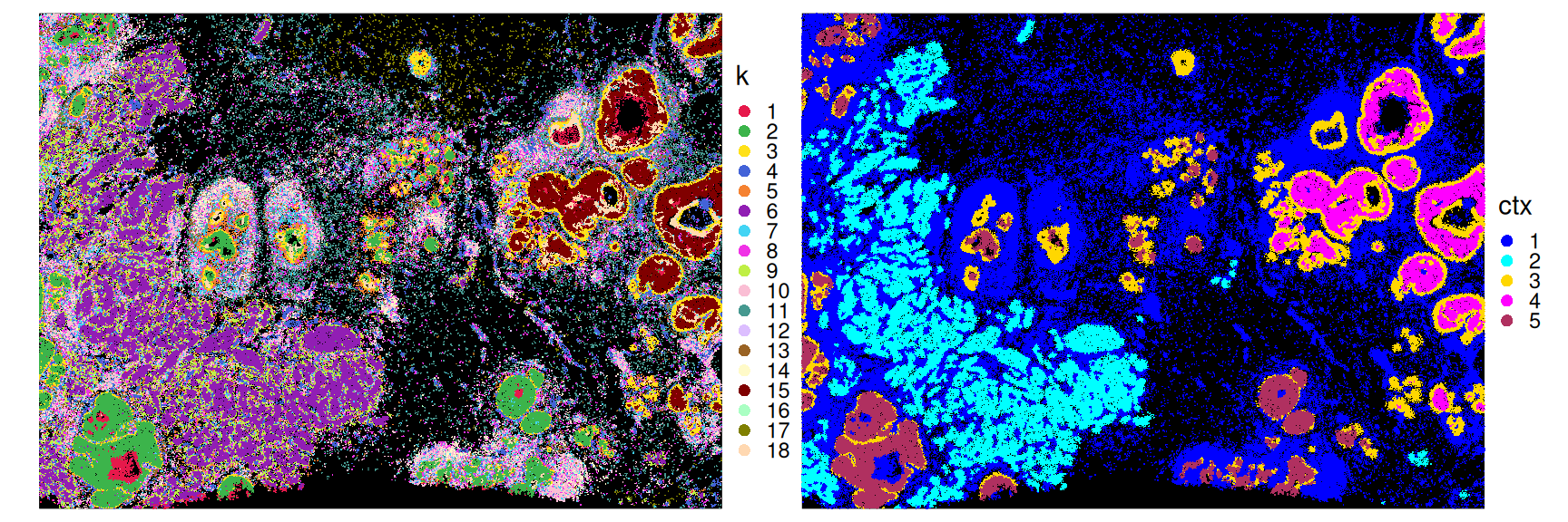
19.4 Co-localization
hoodscanR (Liu et al. 2024) also relies on a (Euclidean) \(k\)NN graph to estimate the probability of each cell associating with its NNs. The resulting probability matrix (rows=cells, columns=NNs) can, in turn, be used to assess co-occurrence of subpopulations.
Code
library(hoodscanR)
sqe <- readHoodData(spe, anno_col="k")
nbs <- findNearCells(sqe, k=100)
mtx <- scanHoods(nbs$distance)
grp <- mergeByGroup(mtx, nbs$cells)
sqe <- mergeHoodSpe(sqe, grp)
To perform neighborhood co-localization analysis, plotColocal() computes the Pearson correlation of probability distribution between cells. Here, high/low values indicate attraction/repulsion between clusters:
Code
library(pheatmap)
cor <- plotColocal(sqe, pm_cols=colnames(grp), return_matrix=TRUE)
pal <- colorRampPalette(rev(hcl.colors(9, "Roma")))(100)
pheatmap(cor,
    cellwidth=15, cellheight=15,
    treeheight_row=5, treeheight_col=5,
    col=pal, breaks=seq(-1, 1, length=100))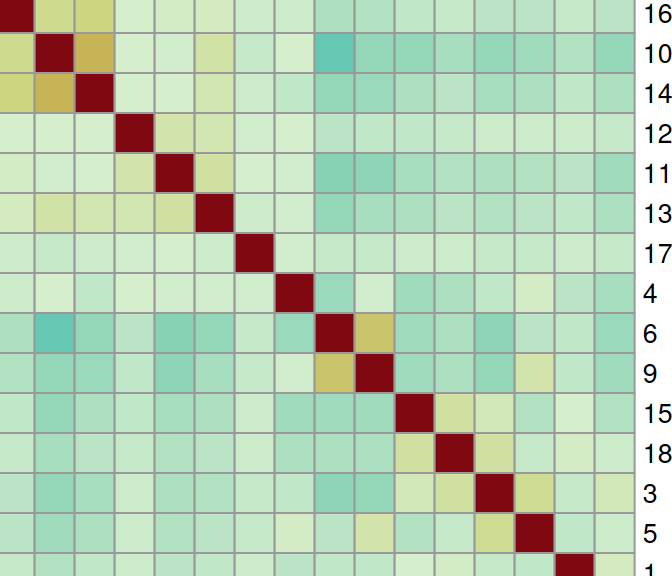
Downstream, calcMetrics() can be used to calculate cell-level entropy and perplexity, which both measure the mixing of cellular neighborhoods. Here, low/high values indicate heterogeneity/homogeneity of a cell’s local neighborhood:
Code
sqe <- calcMetrics(sqe, pm_cols=colnames(grp))Code
df <- data.frame(colData(sqe), k=spe$k, spatialCoords(spe))
vs <- c("perplexity", "entropy")
fd <- df |>
    mutate(across(all_of(vs), scale)) |>
    pivot_longer(all_of(vs)) |>
    # threshold at 2 SDs for clearer visualization
    mutate(value=case_when(abs(value) > 2 ~ sign(value)*2, TRUE ~ value))
ggplot(fd, aes(x_centroid, y_centroid, col=value)) +
    facet_grid(~name) + geom_point(shape=16, size=0) +
    theme_xy + theme(legend.key.size=unit(0.5, "lines")) +
scale_color_gradient2("z-scaled\nvalue", low="cyan", mid="navy", high="magenta") 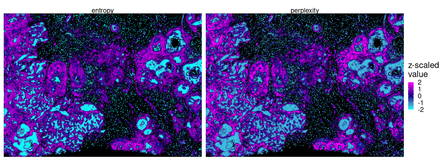
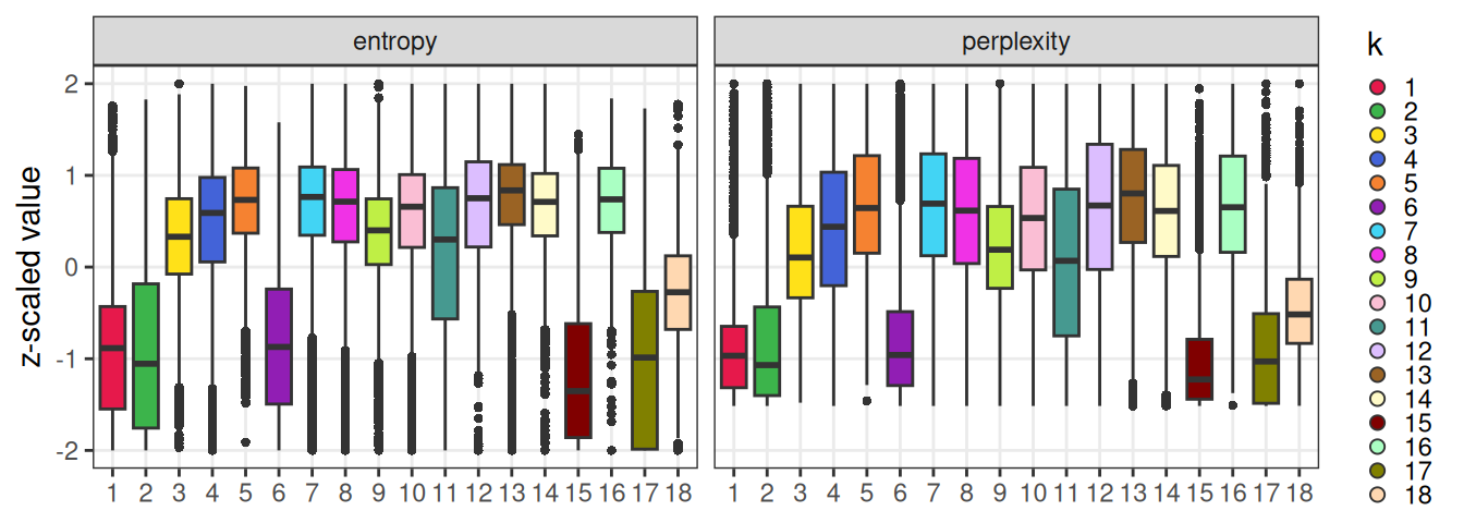
Stratifying these values by subpopulation, we can observe that clusters forming distinct aggregates in space are lowest in entropy/perplexity (i.e., the most homogeneous locally):
Code
ggplot(fd, aes(k, value, fill=k)) +
    facet_wrap(~name) +
    scale_fill_manual(values=pal_k) +
    geom_boxplot(outlier.stroke=0, key_glyph="point") +
    scale_y_continuous("z-scaled value", limits=c(-2, 2)) +
    guides(fill=guide_legend(override.aes=list(shape=21, size=2))) +
    theme_bw() + theme(
        axis.title.x=element_blank(),
        panel.grid.minor=element_blank(),
        legend.key.size=unit(0.5, "lines"))