36 Differential colocalization
36.1 Preamble
36.1.1 Introduction
In this chapter, we explore tools to assess differential colocalization between conditions with the two packages spicyR (Canete et al. 2022) and spatialFDA (Emons et al. 2026). Both packages compare known spatial statistics functions implemented in the package spatstat.
This chapter extends the single-sample neighborhood and spatial statistics ideas introduced in Chapter 22 and Chapter 32 to a multiple-sample setting.
36.1.2 Dependencies
36.1.3 Load data
For this example, we use a dataset on type I diabetes (T1D) (Damond et al. 2019). This dataset contains three conditions (non-diabetic, onset, and long-duration diabetes), several patients per condition, and several fields-of-view per patient. This hierarchical setup requires the modeler to account for correlation between fields-of-view, for example if they stem from the same patient. Such a setup can be modeled with mixed models (see below).
An assay-free version of the dataset is available through our OSF repository (used here to reduce runtime as the following analyses do not require assay data):
Code
# load data from OSF repository (for smaller download)
osf_repo <- osf_retrieve_node("https://osf.io/5n4q3/")
osf_files <- osf_ls_files(osf_repo,
    path="zzz", n_max=Inf,
    pattern="Damond_noAssays.rds")
dir.create(td <- tempfile())
foo <- osf_download(osf_files, path=td)

# read into R & subset patient IDs (to reduce runtime)
spe <- readRDS(file.path(td, list.files(td, ".rds")))
ids <- c(6089, 6180, 6126, 6134, 6228, 6414)
(spe <- spe[, spe$patient_id %in% ids])
## class: SpatialExperiment
## dim: 38 881544
## metadata(0):
## assays(0):
## rownames(38): H3 SMA ... DNA1 DNA2
## rowData names(6): channel metal ... antibody_clone full_name
## colnames(881544): 138_1 138_2 ... 566_1171 566_1172
## colData names(29): cell_id image_name ... patient_BMI sample_id
## reducedDimNames(0):
## mainExpName: Damond_2019_Pancreas_FULL_v1
## altExpNames(0):
## spatialCoords names(2) : x y
## imgData names(0):36.2 spicyR
First, we show the functionality of spicyR. This package condenses the information of a spatial statistics curve to a scalar value and models this continuous value as the response in a linear (mixed) effects model (Canete et al. 2022).
By default, spicyR chooses the first level of the condition factor as the base, and the second as the comparison condition; we first refactor patient stages accordingly:
To save on runtime, we here skip over some larger cell_types. By default, from/to=NULL will test all pairwise combinations.
Code
# filter out some larger 'cell_type's
# (for runtime reasons in this demo)
ids <- setdiff(
    levels(spe$cell_type), c("endothelial",
    "alpha", "acinar", "ductal", "unknown"))
.spe <- spe[, spe$cell_type %in% ids]

# perform spatial tests
spicyTestPair <- spicy(
    cells=.spe,
    condition="patient_stage",
    imageID="image_name",
    cellType="cell_type",
    window="square",
    cores=4)

# extract most significant pairs
head(topPairs(spicyTestPair))
## intercept coefficient p.value adj.pvalue from to
## beta__Tc -21.90519 27.11610 5.321113e-22 6.438546e-20 beta Tc
## Tc__beta -20.70299 26.89058 1.341501e-21 8.116080e-20 Tc beta
## delta__Tc -21.76499 21.49124 2.420556e-17 9.157442e-16 delta Tc
## Tc__delta -20.60341 21.43587 3.027253e-17 9.157442e-16 Tc delta
## Th__beta -24.27671 31.29873 5.364678e-13 1.298252e-11 Th beta
## beta__Th -25.21713 31.23346 7.225223e-13 1.457087e-11 beta ThThe results can be represented as a bubble plot using the signifPlot function.
Code
signifPlot(spicyTestPair)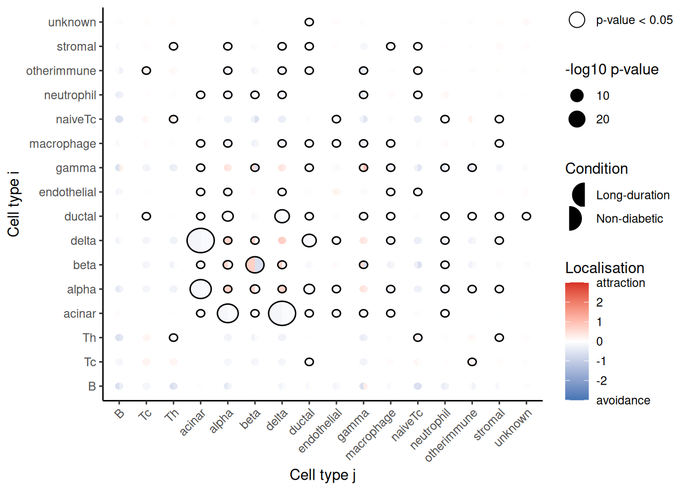
Here, we can observe that the most significant relationship occurs between cytotoxic T cells (Tc) and the beta cells of the pancreas. Tc and beta cells appear to be significantly more colocalized in patients with onset diabetes compared to non-diabetic patients, indicated by the positive coefficient.
We can use spicyBoxPlot to examine a cell type-cell type relationship closely.
Code
spicyBoxPlot(spicyTestPair, from="Tc", to="beta") + ylim(c(-50, 50))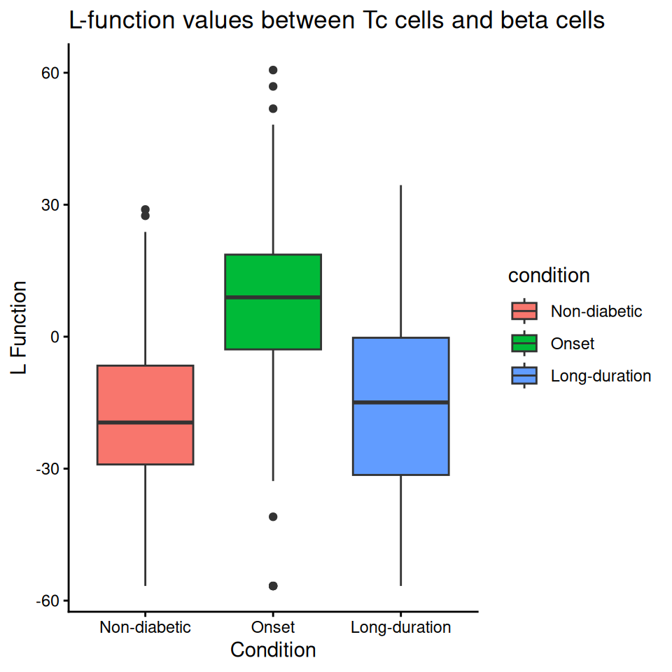
We can investigate individual images to ensure our results reflect biologically meaningful relationships. We can extract the individual colocalization metrics from the spicyTest object using the bind function.
Code
# extract colocalization metrics
cd <- colData(.spe) |>
    as.data.frame() |>
    distinct(patient_id, patient_stage, image_name) |>
    dplyr::rename(imageID=image_name)
bind(spicyTest) |>
    # merge with metadata
    merge(cd, by="imageID", all=FALSE) |>
    # select columns of interest
    select(c(imageID, Tc__beta, patient_id, patient_stage)) |>
    filter(imageID %in% c("L29", "O02", "E17", "G17"))
We can then visualize the spatial relationship between a pair of cell types in the original image using the plotImage function.
The left image (L29) comes from a non-diabetic patient. We can see that beta and Tc cells appear to be dispersed, which is reflected in the colocalization metric.
The right image (O02) comes from a patient with early onset diabetes. We can see that beta and Tc cells are far more colocalized, with Tc cells even infiltrating the pancreatic islets in some cases.
Code
# this is needed due to a bug in 'spicyR'
# (setting 'cellType' doesn't work)
.spe$cellType <- .spe$cell_type
lapply(c("L29", "O02"), \(i) {
    plotImage(.spe,
        imageToPlot=i,
        #cellType="cell_type",
        imageID="image_name",
        from="Tc", to="beta")
}) |>
    wrap_plots(nrow=1) &
    coord_equal()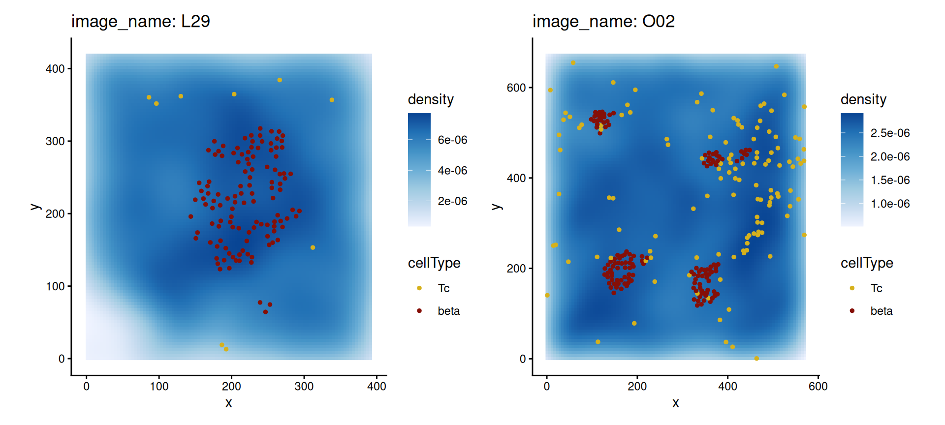
spicyR can also be used with custom distance metrics and to perform survival analysis, which are outlined in the spicyR vignette.
36.3 spatialFDA
The spatialFDA package computes spatial summaries as functions (e.g., Ripley’s \(K\) function) and compares them using tools from functional data analysis (FDA). We will consider the colocalization (spacing) of alpha cells in the islet and cytotoxic T-cells, which are important in the destruction of islet cells in T1D (Damond et al. 2019).
This subchapter is adapted from the spatialFDA vignette.
The first important question is in what range we want to consider interactions. We provide a generalization of a guideline for the maximum radius provided by Baddeley et al. (2015), which suggests to not consider any radii beyond \(1/2\) of the bounding-circle radius of an image, as else effects at the border of a FOV become too extreme.
The histogram of all bounding-circle radii across all images and \(1/2\) of the smallest bin of this histogram as a heuristic are shown below.
Code
rMaxHeuristic(spe, subsetby="image_number", marks="cell_type")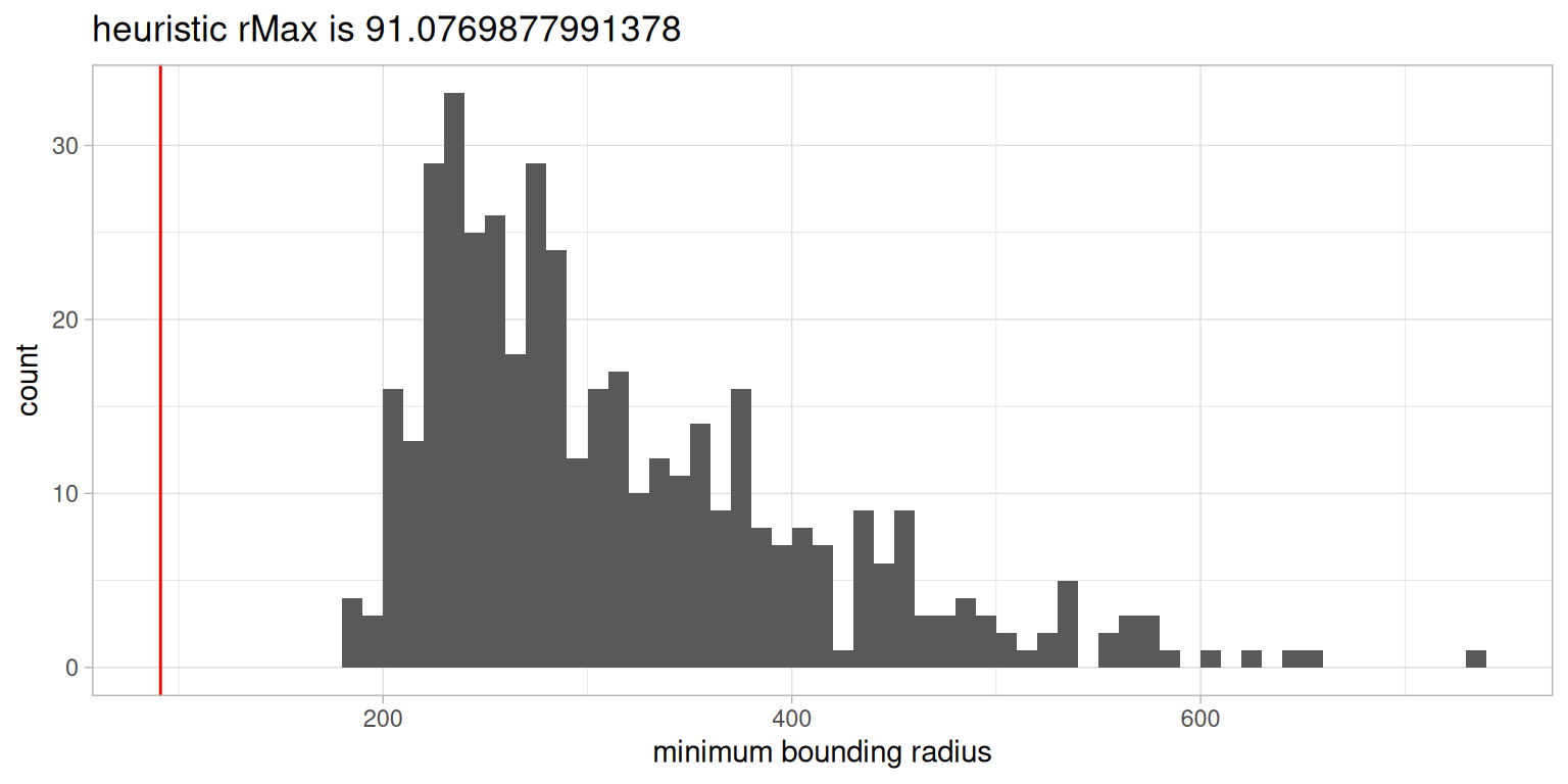
We will consider a radius of \(50 \mu m\) to a) be below the heuristic of \(91 \mu m\) defined above, and b) consider shorter range interactions in our data. With a cell diameter of \(\sim 10 \mu m\), the rMax of \(50 \mu m\) results in interactions across 5 cell pairs.
Apart from the radius, we have to define some other parameters as well. Important are:
-
selectiondefines which cell types to consider (NULLto compare all) -
funspecifies the spatial function -
marksspecifies cell type annotation in thecolData -
correctionspecifies which border correction to compare in the functional model -
transformationspecifies whether to apply a variance-stabilising transformation
The parameters sample_id, image_id, condition are important for the statistical inference. All other parameters can be specified to achieve better results but there are defaults specified as well.
Code
# relevel to have non-diabetic as the reference category
spe$patient_stage <- relevel(factor(spe$patient_stage), "Non-diabetic")

# run the spatial statistics inference
resLs <- crossSpatialInference(
    spe,
    selection=c("alpha", "Tc", "Th"),
    fun="Gcross",
    marks="cell_type",
    rSeq=seq(0, 50, l=50),
    correction="rs",
    transformation="Fisher",
    eps=1e-3,
    delta="minNnDist",
    family=mgcv::scat(link="log"),
    sample_id="patient_id",
    image_id="image_name",
    condition="patient_stage",
    algorithm="bam",
    verbose=FALSE)
The convenience function crossSpatialInference first calculates the spatial statistics functions, and then compares these with a functional additive mixed model across all cell types in the selection (Baddeley et al. 2015; Baddeley and Turner 2005; Scheipl et al. 2015, 2016; Goldsmith et al. 2024).
The result is a list of lists containing the results across all cell types:
Code
# list with one element per cell type
names(resLs)
## [1] "alpha_alpha" "Tc_alpha" "Th_alpha" "alpha_Tc" "Tc_Tc"
## [6] "Th_Tc" "alpha_Th" "Tc_Th" "Th_Th"Results for each cell type pair include the transformed functions (metricRes), the untransformed functions (metricResRaw), the design matrix used to fit the model (designmat), the actual functional model (mdl) and some QC metrics of the statistical inference (curveFittingQC):
Code
# list of results for first cell type
names(resLs[[1]])
## [1] "metricRes" "designmat" "mdl" "curveFittingQC"We can plot the overall picture of the interactions by performing an \(F\)-test on all functional models and plotting both the \(p\)-value of the tests as well as the mean coefficient over the domain \(r\).
Code
coefs <- c(
    "Onset"="conditionOnset(x)",
    "Long-Duration"="conditionLong_duration(x)")
plotCrossHeatmap(resLs,
    coefficientsToPlot=coefs, QCThreshold=0, QCMetric="medianMinIntensity") +
    guides(shape="none") + facet_wrap(~factor(coefficient, coefs, names(coefs)))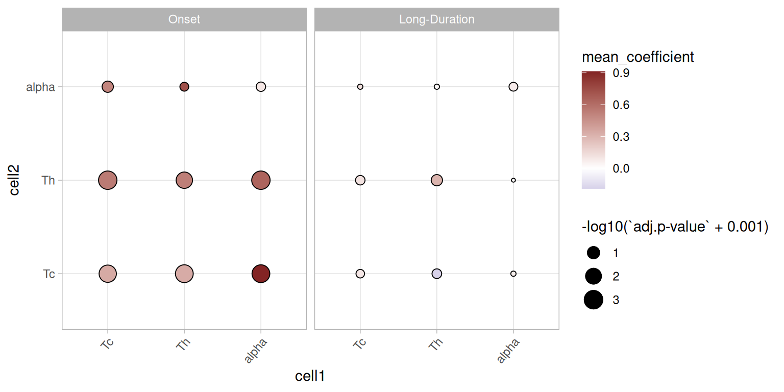
This plot highlights an increased colocalization of T-cell types with pancreatic \(\alpha\) cells in Onset diabetes but not in Long-duration diabetes. This is an interesting overall finding and we will focus on the cell type pair \(\alpha\)-cytotoxic T cells in more detail below.
First, we will plot the functional box plot of the transformed spatial statistics functions (Sun and Genton 2011). Here, the black line indicates the median curve, the purple region is the 50% central region, and the red lines indicate outliers.
Code
# extract the metric dataframe
res <- resLs$alpha_Tc
metricRes <- res$metricRes

# make unique identifiers
metricRes$ID <- with(metricRes, paste(sep="x",
    patient_stage, patient_id, image_name))

# functional boxplot of spatial statistics curves
collector <- plotFbPlot(metricRes, "r", "rs", "patient_stage")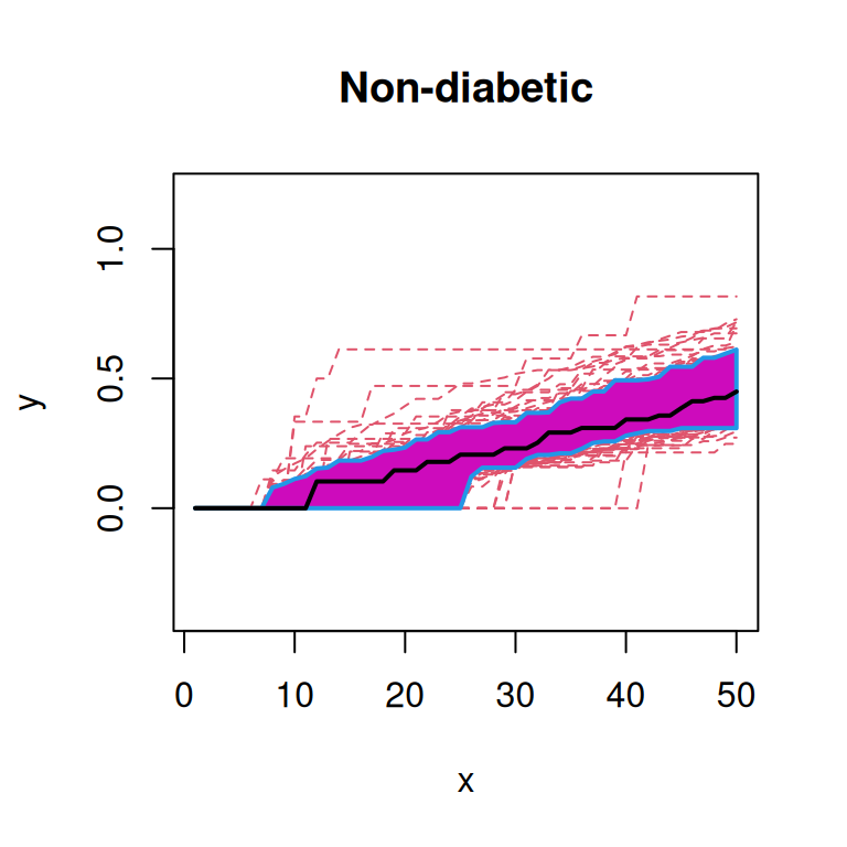
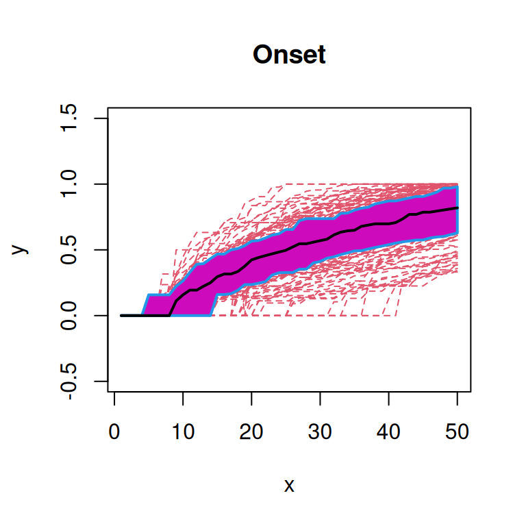
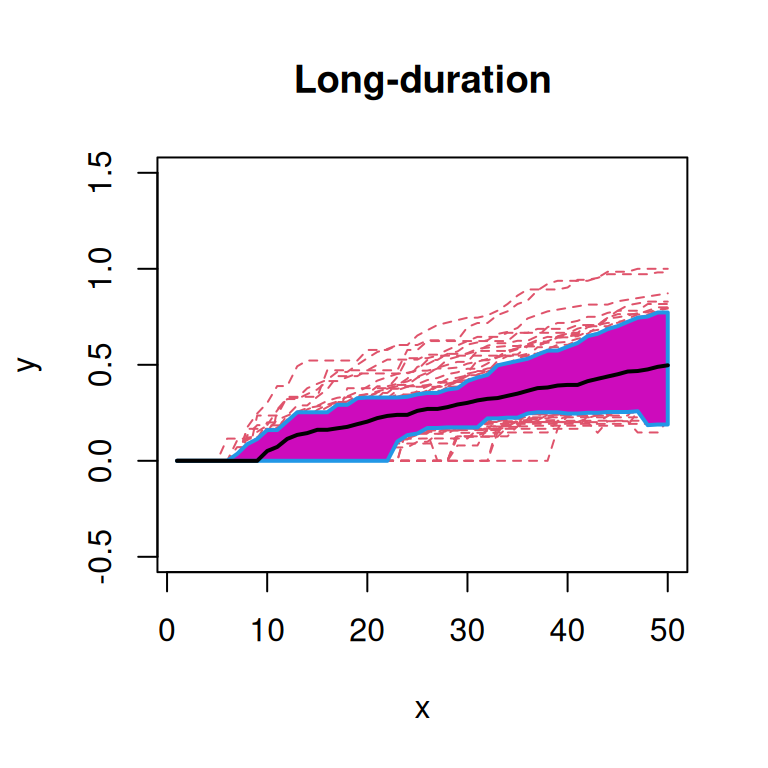
From these plots, we note that the functions from ‘Onset’ patients seem to qualitatively have a higher median curve than those from ‘Non-diabetic’ or ‘Long-duration’ patients.
Another exploratory technique is functional PCA (FPCA). FPCA is similar to standard PCA in that it decomposes the functional data into the main modes of variation. Here, we decompose the functional data into eigenfunctions and can plot the first two principal components as a biplot (Goldsmith et al. 2024).
Code
# prepare 'data.frame' from 'calcMetricRes'
# to be in the correct format for FDA
dat <- prepData(metricRes, "r", "rs")

# create meta info of the IDs
splitData <- dat$ID |>
    str_replace("-","_") |>
    str_split_fixed("x", 3) |>
    data.frame(stringsAsFactors=TRUE) |>
    setNames(c("condition", "patient_id", "imageId")) |>
    mutate(condition=relevel(condition,"Non_diabetic"))

dat <- cbind(dat, splitData) # join with results
dat <- drop_na(dat)          # drop rows with NA

# calculate FPCA & visualize biplot
pca <- functionalPCA(dat=dat, r=unique(metricRes$r), pve=0.995)
plotFpca(dat=dat, res=pca, colourby="condition") + labs(color="condition")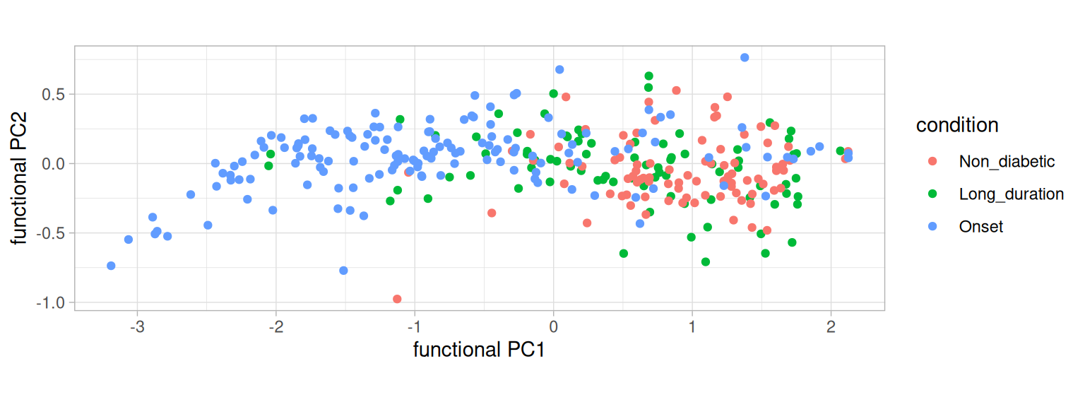
From the FPCA, we note that the variability in curves from ‘Onset’ patients is larger than the other two groups.
Next, we will show how FDA can be used to make inferences from functional spatial summaries. We use a generalized additive mixed model with a functional response (Scheipl et al. 2015, 2016; Goldsmith et al. 2024). In such models, some parameters are functional and some are constants (see below).
Code
summary(mdl <- res$mdl)
mm <- res$designmat
lapply(colnames(mm), \(x) {
    i <- mdl$coefficients[[1]]
    plotMdl(mdl, predictor=x, shift=i)
}) |> wrap_plots(nrow=3, axes="collect")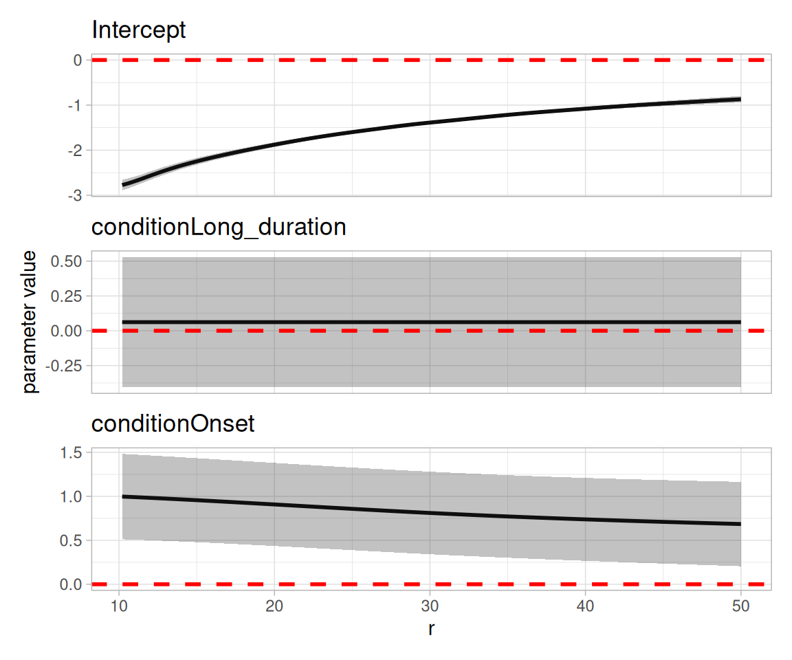
With the functional GAM, we see not only the effect (e.g., increased colocalization of \(\alpha\) and cytotoxic T cells in ‘Onset’ patients compared to ‘Non-diabetic’ patients) but also the strength of the effect at each scale.
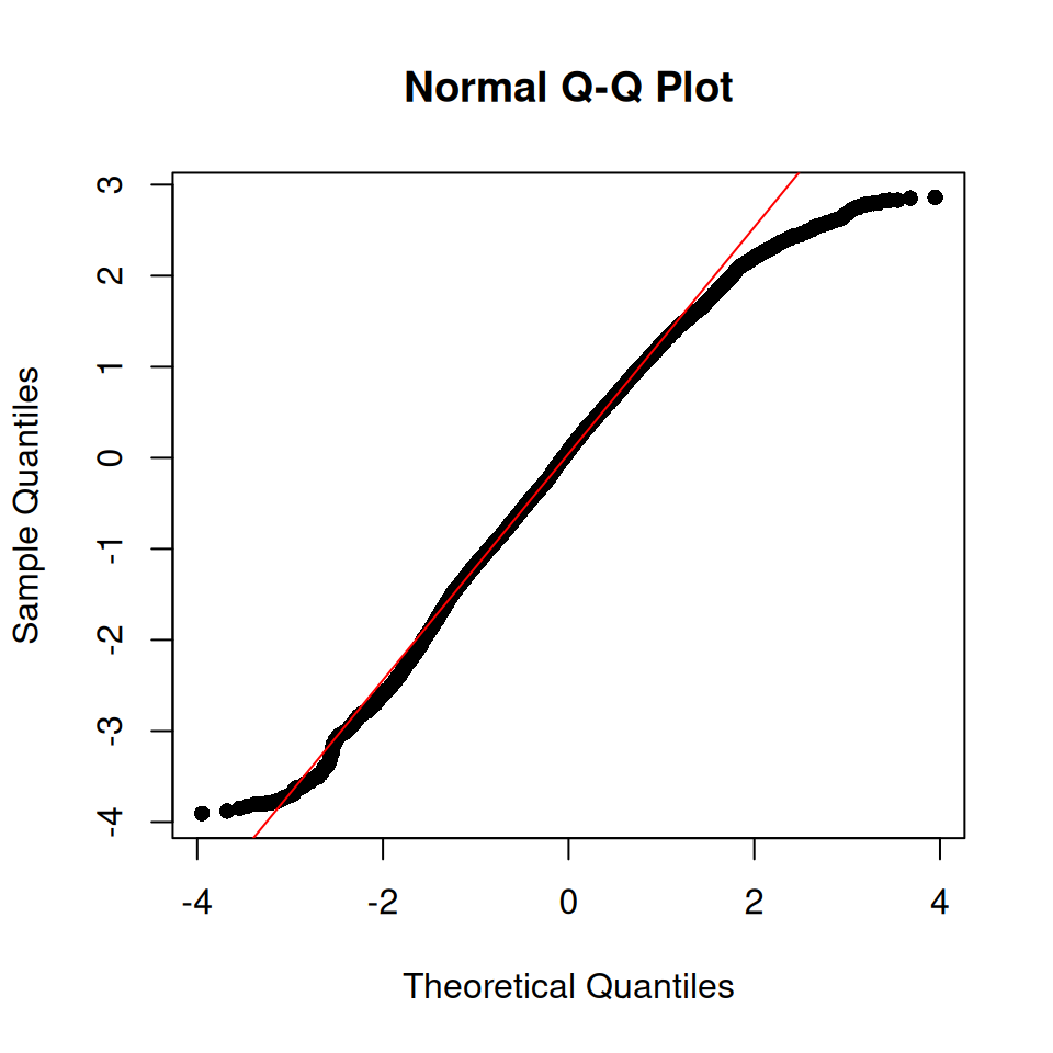
The Q-Q plot indicates a reasonable model fit, although not perfect.
In summary, we have seen that there is increased colocalization of T-cell types to the pancreatic islets early in the disease and that this recruitment is absent later in the disease. This increased colocalization in onset diabetes is happening at shorter scales around \(\alpha\) cells indicating that effects close to the pancreatic islets are more affected than those further away.