22 Neighborhood analysis
22.1 Preamble
22.1.1 Introduction
Neighborhood analysis aims to investigate the composition of and interaction between cells and cell types within small regions of tissue, which are referred to as neighborhoods or niches. This chapter addresses a complementary form of analysis to spatial domain clustering: instead of grouping cells or spots primarily by their own expression profiles, neighborhood and niche analyses summarize the local cellular environment around each cell or region. These methods are especially relevant for classifying cell neighborhoods, identifying tissue niches, and detecting recurring microenvironments. For spatial domain detection based on expression, coordinates, and learned embeddings, see Chapter 29.
22.1.2 Dependencies
Code
# basic theme for spatial plots
theme_xy <- list(
    coord_equal(expand=FALSE),
    theme_void(), theme(
        plot.margin=margin(l=5),
        legend.key=element_blank(),
        panel.background=element_rect(fill="black")))
22.2 Nearest neighbors
Custom spatial analyses may rely on identifying nearest neighbors (NNs) of cells. We recommend RANN for this purpose, which finds NNs in \(O(N\log N)\) time for \(N\) cells (c.f., conventional approaches would take \(O(N^2)\) time) by relying on an approximate nearest-neighbor (ANN) C++ library. Furthermore, there is support for exact, approximate, and fixed-radius searchers. The latter is of particular interest in biology; e.g., one might require \(k\)NNs to lie within a biologically sensible distance as to avoid consideration of cells that are far-off, especially in sparse regions or at tissue borders.
As a toy example, we here compute the \(k\)NNs between a pair of subpopulations, with and without thresholding on NN distances (searchtype="radius").
For the first approach, each cell will receive \(k\) neighbors exactly,
but these may lie within an arbitrary distance.For the second approach, cells will receive \(\leq k\) neighbors,
depending on how many cells lie within a radius \(r\).
Code
library(RANN)
k <- 10 # num. neighbors
r <- 50 # dist. threshold
i <- spe$k == 1 # source
j <- spe$k == 4 # target
xy <- spatialCoords(spe)
# k-NN search: all cells have k neighbors
ns_k <- nn2(xy[j, ], xy[i, ], k=k)
is_k <- ns_k$nn.idx
all(rowSums(is_k > 0) == k)
# w/ fixed-radius: cells have 0-k neighbors
ns_r <- nn2(xy[j, ], xy[i, ], k=k, searchtype="radius", r=r)
is_r <- ns_r$nn.idx
range(rowSums(is_r > 0))
## [1] TRUE
## [1] 0 10The neighbors obtained via fixed-radius search (right) are less scattered than those obtained for unlimited distances (left); the former are arguably more meaningful in a biological context:
Code
df <- data.frame(xy, colData(spe))
p0 <- ggplot(df, aes(x_centroid, y_centroid)) +
    geom_point(data=df, col="navy", shape=16, size=0) +
    geom_point(data=df[i, ], col="magenta", shape=16, size=0)
p1 <- p0 + geom_point(
    data=df[which(j)[is_k], ],
    col="gold", shape=16, size=0) +
    ggtitle("k-nearest neighbors")
p2 <- p0 + geom_point(
    data=df[which(j)[is_r], ],
    col="gold", shape=16, size=0) +
    ggtitle("fixed-radius search")
(p1 | p2) + plot_layout(nrow=1) & theme_xy
Note that, we could also set a very large k in order to identify all neighbors within a radius r. In order to prevent unnecessarily costly searches, it is sensible to estimate how many neighbors we would expect, and to set k accordingly. nn2() will otherwise find each cells’ \(k\)NNs, and set the indices of those with a distance \(>r\) to 0.
As an exemplary approach, we here sample 1,000 cells to estimate the highest number of NNs obtained, considering half of all target cells as potential NNs:
Code
## [1] 56For our actual search, we then set k to be twice our estimate. As a final spot-check, we make sure that all cells have fewer than k NNs, since we might otherwise be missing some.
22.3 Spatial contexts
Spatial niche analysis aims at identifying regions of homogeneous composition by grouping cells based on their microenvironment. To this end, methods such as imcRtools (Windhager et al. 2023) rely on a \(k\)-nearest-neighbor (\(k\)NN) graph (based on Euclidean cell-to-cell distances), and clustering cells using common clustering algorithms (according to their neighborhood’s subpopulation frequencies).
Here, we demonstrate how to identify spatial contexts based on \(k\)-means clustering on cluster frequencies among (Euclidean) \(k\)NNs. We recommend readers consult the imcRtools documentation for a much wider range of visualizations and downstream analyses in this context.
Code
library(imcRtools)
# construct kNN-graph based on Euclidean distances
sqe <- buildSpatialGraph(spe,
    coords=spatialCoordsNames(spe),
    img_id="sample_id", type="knn", k=10)
# compute cluster frequencies among each cell's kNNs
sqe <- aggregateNeighbors(sqe,
    colPairName="knn_interaction_graph",
    aggregate_by="metadata", count_by="k")
# view composition of 1st cell's kNNs
unlist(sqe$aggregatedNeighbors[1, ])
## 1 2 3 4 5 6 7 8 9 10 11 12 13 14 15 16 17
## 0.4 0.6 0.0 0.0 0.0 0.0 0.0 0.0 0.0 0.0 0.0 0.0 0.0 0.0 0.0 0.0 0.0Code
##
##      1     2     3     4     5
##  75351 13998 21727 15482 13710
Let’s quickly view the subpopulation composition of each spatial context:
Code
df <- data.frame(spatialCoords(sqe), colData(sqe))
round(100*with(df, prop.table(table(k, ctx), 2)), 2)
## ctx
## k 1 2 3 4 5
## 1 0.85 0.14 0.23 0.51 80.58
## 2 3.02 0.37 1.43 1.90 3.29
## 3 2.56 0.00 0.00 6.63 1.77
## 4 1.12 45.64 64.44 0.01 0.23
## 5 3.75 0.00 0.00 6.90 9.10
## 6 13.58 5.05 8.21 0.83 1.17
## 7 15.68 0.01 0.13 0.86 1.49
## 8 0.77 0.05 0.03 0.01 0.01
## 9 0.10 42.67 15.68 0.00 0.06
## 10 9.68 1.70 2.60 1.90 1.09
## 11 22.69 1.11 1.80 0.08 0.12
## 12 13.97 2.96 4.95 0.37 0.75
## 13 4.68 0.00 0.03 0.00 0.01
## 14 5.27 0.22 0.32 0.03 0.04
## 15 0.72 0.06 0.09 0.02 0.01
## 16 0.88 0.02 0.07 0.00 0.00
## 17 0.66 0.00 0.00 79.96 0.28Secondly, let’s visualize the obtained spatial contexts in space:
Code
pal_k <- unname(pals::trubetskoy(nlevels(df$k)))
pal_c <- c("blue", "cyan", "gold", "magenta", "maroon")
ggplot(df, aes(x_centroid, y_centroid, col=k)) +
    scale_color_manual(values=pal_k) +
ggplot(df, aes(x_centroid, y_centroid, col=ctx)) +
    scale_color_manual(values=pal_c) +
plot_layout(nrow=1) &
    geom_point(shape=16, size=0) &
    guides(col=guide_legend(override.aes=list(size=2))) &
    theme_xy & theme(legend.key.size=unit(0.5, "lines"))
22.4 Colocalization
hoodscanR (Liu et al. 2025) also relies on a (Euclidean) \(k\)NN graph to estimate the probability of each cell associating with its NNs. The resulting probability matrix (rows=cells, columns=NNs) can, in turn, be used to assess co-occurrence of subpopulations.
Code
library(hoodscanR)
sqe <- readHoodData(spe, anno_col="k")
nbs <- findNearCells(sqe, k=100)
mtx <- scanHoods(nbs$distance)
grp <- mergeByGroup(mtx, nbs$cells)
sqe <- mergeHoodSpe(sqe, grp)
To perform neighborhood colocalization analysis, plotColocal() computes the Pearson correlation of probability distribution between cells. Here, high/low values indicate attraction/repulsion between clusters:
Code
library(pheatmap)
cor <- plotColocal(sqe, pm_cols=colnames(grp), return_matrix=TRUE)
pal <- colorRampPalette(rev(hcl.colors(9, "Roma")))(100)
pheatmap(cor,
    cellwidth=15, cellheight=15,
    treeheight_row=5, treeheight_col=5,
    col=pal, breaks=seq(-1, 1, length=100))
Downstream, calcMetrics() can be used to calculate cell-level entropy and perplexity, which both measure the mixing of cellular neighborhoods. Here, low/high values indicate heterogeneity/homogeneity of a cell’s local neighborhood:
Code
sqe <- calcMetrics(sqe, pm_cols=colnames(grp))Code
df <- data.frame(colData(sqe), k=spe$k, spatialCoords(spe))
vs <- c("perplexity", "entropy")
fd <- df |>
    pivot_longer(all_of(vs)) |>
    group_by(name) |> mutate_at("value", scale)
# threshold at 2 SDs for clearer visualization
fd$value[i] <- 2*sign(fd$value[i <- abs(fd$value) > 2])
ggplot(fd, aes(x_centroid, y_centroid, col=value)) +
    facet_grid(~name) + geom_point(shape=16, size=0) +
    theme_xy + theme(legend.key.size=unit(0.5, "lines")) +
scale_color_gradient2("z-scaled\nvalue", low="cyan", mid="navy", high="magenta") 
Stratifying these values by subpopulation, we can observe that clusters forming distinct aggregates in space are lowest in entropy/perplexity (i.e., the most homogeneous locally):
Code
ggplot(fd, aes(k, value, fill=k)) +
    facet_wrap(~name) +
    scale_fill_manual(values=pal_k) +
    geom_boxplot(outlier.stroke=0, key_glyph="point") +
    scale_y_continuous("z-scaled value", limits=c(-2, 2)) +
    guides(fill=guide_legend(override.aes=list(shape=21, size=2))) +
    theme_bw() + theme(
        axis.title.x=element_blank(),
        panel.grid.minor=element_blank(),
        legend.key.size=unit(0.5, "lines"))
22.5 Spatial density-based analysis
scider (Li et al. 2025) defines spatial domains as regions of interest (ROIs) while preserving the tissue structure through spatial density analysis. Kernel density estimation (KDE) is used to describe the spatial distributions of cells, and ROIs are identified based on the spatial density of some cell types of interest (COIs). One can also calculate the spatial density of transcript expression of a gene or a gene set, so that gene (set)-specific ROIs can be identified. ROIs can then be used for downstream analysis such as cell type colocalization, cell type composition and differential expression (DE) analysis. All functions operate on SpatialExperiment objects, allowing seamless integration. Using the Xenium breast carcinoma dataset, we demonstrate a standard scider workflow.
Code
# dependencies
library(scider)
library(OSTA.data)
library(SpatialExperimentIO)
# retrieve data from OSF repo &
# read into 'SpatialExperiment'
id <- "Xenium_HumanBreast1_Janesick"
pa <- OSTA.data_load(id, mol=FALSE)
dir.create(td <- tempfile())
unzip(pa, exdir=td)
spe <- readXeniumSXE(td, addTx=FALSE)
In this example, we define ROIs based on the cellular density of tumor cells, that is, DCIS_1, DCIS_2 and invasive tumor cells are considered as the COI. Firstly, we need to add cell type annotations to colData, where cell type annotations were obtained from the original publication (Janesick et al. 2023).
Code
anno <- read.csv(file.path(td, "annotation.csv"))
spe$cell_type <- anno$Annotation[match(spe$cell_id, anno$Barcode)]

scider::plotSpatial(spe, group="cell_type", pt.alpha=1)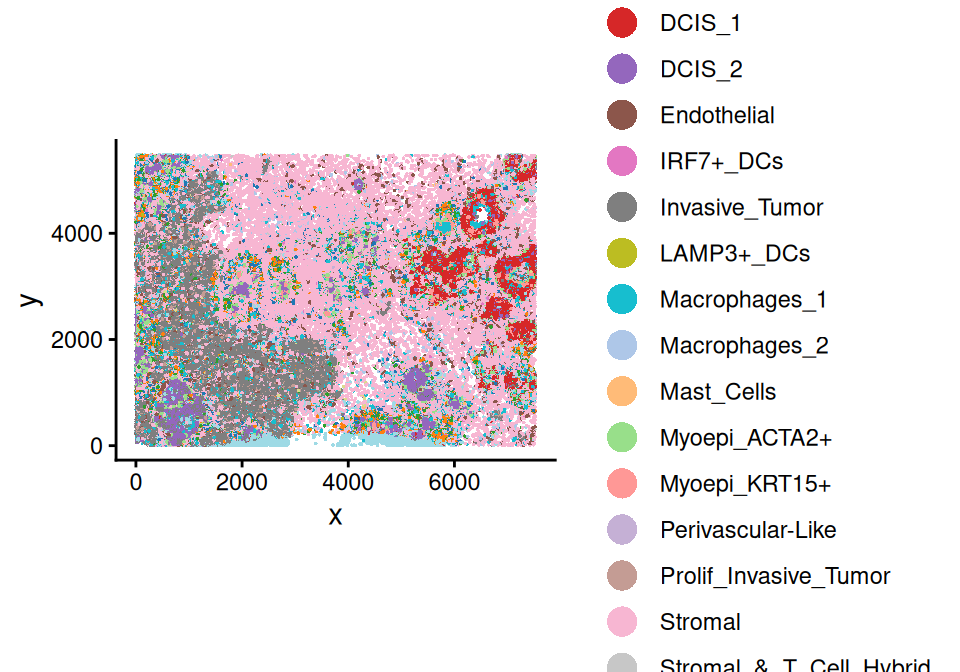
We first estimate the spatial density of each cell type using the gridDensity() function.
Code
spe <- gridDensity(spe, grid.length.x=50, bandwidth=25)
metadata(spe)$grid_density[1:4, 1:8]
## DataFrame with 4 rows and 8 columns
## x_grid y_grid node_x node_y node density_b_cells
## <numeric> <numeric> <numeric> <numeric> <character> <numeric>
## 1 2.13252 1.36716 1 1 1-1 -7.00970e-17
## 2 52.13252 1.36716 2 1 2-1 -4.07403e-17
## 3 102.13252 1.36716 3 1 3-1 -6.61382e-17
## 4 152.13252 1.36716 4 1 4-1 2.35977e-16
## density_cd4_t_cells density_cd8_t_cells
## <numeric> <numeric>
## 1 -2.04811e-16 -1.43713e-16
## 2 -3.60811e-16 4.88041e-11
## 3 -3.24988e-16 1.07286e-06
## 4 7.18931e-17 4.32820e-04The density value represents the expected number of COI cells on each grid, and can be visualized by the plotDensity() function. For example, here we visualize the density of COI cells:
Code
coi <- c("DCIS_1", "DCIS_2", "Invasive_Tumor")
scider::plotDensity(spe, coi=coi, probs=0.5) +
  ggtitle("Spatial density of tumor cells")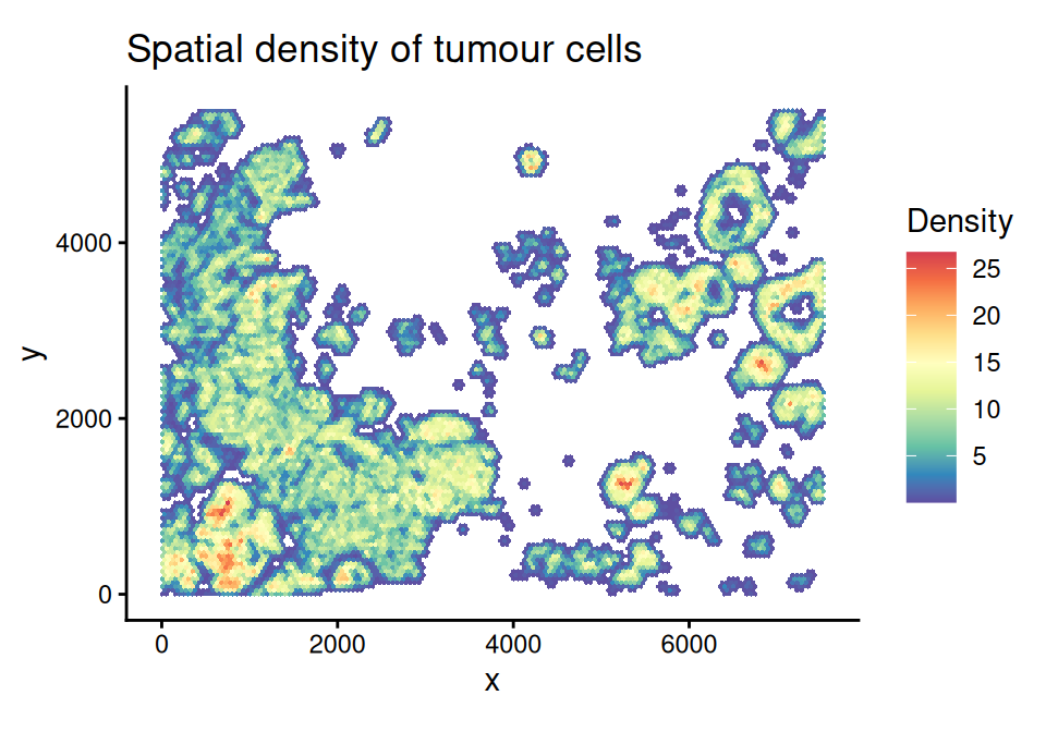
ROI detection is performed using a graph-based approach as described in Li et al. (2025). Only grids with \(\geq 1\) expected COI cell (estimated COI density \(\geq 1\)) are retained in ROI detection.
Code
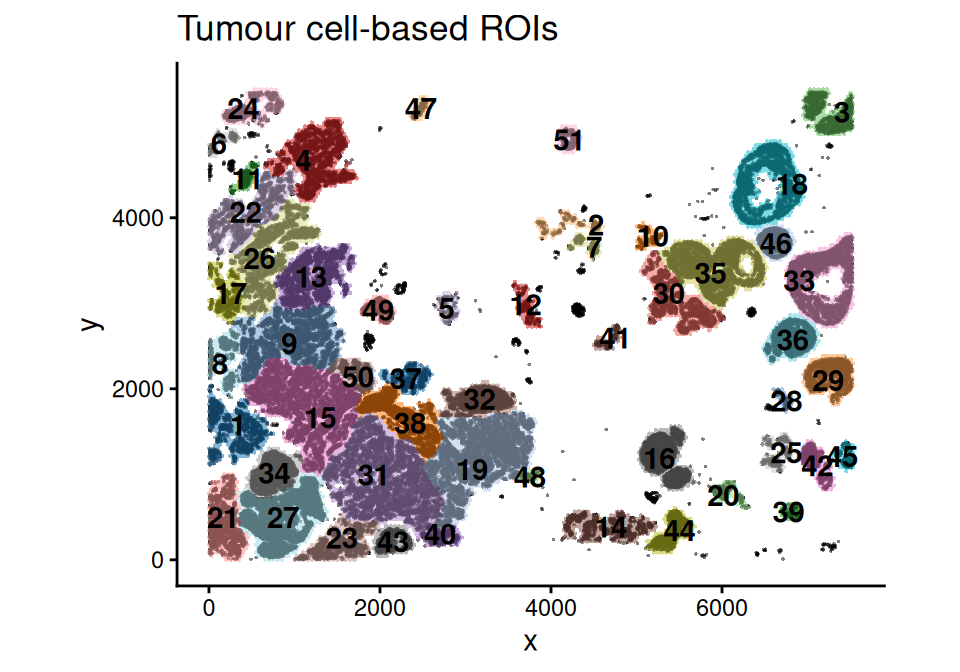
These ROIs can then be used for downstream analysis, such as cell type colocalization, spatial domain clustering, and differential expression (DE). Here as an example, we demonstrate an ROI-level cell type colocalization analysis.
22.5.1 Cell type colocalization on the ROI level
scider performs cell type colocalization analysis by calculating the correlation between the spatial densities of every two cell types.
Code
spe_cor <- corDensity(spe)
scider::plotCorHeatmap(spe_cor)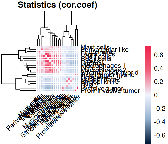
We see that immune and stromal cells are positively colocalized within their respective groups, whereas myoepithelial, DCIS, and invasive tumor populations form distinct, negatively correlated clusters.
22.5.2 Cell type composition analysis based on density contours
Additionally, contour levels can be calculated from the estimated COI density, which is useful for cell type composition analysis.
Code
spe <- getContour(spe, coi=coi, bins=10)
scider::plotContour(spe, coi=coi, line.width=0.5)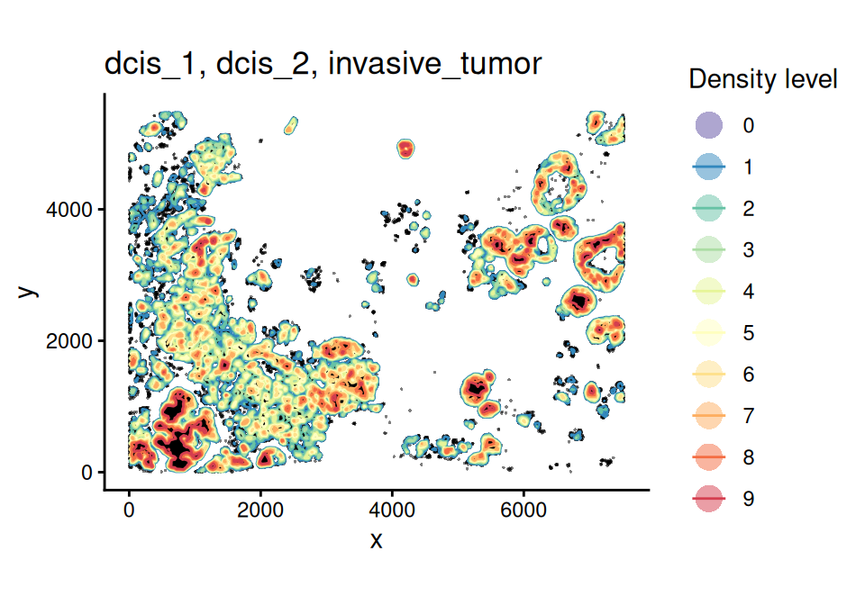
We can then assign each cell to its corresponding contour level according to their spatial coordinates, and visualize the cell type composition at each COI contour level using the plotCellCompo() function.
Code
spe <- allocateCells(spe, contour=coi, to.roi=TRUE)
scider::plotCellCompo(spe, contour=coi, self.included=FALSE)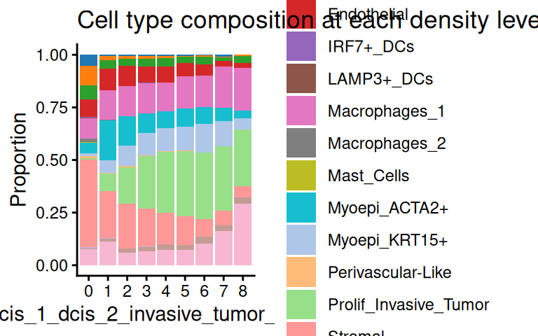
For example, we see a decreasing proportion of stromal cells, and an increasing proportion of unlabeled cells as tumor cell density increases. Normally, we would have filtered out unlabeled cells in preprocessing. It is also useful to investigate how cell type composition changes to COI densities within each ROI:
Code
scider::plotCellCompo(spe, contour=coi, self.included=FALSE, roi=coi)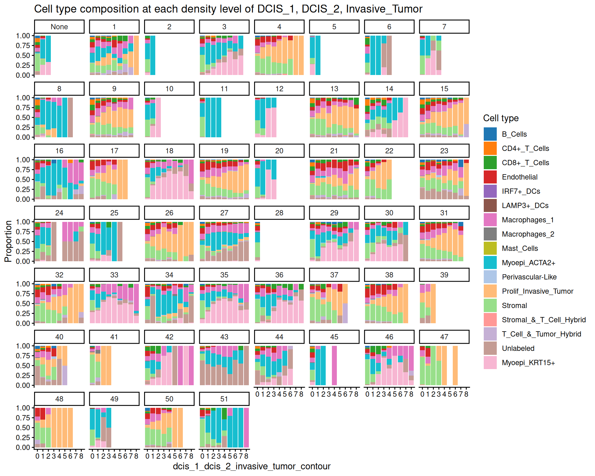
ROIs can also be used to perform other types of downstream analysis, such as gene expression clustering, DE analysis and pathway analysis by pseudo-bulking cells located within each ROI, using the spe2PB() function. Given the pseudo-bulk samples, scider is fully compatible with all limma and edgeR functionalities, allowing arbitrarily complex experimental design to answer various biological questions. We recommend performing such DE analyses using the voomLmFit() pipeline (Baldoni et al. 2025) or the quasi-likelihood pipeline in edgeR (Chen et al. 2025). Examples of DE and pathway analyses can be found in Li et al. (2025); more case studies are also available in the corresponding code repository.
22.6 Other methods
The approaches presented here are relatively simple in that they are straightforward to understand and interpret. Emerging Python-based frameworks rely on modern machine and deep learning-based architectures to learn, rather than quantitatively characterize, tissue features from data multitudes; we provide a few examples here, but this is by no means a comprehensive list:
Note that there is significant conceptual overlap between neighborhoods and spatial clustering (cf., Chapter 29).
DeepST (Xu et al. 2022) uses graph convolutional networks to integrate gene expression and spatial information, learning low-dimensional representations for spatial domain identification and tissue architecture characterization.
GraphST (Long et al. 2023) uses graph neural networks to model spatial relationships between spots or cells, and learns spatially informed embeddings for clustering and detection of spatial contexts across datasets.
NicheCompass(Birk et al. 2025) offers a graph neural network that models inter-cellular signaling to learn interpretable cell embeddings based on which niches with coherent communication pathways are identified.Novae(Blampey et al. 2025) is a graph-based foundation model (FM) that extracts representations of cells within their spatial contexts; it was originally trained on ~30M cells from 18 tissues, different gene panels, and technologies (see also Beyond this book for additional details on FMs).SpaGCN (Hu et al. 2021) combines gene expression, spatial and histological information via a graph convolutional network to identify spatial domains and characterize tissue organization.
STAGATE (Dong and Zhang 2022) relies on a graph attention auto-encoder to capture spatial gene expression and neighborhood patterns, modeling spatial neighborhoods as graphs that can be used as input for several downstream tasks, including spatial domain identification.