3. Analysis workflow
Lukas M. Weber
Source:vignettes/Vignette03_Analysis_workflow.Rmd
Vignette03_Analysis_workflow.RmdLast updated: 2021-08-17
Visium human DLPFC workflow
In this vignette, we demonstrate the steps in a computational analysis workflow for spatially resolved transcriptomics (ST) data, using an example dataset from the 10x Genomics Visium platform.
As described in the previous vignette, the dataset consists of a single sample (sample 151673) from the human brain dorsolateral prefrontal cortex (DLPFC) region, previously described in our publication Maynard and Collado-Torres et al. (2021). The full original dataset can be obtained through the spatialLIBD Bioconductor package.
Load data
We begin by loading the dataset. We have stored a copy of this dataset in SpatialExperiment format in the STexampleData package, to make it easier to load for use in examples and tutorials.
If you are using the latest devel version of Bioconductor 3.14, the dataset can be loaded as shown in the code below.
Alternatively, if you are working in a release version of Bioconductor 3.13, the helper function shown in the code comments below can be used instead.
library(SpatialExperiment)
library(STexampleData)

# load dataset from ExperimentHub
spe <- Visium_humanDLPFC()
spe
#> class: SpatialExperiment
#> dim: 33538 4992
#> metadata(0):
#> assays(1): counts
#> rownames(33538): ENSG00000243485 ENSG00000237613 ... ENSG00000277475
#>   ENSG00000268674
#> rowData names(3): gene_id gene_name feature_type
#> colnames(4992): AAACAACGAATAGTTC-1 AAACAAGTATCTCCCA-1 ...
#>   TTGTTTGTATTACACG-1 TTGTTTGTGTAAATTC-1
#> colData names(3): cell_count ground_truth sample_id
#> reducedDimNames(0):
#> mainExpName: NULL
#> altExpNames(0):
#> spatialData names(6) : barcode_id in_tissue ... pxl_col_in_fullres
#>   pxl_row_in_fullres
#> spatialCoords names(2) : x y
#> imgData names(4): sample_id image_id data scaleFactor
# alternatively: load dataset using helper function in Bioc 3.13
# spe <- load_data("Visium_humanDLPFC")
# spe
Plot data
As an initial check, plot the spatial coordinates (spots) in x-y dimensions on the tissue slide, to check that the object has loaded correctly and that the orientation is as expected.
We use visualization functions from the ggspavis package to generate plots.
# plot spatial coordinates (spots)
plotSpots(spe)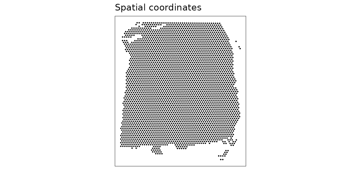
Quality control (QC)
First, we subset the object to keep only spots over tissue.
# subset to keep only spots over tissue
spe <- spe[, spatialData(spe)$in_tissue == 1]
dim(spe)
#> [1] 33538  3639
Next, calculate spot-level quality control (QC) metrics using the scater package (McCarthy et al. 2017) and store the QC metrics in colData in the object.
# identify mitochondrial genes
is_mito <- grepl("(^MT-)|(^mt-)", rowData(spe)$gene_name)
table(is_mito)
#> is_mito
#> FALSE  TRUE
#> 33525    13
rowData(spe)$gene_name[is_mito]
#>  [1] "MT-ND1"  "MT-ND2"  "MT-CO1"  "MT-CO2"  "MT-ATP8" "MT-ATP6" "MT-CO3"
#>  [8] "MT-ND3"  "MT-ND4L" "MT-ND4"  "MT-ND5"  "MT-ND6"  "MT-CYB"

# calculate per-spot QC metrics and store in colData
spe <- addPerCellQC(spe, subsets = list(mito = is_mito))
head(colData(spe), 3)
#> DataFrame with 3 rows and 9 columns
#>                    cell_count ground_truth     sample_id       sum  detected
#>                     <integer>     <factor>   <character> <numeric> <numeric>
#> AAACAAGTATCTCCCA-1          6       Layer3 sample_151673      8458      3586
#> AAACAATCTACTAGCA-1         16       Layer1 sample_151673      1667      1150
#> AAACACCAATAACTGC-1          5       WM     sample_151673      3769      1960
#>                    subsets_mito_sum subsets_mito_detected subsets_mito_percent
#>                           <numeric>             <numeric>            <numeric>
#> AAACAAGTATCTCCCA-1             1407                    13              16.6351
#> AAACAATCTACTAGCA-1              204                    11              12.2376
#> AAACACCAATAACTGC-1              430                    13              11.4089
#>                        total
#>                    <numeric>
#> AAACAAGTATCTCCCA-1      8458
#> AAACAATCTACTAGCA-1      1667
#> AAACACCAATAACTGC-1      3769
Select filtering thresholds for the QC metrics by examining distributions using histograms. For more details, see the Quality control chapter in OSTA.
# histograms of QC metrics
par(mfrow = c(1, 4))
hist(colData(spe)$sum, xlab = "sum", main = "UMIs per spot")
hist(colData(spe)$detected, xlab = "detected", main = "Genes per spot")
hist(colData(spe)$subsets_mito_percent, xlab = "percent mitochondrial", main = "Percent mito UMIs")
hist(colData(spe)$cell_count, xlab = "number of cells", main = "No. cells per spot")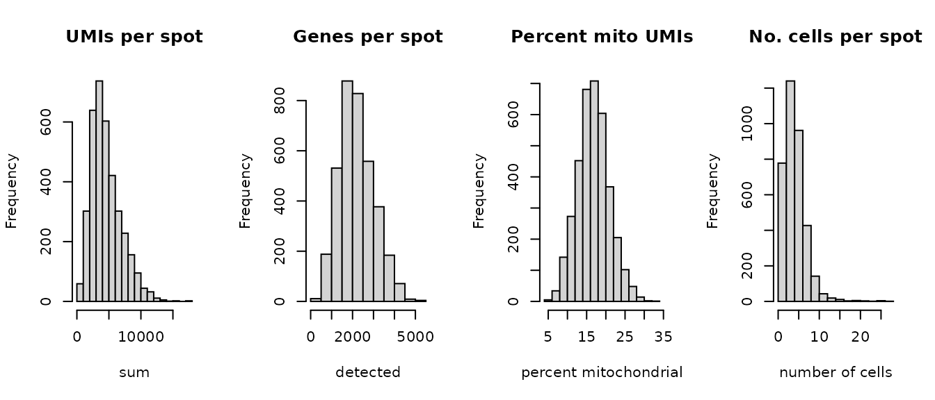
par(mfrow = c(1, 1))

# select QC thresholds
qc_lib_size <- colData(spe)$sum < 500
qc_detected <- colData(spe)$detected < 250
qc_mito <- colData(spe)$subsets_mito_percent > 30
qc_cell_count <- colData(spe)$cell_count > 12

# number of discarded spots for each metric
apply(cbind(qc_lib_size, qc_detected, qc_mito, qc_cell_count), 2, sum)
#>   qc_lib_size   qc_detected       qc_mito qc_cell_count
#>             7             5             3            47

# combined set of discarded spots
discard <- qc_lib_size | qc_detected | qc_mito | qc_cell_count
table(discard)
#> discard
#> FALSE  TRUE
#>  3582    57

# store in object
colData(spe)$discard <- discard
Plot the set of discarded spots in x-y coordinates, to confirm that the spatial distribution of the discarded spots does not correspond to any obvious biologically meaningful regions, which would indicate that we are removing biologically informative spots.
# check spatial pattern of discarded spots
plotQC(spe, type = "spots", discard = "discard")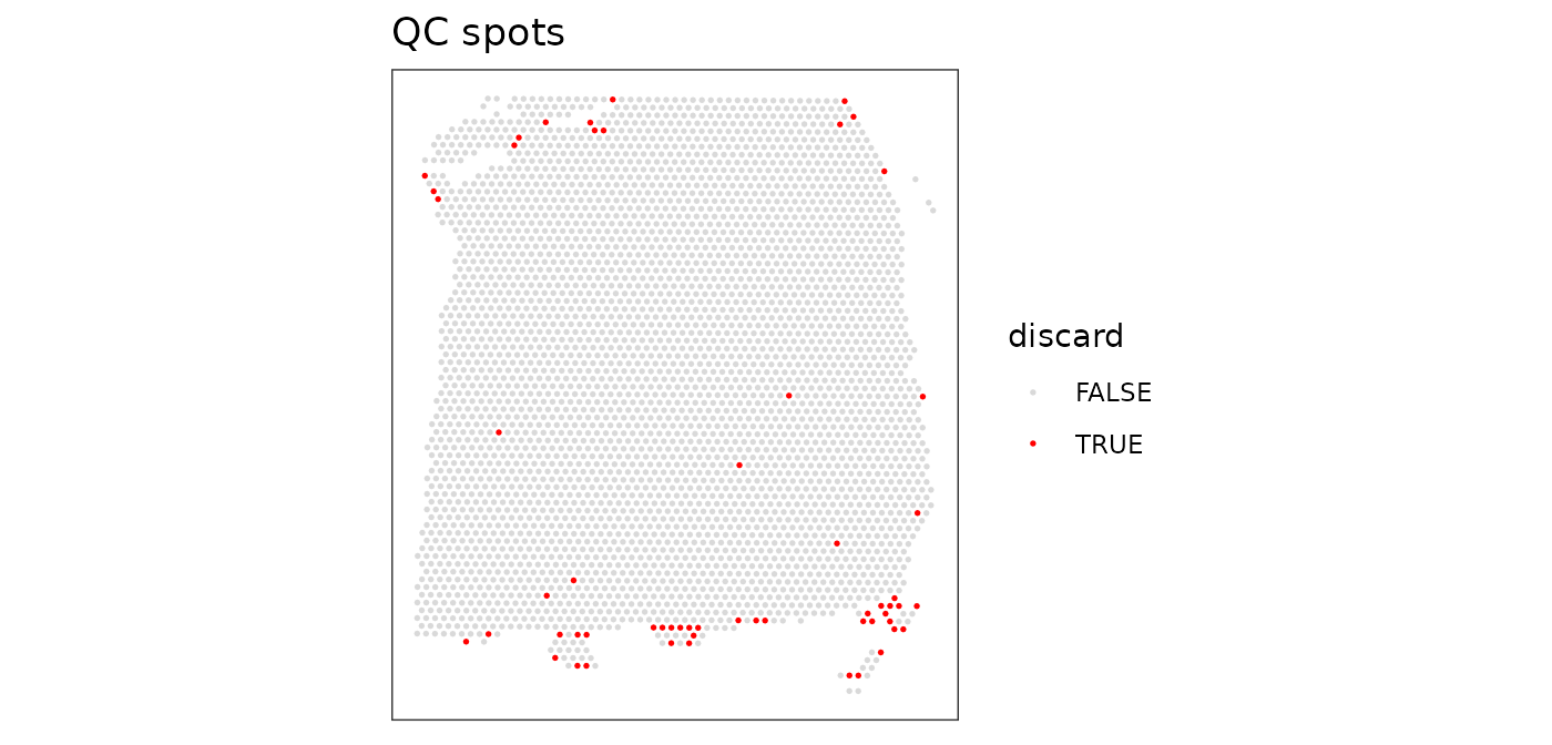
There is some concentration of discarded spots at the edge of the tissue region, which may be due to tissue damage.
We filter out the low-quality spots from the object.
Normalization
Calculate log-transformed normalized counts, using pool-based size factors and deconvolution to the spot level. We use normalization methods from the scater (McCarthy et al. 2017) and scran (Lun et al. 2016) packages, by assuming that these methods can be applied by treating spots as equivalent to cells. Since we have a single sample, there are no blocking factors.
library(scran)
# quick clustering for pool-based size factors
set.seed(123)
qclus <- quickCluster(spe)
table(qclus)
#> qclus
#>   1   2   3   4   5   6   7   8   9  10
#> 372 245 254 744 415 230 394 299 492 137

# calculate size factors and store in object
spe <- computeSumFactors(spe, cluster = qclus)

summary(sizeFactors(spe))
#>    Min. 1st Qu.  Median    Mean 3rd Qu.    Max.
#>  0.1334  0.6093  0.8844  1.0000  1.2852  4.2475
hist(sizeFactors(spe), breaks = 20)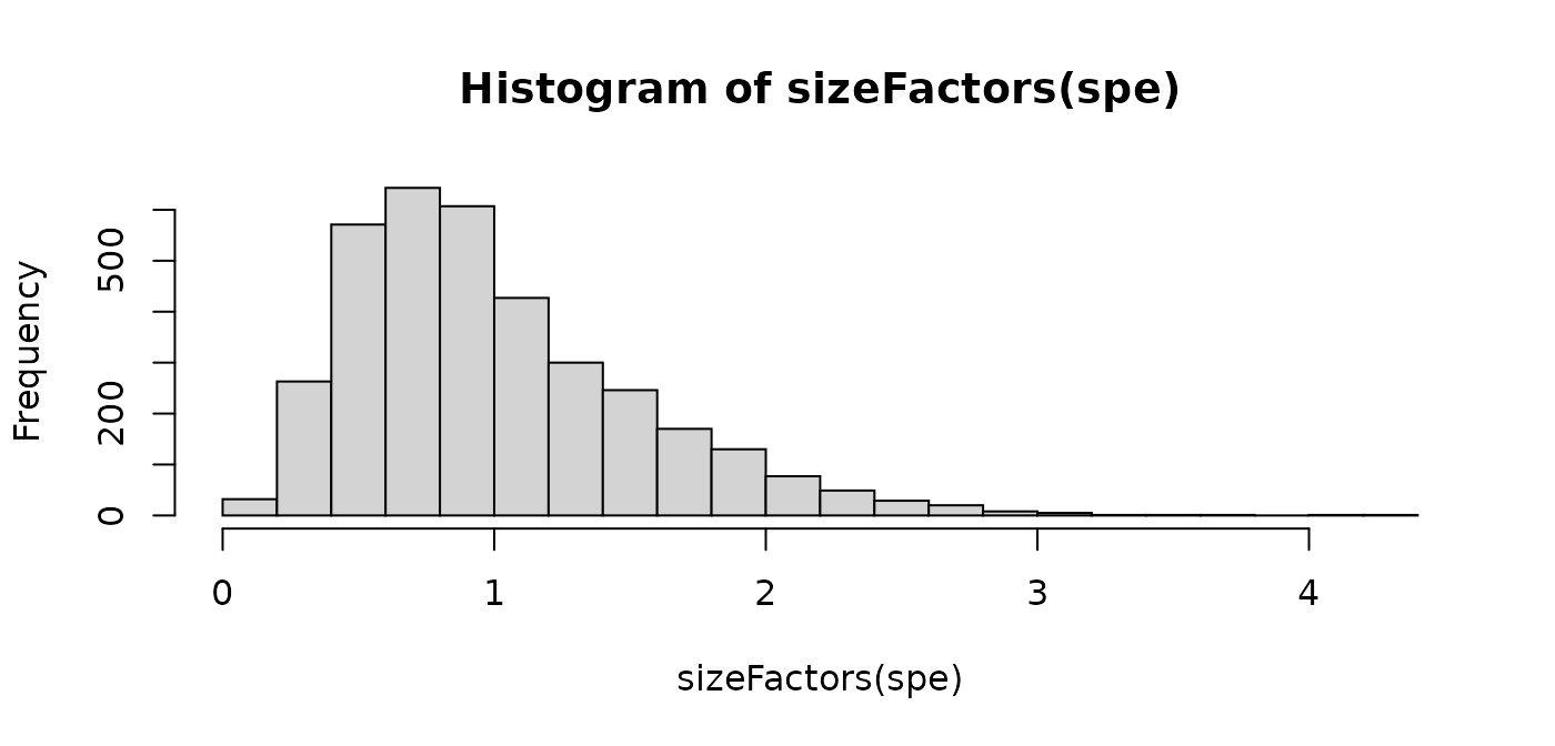
# calculate logcounts (log-transformed normalized counts) and store in object
spe <- logNormCounts(spe)

assayNames(spe)
#> [1] "counts"    "logcounts"
Feature selection
Identify a set of top highly variable genes (HVGs), which will be used to define cell types. We again use methods from scran, treating spots as equivalent to cells. We also first filter out mitochondrial genes, since these are very highly expressed and not of main biological interest here.
# remove mitochondrial genes
spe <- spe[!is_mito, ]
dim(spe)
#> [1] 33525  3582
# fit mean-variance relationship
dec <- modelGeneVar(spe)

# visualize mean-variance relationship
fit <- metadata(dec)
plot(fit$mean, fit$var,
     xlab = "mean of log-expression", ylab = "variance of log-expression")
curve(fit$trend(x), col = "dodgerblue", add = TRUE, lwd = 2)
# select top HVGs
top_hvgs <- getTopHVGs(dec, prop = 0.1)
length(top_hvgs)
#> [1] 1448
Dimensionality reduction
Run principal component analysis (PCA) on the set of top HVGs, and retain the top 50 principal components (PCs) for further downstream analyses. This is done to reduce noise and to improve computational efficiency.
We also run UMAP on the set of top 50 PCs and retain the top 2 UMAP components for plotting.
Note that we use the computationally efficient implementation of PCA available in scater, which uses randomization, and therefore requires setting a random seed for reproducibility.
Clustering
Next, we perform clustering to define cell types based on molecular expression profiles. We apply graph-based clustering using the Walktrap method implemented in scran, applied to the top 50 PCs calculated on the set of top HVGs.
# graph-based clustering
set.seed(123)
k <- 10
g <- buildSNNGraph(spe, k = k, use.dimred = "PCA")
g_walk <- igraph::cluster_walktrap(g)
clus <- g_walk$membership
table(clus)
#> clus
#>    1    2    3    4    5    6
#>  372  916  342 1083  349  520

# store cluster labels in column 'label' in colData
colLabels(spe) <- factor(clus)
We can visualize the clusters by plotting in (i) x-y coordinates on the tissue slide, and (ii) UMAP dimensions.
From the plots, we can see that the clustering on molecular expression profiles reproduces the known biological structure (cortical layers) to some degree, although not perfectly. The clusters are also separated in UMAP space, but again not perfectly.
# plot clusters in x-y coordinates
plotSpots(spe, annotate = "label",
          palette = "libd_layer_colors")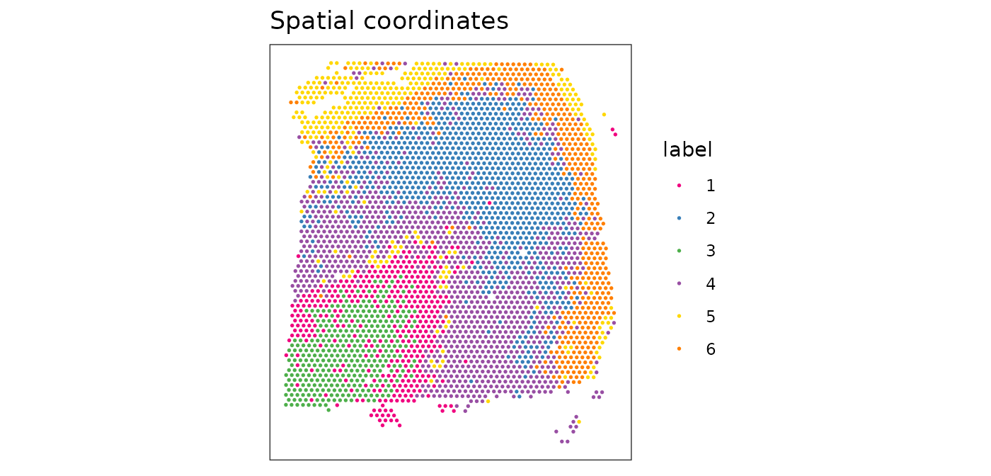
# plot ground truth labels in x-y coordinates
plotSpots(spe, annotate = "ground_truth",
          palette = "libd_layer_colors")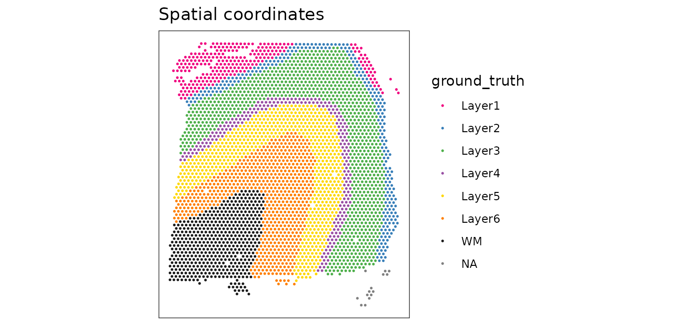
# plot clusters in UMAP dimensions
plotDimRed(spe, type = "UMAP",
           annotate = "label", palette = "libd_layer_colors")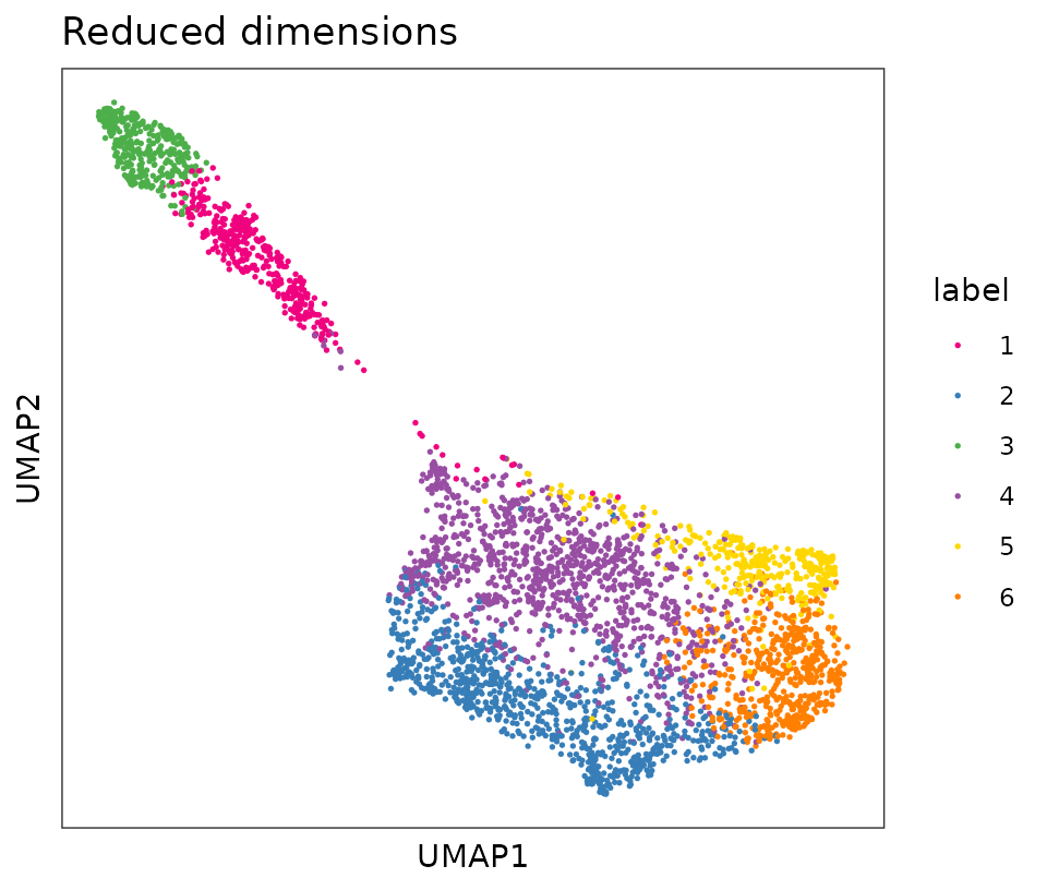
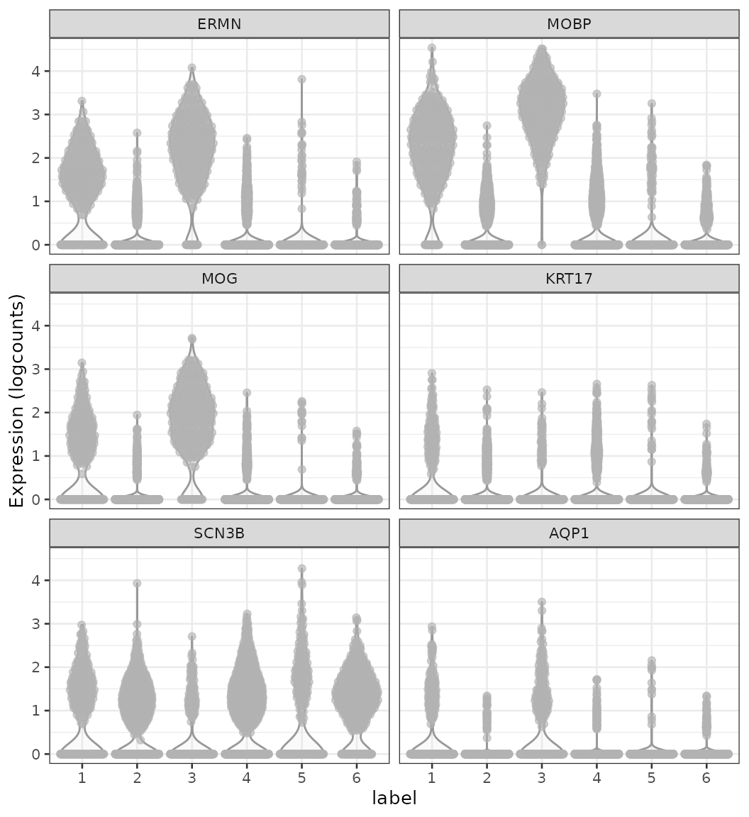
Marker genes
Finally, we can identify marker genes by testing for differential gene expression between clusters. We use the findMarkers implementation in scran, using a binomial test, which tests for genes that differ in the proportion expressed vs. not expressed between clusters. This is a more stringent test than the default t-tests, and tends to select genes that are easier to interpret and validate experimentally.
# set gene names as row names for easier plotting
rownames(spe) <- rowData(spe)$gene_name

# test for marker genes
markers <- findMarkers(spe, test = "binom", direction = "up")

# returns a list with one DataFrame per cluster
markers
#> List of length 6
#> names(6): 1 2 3 4 5 6
library(pheatmap)
# plot log-fold changes for one cluster over all other clusters
# selecting cluster 1
interesting <- markers[[1]]
best_set <- interesting[interesting$Top <= 5, ]
logFCs <- getMarkerEffects(best_set)

pheatmap(logFCs, breaks = seq(-5, 5, length.out = 101))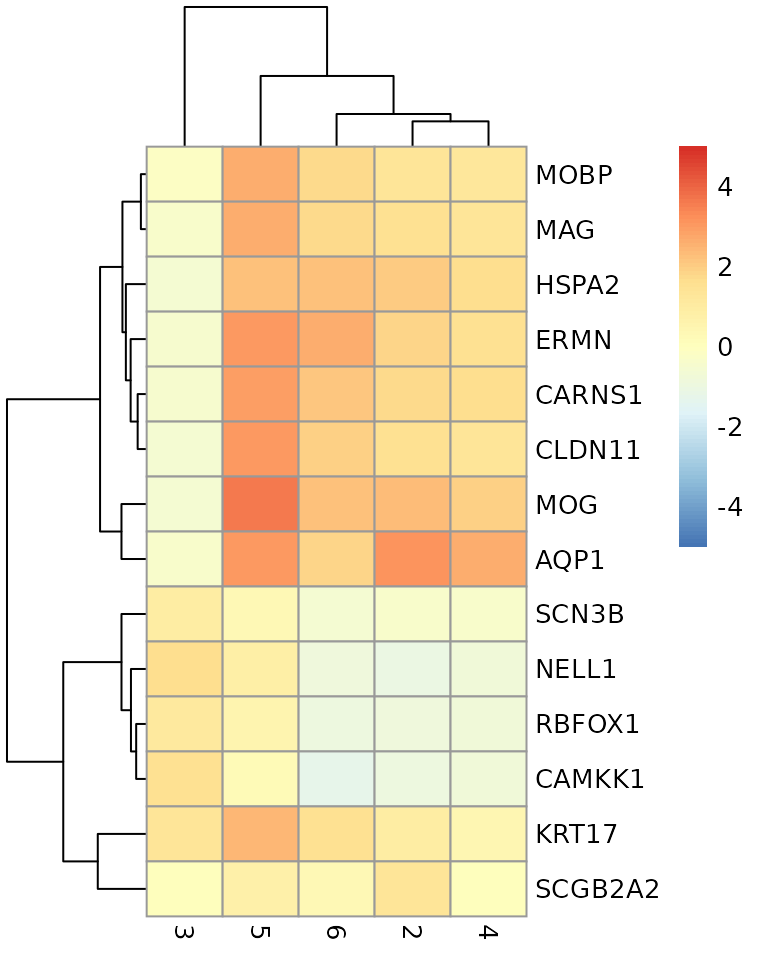
# plot log-transformed normalized expression of top genes for one cluster
top_genes <- head(rownames(interesting))

plotExpression(spe, x = "label", features = top_genes)